
How to Build the Perfect Bathroom Color and Material Palette
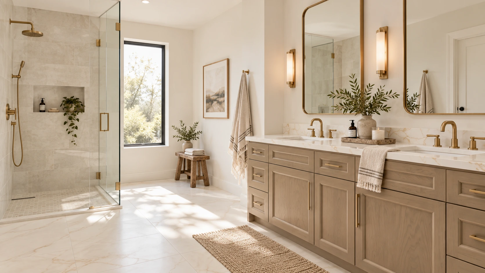
A successful bathroom should feel good at 7 a.m. on a busy weekday and still feel relaxed at the end of the day. It needs to manage water, humidity, storage, lighting and daily traffic while also supporting the style of the home. That combination of beauty and performance is what turns a collection of attractive products into a well-designed bathroom.
Recent industry research shows that homeowners are asking bathrooms to do more. The National Kitchen & Bath Association's 2026 Bath Trends Report describes bath design as increasingly personal, with wellness, technology, storage and lifestyle shaping the room. Houzz's 2025 U.S. Bathroom Trends Study found that 36% of renovated bathrooms included wellness-oriented features, while 68% of homeowners considered special needs in their projects. The message is clear: a bathroom renovation is not only about choosing a tile you love; it is about designing a room that will work comfortably for years.
If you are beginning a bathroom remodel, use the decisions below as a planning sequence. Start with function and wet-area performance, then build the visual palette around materials that suit the way the room will actually be used.
1. Start With the Feeling You Want the Bathroom to Have
Before choosing a tile color, decide how you want the room to feel. Calm and spa-like? Warm and organic? Crisp and architectural? Colorful and collected? That first decision gives every later material a filter.
A calm organic bathroom might begin with warm stone, soft ivory, sage or natural wood. A more tailored bathroom could use a cooler white, deep navy cabinetry and brushed metal. A colorful bathroom can still feel sophisticated when the permanent finishes share an undertone and only one or two surfaces carry the strongest color.
Current research supports the move toward softer, nature-connected palettes. NKBA’s 2026 Bath Trends Report found neutrals to be the dominant bath color family, while sage and olive were the strongest green directions among surveyed industry professionals. The same report identified timeless/transitional, organic/natural and modern/minimal design as leading style directions.
Trends are useful for context, but they should not make the decision for you. The best palette is one that fits the architecture of the home, the light in the room and the way you want to live with the space.
2. Choose One Anchor Material First
Instead of trying to choose six finishes at once, select one anchor material, the surface with the most visual influence or the one you are least willing to compromise on.
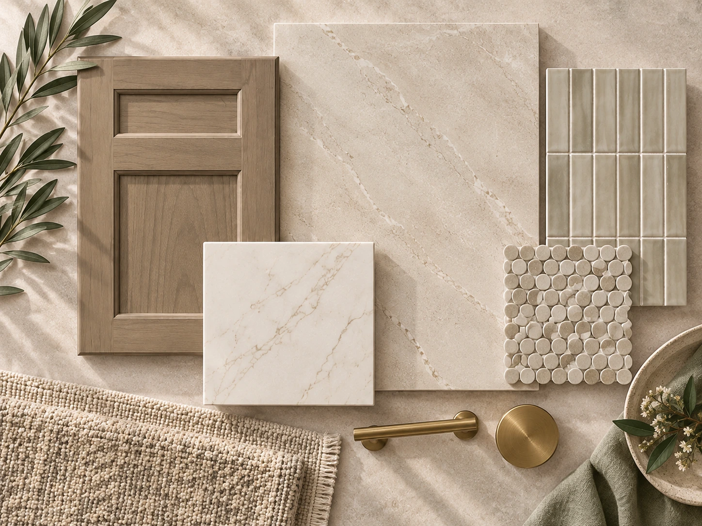
Your anchor could be a large-format floor tile, a dramatic shower wall, a quartzite countertop, a painted vanity color or a wood cabinet finish. Once that material is established, every other sample has a job: support it, balance it or provide controlled contrast.
For example, if the countertop has expressive veining, you may not need a heavily patterned floor and a decorative shower wall. If a sage vanity is the main color moment, quieter stone-look tile can give that cabinetry room to stand out.
This is one of the simplest ways to keep a bathroom from becoming visually crowded.
3. Read the Undertones Before You Read the Color Name
Two materials can both be described as “white” and still fight each other.
One white may lean creamy or yellow, another blue-gray, and another almost neutral. Beige can lean pink, gold, gray or green. The same is true of natural stone, porcelain, paint and cabinet finishes.
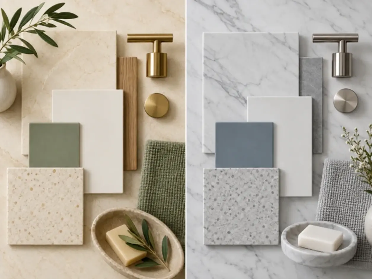
Place samples directly beside each other instead of evaluating them separately. Look for the quiet color beneath the obvious color. If the floor has a warm gold vein, a slightly warm countertop often feels more intentional than a stark blue-white surface. If the shower tile is cool gray, a very yellow cream beside it may make both finishes look less attractive.
The goal is not to make every undertone identical. It is to understand when you are creating harmony and when you are creating deliberate contrast.
4. Build a Hierarchy: Foundation, Supporting Materials and Accent
A cohesive bathroom is easier to design when every finish is not competing for equal attention.
Think of the palette in three levels:
- Foundation materials: the largest surfaces, such as the main bathroom floor and major wall tile.
- Supporting materials: vanity cabinetry, countertop and quieter secondary tile.
- Accent materials: a shower niche detail, decorative mosaic, stronger paint color or metal finish.
This hierarchy prevents a common mistake: choosing a “favorite” floor, a “favorite” countertop, a “favorite” accent tile and a “favorite” cabinet color that were never meant to live in the same room.
5. Coordinate the Bathroom Floor and Shower — Do Not Treat Them as the Same Problem
The main bathroom floor and the shower floor are connected visually, but they have different technical demands.
Large-format tile can create a quieter look across the main floor. NKBA’s 2026 research found strong expectations for large-format bath flooring and reduced grout lines, alongside a high priority on durability and practical maintenance.
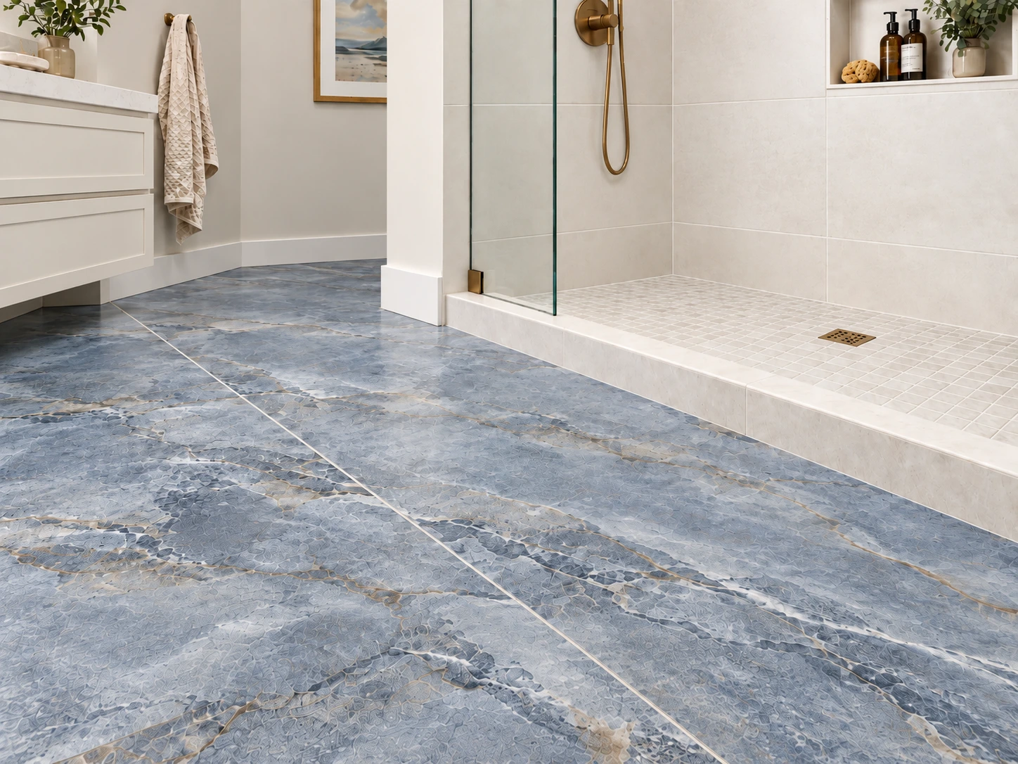
Inside the shower, however, material suitability depends on the complete installation: drainage, surface structure, tile size, grout joints, expected contaminants and barefoot use. The Tile Council of North America notes that DCOF alone should not be used as the sole predictor of slip risk, and ANSI A326.3 specifically treats shower-floor suitability as a combination of factors rather than one universal number.
Design-wise, the two surfaces do not need to match. A large warm-white porcelain floor can transition beautifully into a smaller mosaic that repeats the same color family. The result feels connected without pretending the two surfaces have the same job.
6. Pair the Vanity and Countertop as One Composition
Cabinetry and countertop should be tested together, not selected weeks apart.
If the vanity is painted, the countertop should either reinforce its temperature or intentionally contrast with it. If the vanity is natural wood, pay attention to whether the stone veining feels warm, cool or neutral against the wood grain.
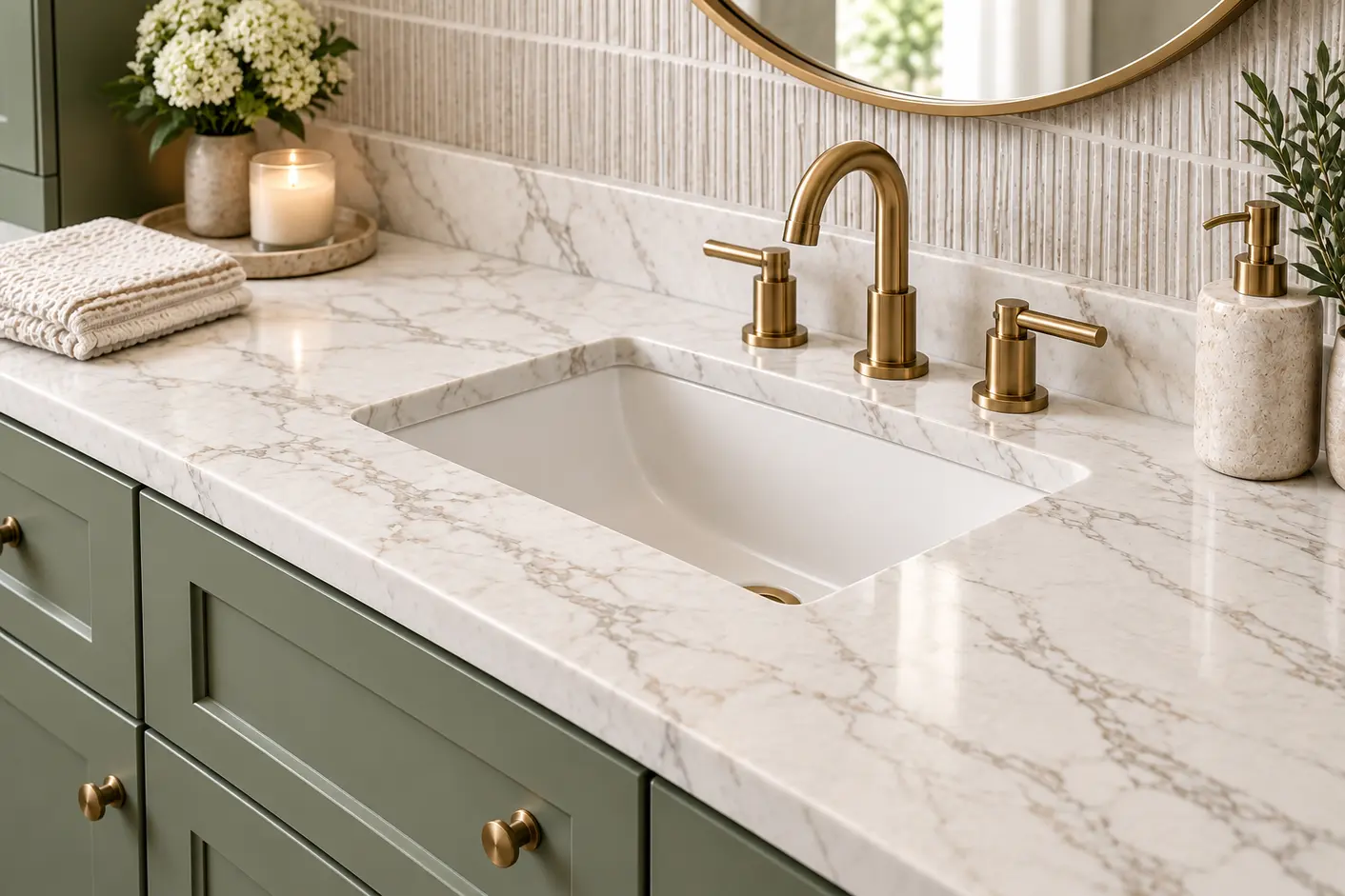
Houzz’s 2025 bathroom research found wood tones leading vanity colors among renovating homeowners, while white remained the dominant countertop color. Engineered quartz was the most selected countertop material in the study, followed by quartzite, granite and marble.
Those numbers do not mean every bathroom should use wood and white. They do show why this pairing works so often: a visually grounded cabinet finish below a lighter horizontal surface creates clear hierarchy and gives the countertop room to reflect light.
7. Control Pattern Scale and Movement
Pattern is not only about whether a tile is “busy.” Scale matters just as much.
A bathroom with broad marble-like veining on the floor, fine veining on the countertop and a tiny patterned mosaic can work because each pattern operates at a different scale. Three materials with equally strong, similarly sized movement are much more likely to compete.
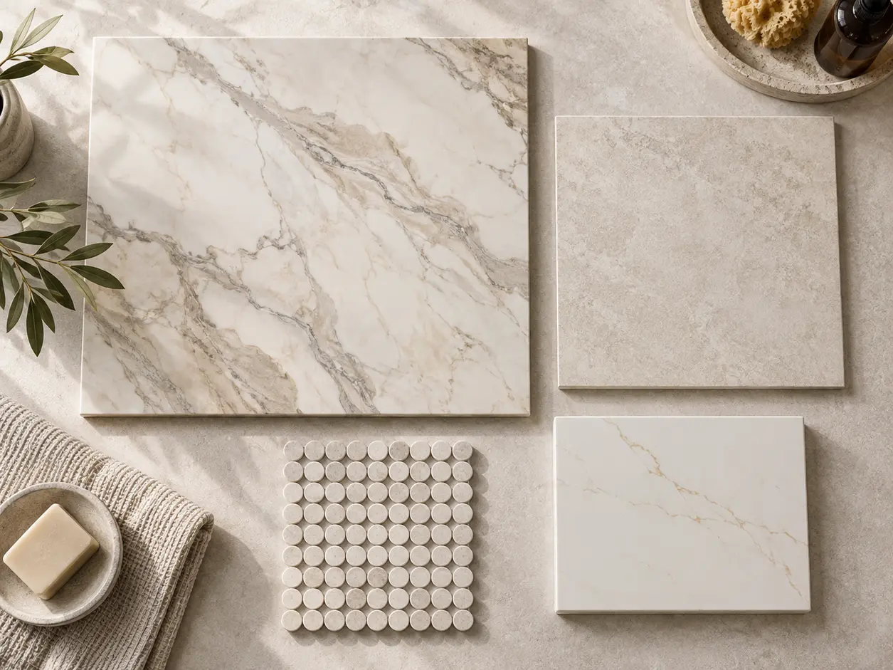
When using a dramatic stone or stone-look surface, give it visual breathing room. Repeat one of its quieter colors elsewhere instead of introducing another unrelated pattern.
Textured and patterned tile is gaining prominence in current bath design, according to NKBA, but that does not require using pattern everywhere. One controlled feature is often more memorable than four competing ones.
8. Use Texture and Sheen to Add Depth Without Adding More Color
A bathroom can be almost monochromatic and still feel layered when the surfaces respond to light differently.
Try combining a matte stone-look floor with a softly glazed shower tile, a smooth countertop and a wood or painted vanity. This creates depth through finish rather than relying on additional colors.
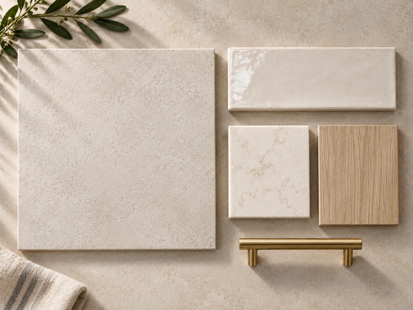
Metal finish matters here too. NKBA’s 2026 report found matte, brushed and satin faucet finishes receiving more support than polished finishes among surveyed professionals. A brushed metal usually reads softer beside stone and wood than a very reflective finish, though polished metal can be beautiful when a more formal result is intended.
9. Choose the Metal Finish After the Main Palette Is Working
Faucets and hardware should complete the palette, not rescue it.
Once the tile, cabinet and countertop are working together, place the metal finish beside them. Brushed brass can warm blue, green, cream and natural wood. Nickel and chrome can sharpen cooler stone palettes. Matte black can create strong contrast, but it should repeat somewhere intentionally rather than appearing as one isolated dark element.
You do not have to make every metal identical. If you mix finishes, give one finish the dominant role and use the second as a controlled accent.
10. Test the Palette in the Light the Bathroom Actually Has
Showroom lighting is useful for comparing materials, but it is not the same as the light in your home.
Take the final samples into the bathroom whenever possible. View them in morning daylight, afternoon light and with the fixtures you expect to use at night. A warm cabinet color can become grayer in cool northern light. White tile can become creamy under a warm bulb. Reflective finishes may look much brighter beside a window than they did under showroom lighting.
Lighting itself is a major part of current bathroom planning. NKBA’s 2026 research identified lighting quality as a top bath-design consideration and strongly supported layered lighting, including task lighting.
That is why material selection and lighting should not be treated as completely separate decisions.
11. Create a Physical Sample Board Before You Order
Once the palette is close, bring the real samples together at the same time.
Your board should include the main floor, shower wall, shower floor, vanity finish, countertop, backsplash or accent tile, and at least one sample of the metal finish. If the bathroom connects directly to a bedroom or hallway, add a sample or photograph of the adjoining flooring too.
Then ask five questions:
- Which material is the focal point?
- Do the undertones support one another?
- Are too many materials patterned at the same scale?
- Does the palette have enough contrast to avoid looking flat?
- Does anything look as though it belongs to a different bathroom?
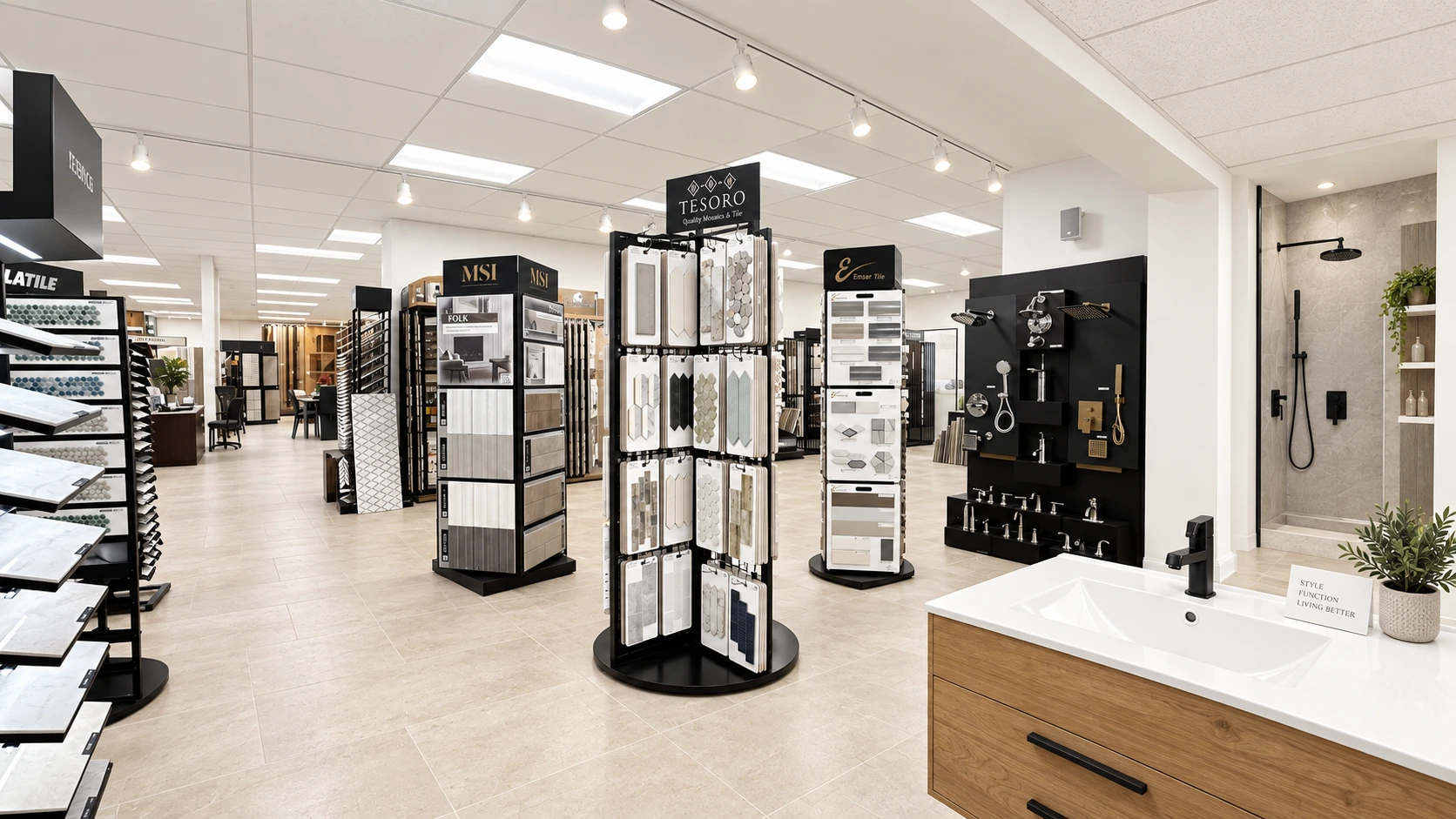
At Karpet King Design Center, this is one of the biggest advantages of working with the materials in one showroom: tile, cabinetry and countertops can be placed together before the order is finalized rather than being chosen in isolation.
12. Current Bathroom Trends Worth Knowing — Without Designing Around Trends Alone
Current data points in a clear direction: bathrooms are becoming warmer, more natural and more personal.
NKBA’s 2026 Bath Trends Report found very strong support for light neutrals, sage and olive, timeless and organic styles, large-format flooring, wood-faced vanities and lower-sheen metal finishes. Houzz’s 2025 study also found wood tones leading upgraded vanity colors, white leading countertop colors and natural stone remaining important alongside engineered quartz.
That does not mean your bathroom needs to look beige, green or wood-toned. The useful lesson is broader: homeowners and designers are moving toward materials that feel calmer, more tactile and easier to live with over time.
Use trends as a reference point, not as the palette itself.
13. Five Bathroom Palette Mistakes to Avoid
Choosing each finish separately: A material can look beautiful alone and still be wrong beside the rest of the room.
Using too many statement surfaces: If the floor, shower, countertop and backsplash all demand attention, nothing becomes the focal point.
Ignoring undertones: Warm and cool neutrals can clash even when they have the same color name.
Choosing from small online images only: Scale, texture, sheen and true color are difficult to judge accurately on a screen.
Waiting until the end to think about lighting and hardware: Both change the way the completed palette is perceived.
14. A Simple Bathroom Material Palette Checklist
- Define the mood and overall color temperature.
- Choose one anchor material.
- Select the main bathroom floor.
- Coordinate the shower wall and shower-floor materials.
- Pair the vanity finish and countertop together.
- Add backsplash or accent tile only if the composition needs it.
- Select the dominant metal finish.
- Test all samples together under the bathroom’s real lighting.
- Photograph the final sample board before ordering so you have a reference during installation.
The Best Bathroom Palette Looks Collected — Not Matched
The most successful bathroom color and material palette is rarely the one where every surface matches. It is the one where each material has a role.
Let one or two finishes lead. Repeat undertones intentionally. Vary pattern scale. Use texture to create depth. Test everything together before ordering.
When the floor, shower, vanity, countertop and hardware are considered as one composition, the room feels designed rather than assembled.
Planning a Bathroom in Rockville, Maryland?
At Karpet King Design Center, you can compare bathroom tile, cabinetry, countertops and coordinating finishes side by side in our Rockville showroom.
Bring your inspiration photos, paint colors, room measurements or existing flooring samples, and our team can help you narrow the palette before you make final selections.
Bathroom Color & Material Palette FAQs
