
How to Use Accent Tile Without Making the Space Look Too Busy
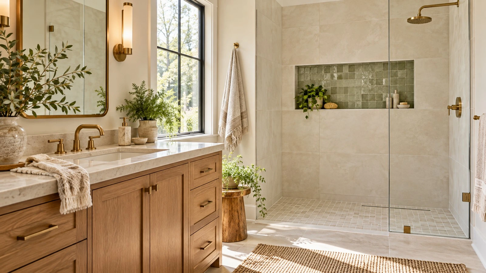
Accent tile is an easy way to bring colour, texture, and personality into a kitchen or bathroom. The key is giving it a clear role. When one tile surface becomes the focal point and the surrounding materials support it, the room feels designed rather than crowded.
You do not have to avoid pattern or colour to create a calm space. Choose where you want the eye to land, then use scale, colour, grout, and quieter surfaces to help the rest of the room feel connected.
Start With One Focal Point
Before choosing tile, decide what you want people to notice first. It might be a colourful backsplash behind the range, a patterned shower niche, a feature wall behind a vanity, or a decorative floor in a powder room. Let that area carry most of the visual interest.
If the countertop has strong veining, the cabinets have a noticeable finish, or the floor already has a pattern, select a simpler accent tile. If the larger surfaces are quiet, a more decorative tile can take the lead. A useful rule is to choose one statement surface for each view of the room, then let the other finishes support it.
Use Color to Connect the Accent to the Room
Accent tile does not need to match every material exactly. It should share at least one relationship with the rest of the palette: a similar undertone, a repeated colour, a natural material, or a finish that feels consistent with the room.
For example, sage green tile can connect to a painted vanity or a small accessory. A warm ivory patterned tile can relate to a cream countertop and light oak cabinetry. A blue accent can feel intentional when the surrounding stone has soft grey or blue notes. Bring samples together and view them in the room’s lighting before making a final selection.
For a fuller material plan, see our bathroom colour and material palette guide and compare the tile beside your cabinet, countertop, flooring, and paint samples.
Mix Tile Patterns by Varying Their Scale
When you combine tiles, vary their scale so each one has room to read. A large-format stone-look field tile can sit comfortably beside a small mosaic in a niche. A simple stacked wall tile can balance a patterned floor. A handmade-look backsplash can bring texture without adding a second competing motif.
Try to vary one or two qualities at a time. You might combine a plain tile with a patterned tile, or a smooth tile with a textured one. Pairing a bold pattern, several contrasting colours, multiple tile shapes, and dramatic grout in the same sightline can make the space feel unsettled.
If you want a patterned accent, keep the surrounding tile more restrained. If you want two patterns, connect them through a shared colour and give them different scales. For example, a small geometric niche can work with larger, quiet wall tile in a related tone.
Choose the Right Place for Accent Tile
Kitchen backsplash
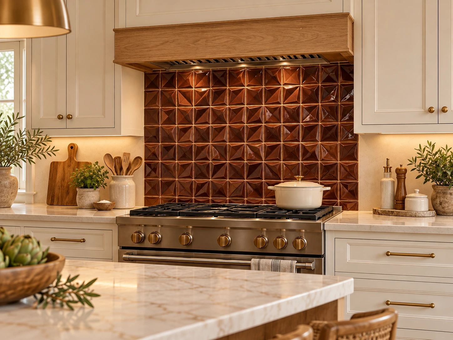
A backsplash is a natural place to use accent tile because it creates a defined surface between the counter and cabinets. Consider a feature behind the range, a full-height backsplash, or a small framed section. Keep the countertop and cabinet fronts simpler when the backsplash has a strong pattern. Browse our kitchen backsplash tile options for materials and styles that can work as a focal point.
Shower niche or feature strip
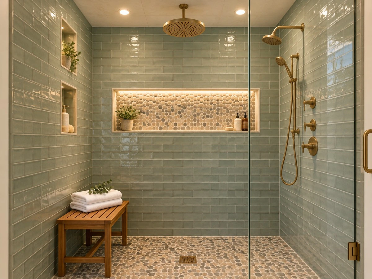
A niche gives a decorative tile a contained area, so even a colourful mosaic can feel intentional. A vertical accent can draw the eye upward, while a horizontal band can emphasize the width of a shower. Use the same accent in one or two places only, such as a niche and a vanity detail, rather than repeating it on every wall.
For wet areas, confirm that the exact tile and finish are appropriate for the specific surface. A decorative wall tile is not automatically suitable for a shower floor. Check product guidance and coordinate the complete installation with your tile professional.
Powder room or vanity wall
A small powder room can handle a bolder pattern because the tile is seen in a compact area. Behind a vanity, a tile accent can create a focal point without needing to cover every wall. If the accent is colourful, keep the mirror, lighting, and countertop visually simple.
Use Grout as Part of the Design
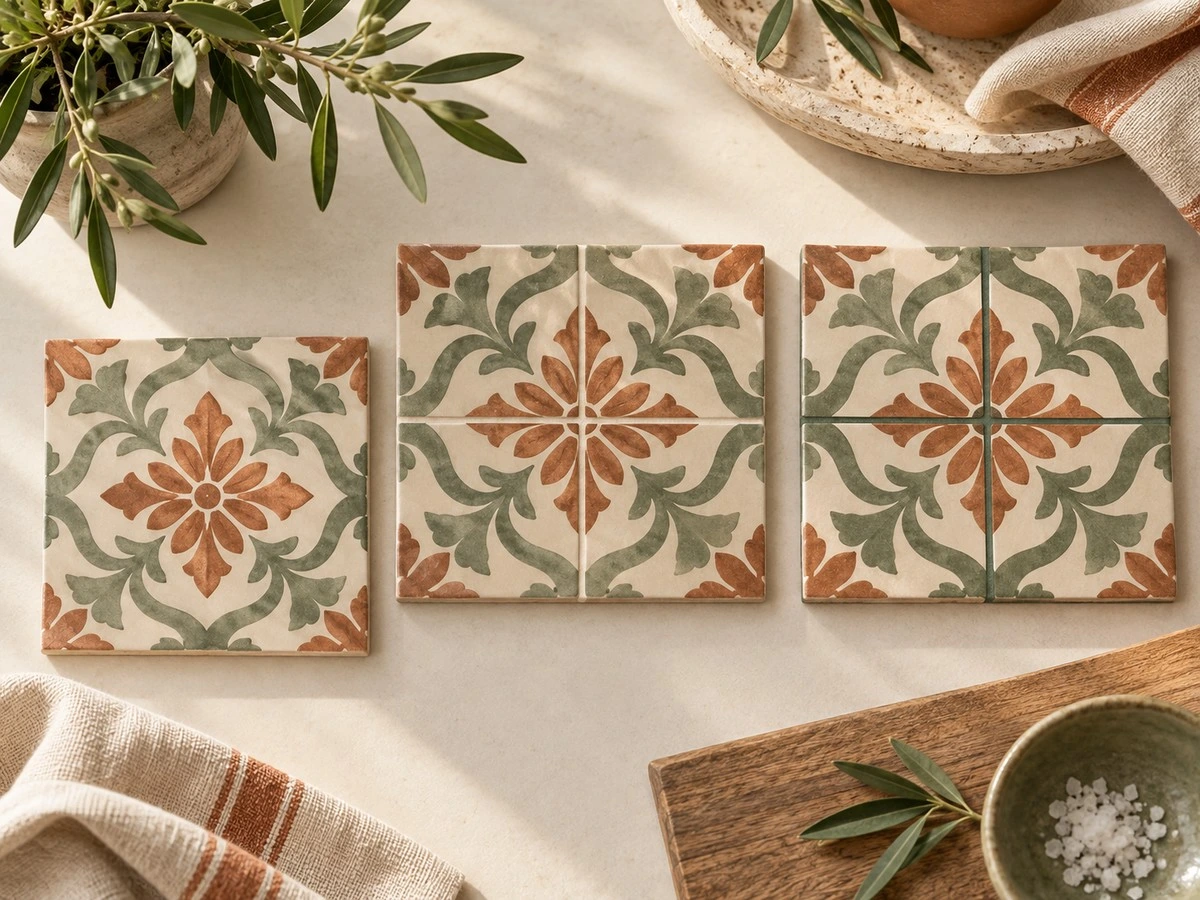
Grout changes how a tile pattern reads. A grout colour close to the tile blends the joints and softens the overall effect. A contrasting grout makes each tile shape and line more visible, which can add graphic impact but can also make a small or busy pattern feel even busier.
Before committing, compare grout samples beside the actual tile. View the combination from across the room as well as up close. In a mosaic or small-format accent, matching or gently coordinating grout can keep the surface from looking too fragmented.
Balance Pattern With Texture and Finish
A room can have visual interest without using several strong patterns. A handmade-look glaze, a fluted surface, a subtle stone variation, or a matte-versus-gloss contrast can add depth while keeping the colour palette quiet. This is especially useful when the cabinetry or countertop already has movement.
Think about the whole composition: tile, countertop, cabinets, hardware, lighting, and flooring. If several surfaces have visible movement, choose a calmer accent. If the room is mostly solid colours, tile can add the detail that makes it feel personal.
For bathroom-specific layouts and material choices, explore our bathroom design guide.
Three Accent Tile Combinations That Feel Balanced
Warm and natural
Pair a handmade-look ivory backsplash with warm oak cabinetry and a pale quartz countertop. Let the tile’s surface variation provide the detail, and keep the grout close to the tile colour.
Colourful but calm
Use a muted sage or dusty blue accent in a shower niche or behind a vanity. Repeat that colour in one small accessory, then keep the larger wall tile and countertop in warm neutral tones.
Pattern with a clear boundary
Use a patterned tile on a powder-room floor or in a framed backsplash section. Give it a clean edge and surround it with simpler wall tile or cabinetry so the pattern looks intentional rather than scattered.
Common Accent Tile Mistakes to Avoid
- Using several bold tile patterns in the same sightline without a shared colour or scale.
- Repeating a feature tile on every wall, niche, border, and backsplash.
- Choosing tile from a small online image without reviewing a sample in the room.
- Using high-contrast grout when the tile already has many small pieces or strong pattern.
- Choosing a tile for a wet floor based only on appearance instead of product application guidance.
Plan the Tile Before You Order
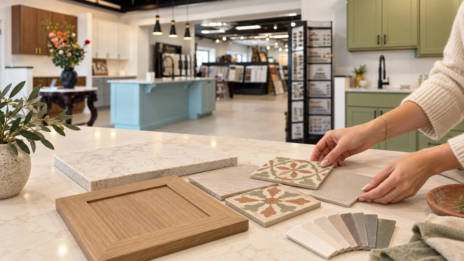
Lay the samples together in the order they will appear: floor, main wall tile, accent tile, countertop, cabinetry, and grout. Check the palette in daylight and under the room’s evening lighting. If possible, make a small sample board or mock-up so you can judge the accent from the doorway, not only at arm’s length.
Also plan where the accent begins and ends, how it meets corners and edges, and whether trim or a clean tile termination is needed. Your installer can confirm the layout, substrate, product ratings, and installation details before the order is placed.
At Karpet King Design Center in Rockville, you can compare tile samples alongside countertop and cabinet finishes. Bring your project samples and contact our team to plan a showroom visit for help narrowing the options.
Frequently Asked Questions
Final Call to Action
Ready to choose accent tile for your kitchen or bathroom? Visit Karpet King Design Center in Rockville to compare tile, grout, countertop, and cabinet samples together. Contact Karpet King Design Center to plan your visit.
