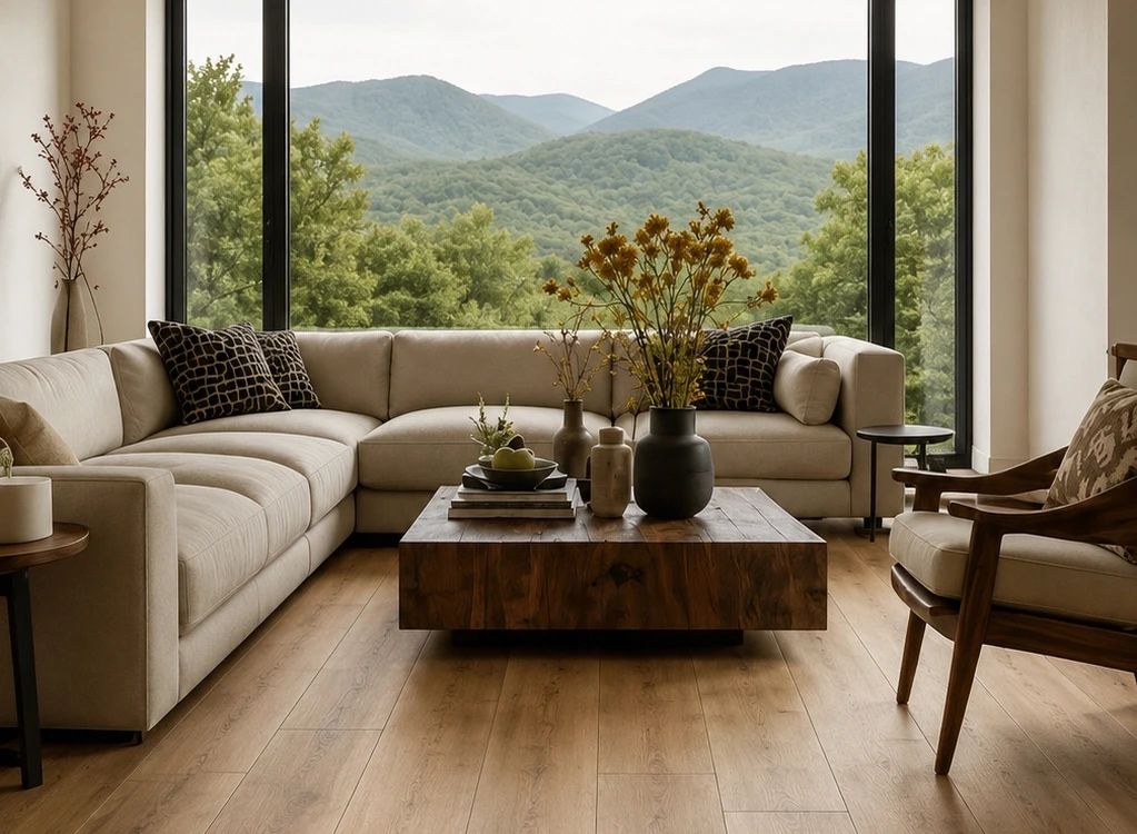
How Flooring Shapes Interior Design: Color, Style and Flow
Understanding how flooring shapes interior design begins with recognizing the floor as one of the largest uninterrupted surfaces in a home. Flooring is often treated as a practical decision: hardwood or carpet, light or dark, durable or delicate. In a well-planned interior, however, it does much more. Its color, undertone, texture, sheen, plank width and installation pattern influence how every wall color, cabinet finish, countertop, rug and piece of furniture is perceived.
A beautiful room rarely comes from choosing each finish separately. It comes from building a coordinated material story. If you are still comparing the basic performance of different surfaces, begin with our flooring and interior design overview. This guide goes one step further and explains how to use flooring as the visual foundation of a complete interior.
1. Start With the Flooring, Not the Paint Color
Paint is flexible. Flooring is not. Wall color can be adjusted quickly and relatively affordably, while flooring is a major investment that is expected to remain in place for years. For a renovation, it usually makes sense to choose the flooring first, then coordinate the fixed finishes, cabinetry, countertops and tile—before selecting paint, textiles and accessories.
This order is especially important in an open-concept home. A flooring sample may appear quiet on a small board, yet cover hundreds of square feet once installed. The color will reflect onto walls and cabinetry and can make a room feel warmer, cooler, brighter, heavier or more relaxed.
A useful selection order is:
- Flooring and other large fixed surfaces
- Cabinetry and countertops
- Backsplash or wall tile
- Paint colors
- Area rugs, upholstery and window treatments
- Lighting, hardware and accessories
2. Read the Undertone Before You Match the Color
Two materials can both be described as beige, brown or gray and still clash. The reason is undertone: the subtle warm, cool, green, pink, yellow or red cast beneath the main color. A floor with golden undertones may look beautiful beside creamy white cabinetry but overly yellow beside a stark blue-white. A taupe floor with a violet cast may fight with a countertop that leans green.
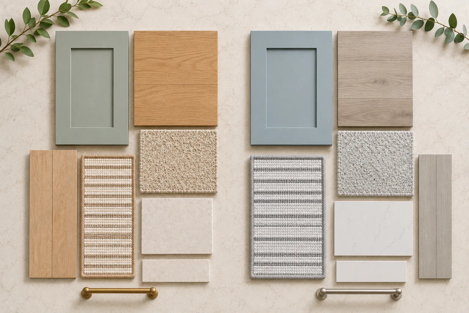
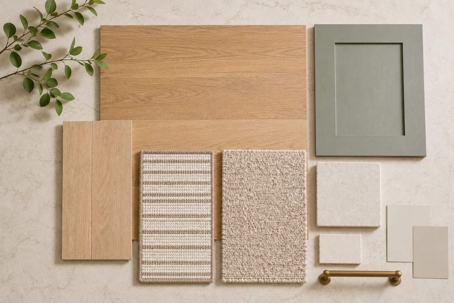
Do not try to make every surface identical. Instead, repeat one or two related undertones and vary the value—the lightness or darkness, and texture. A medium warm-oak floor, an ivory wall, a mushroom cabinet and a warm white quartz can feel layered because they share a family resemblance without matching exactly.
For a warmer palette, our guide to creating a warm modern interior without making it feel dark explains how natural wood tones, soft neutrals and controlled contrast can work together.
3. Let Flooring Establish the Interior Style
One of the clearest examples of how flooring shapes interior design is the way it establishes the design vocabulary. Flooring does not have to dictate one strict style, but it sets the visual direction. A pale matte oak with subtle grain supports Scandinavian, Japandi and organic-modern rooms. A medium brown wood with natural variation feels welcoming in transitional interiors. Deep walnut or a classic narrow plank adds formality. Stone-look tile can create a clean contemporary foundation, while patterned carpet can make stairs, libraries and bedrooms feel tailored and collected.
The finish matters as much as the color. Matte and low-luster surfaces feel natural and relaxed. High sheen reflects more light and reads as formal, but it also makes dust and surface marks more visible. Strong knots, color variation and wire-brushed texture add character; a quieter grain creates a more minimal backdrop.
Explore our hardwood flooring options and compare species, plank proportions, textures and finishes in person before deciding how much visual movement your room needs.
4. Use Scale and Pattern to Change the Room
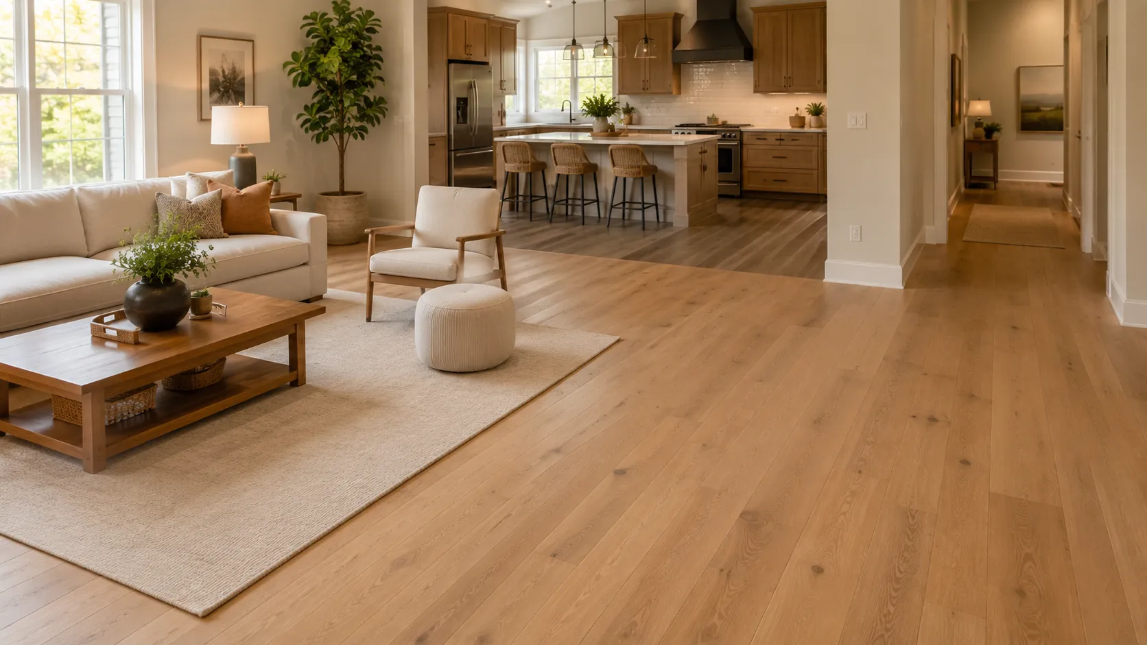
The size and direction of flooring elements affect the way a room is read. Wide planks create fewer seams and can make an open space feel calmer and more expansive. Narrow planks introduce more rhythm and often feel traditional. Large-format tile reduces the number of grout lines, while smaller tile brings pattern and detail.

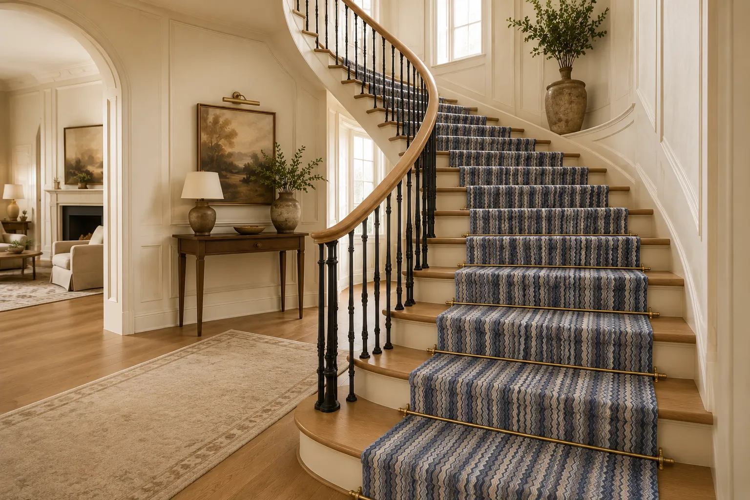
Direction matters too. Straight-laid planks usually create the cleanest flow and can visually lengthen a room. Herringbone or chevron adds movement and formality, so it works best when surrounding finishes are quieter. A patterned carpet or stair runner can become an intentional focal point, but its repeat should be viewed at full scale, not judged from a tiny cutting.
Designer tip: align the dominant flooring direction with the longest sightline or the main flow of movement whenever the architecture allows. In connected rooms, avoid changing direction without a clear architectural reason.
5. Coordinate Flooring With Cabinets and Countertops
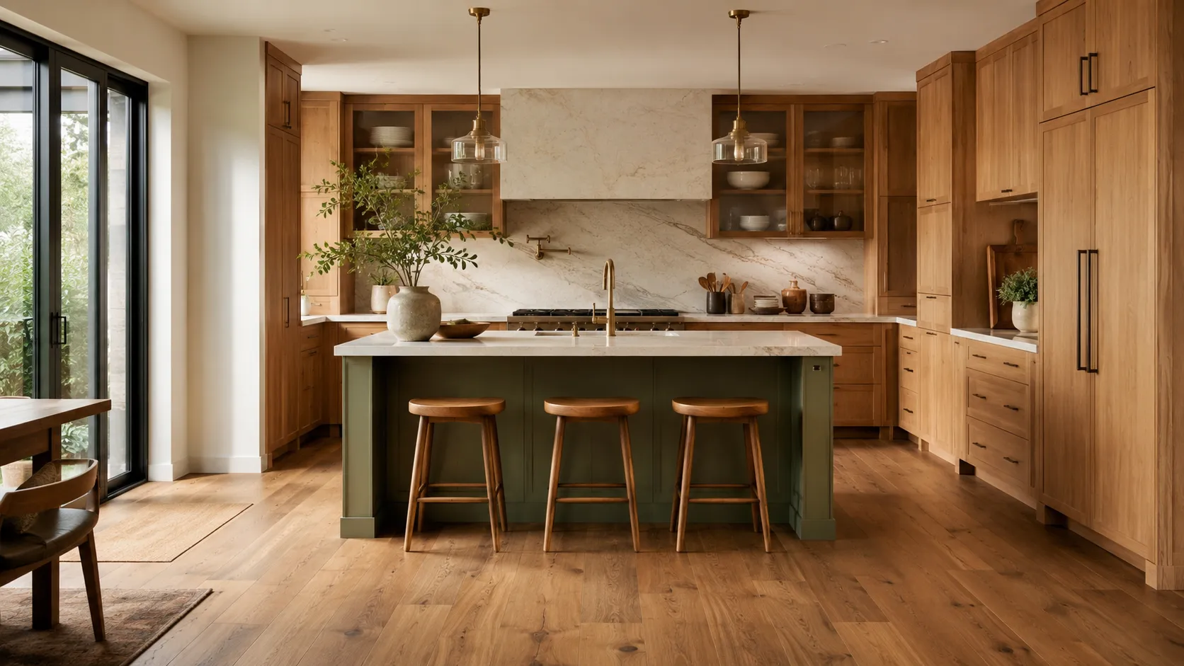
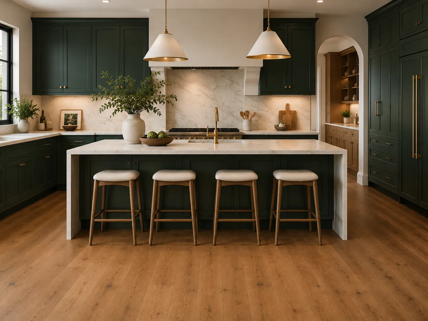
In a kitchen, the floor, cabinetry and countertop are the three largest visual surfaces. If all three have strong grain, contrast or veining, the room can feel busy. A more balanced approach is to choose one lead material and let the others support it.
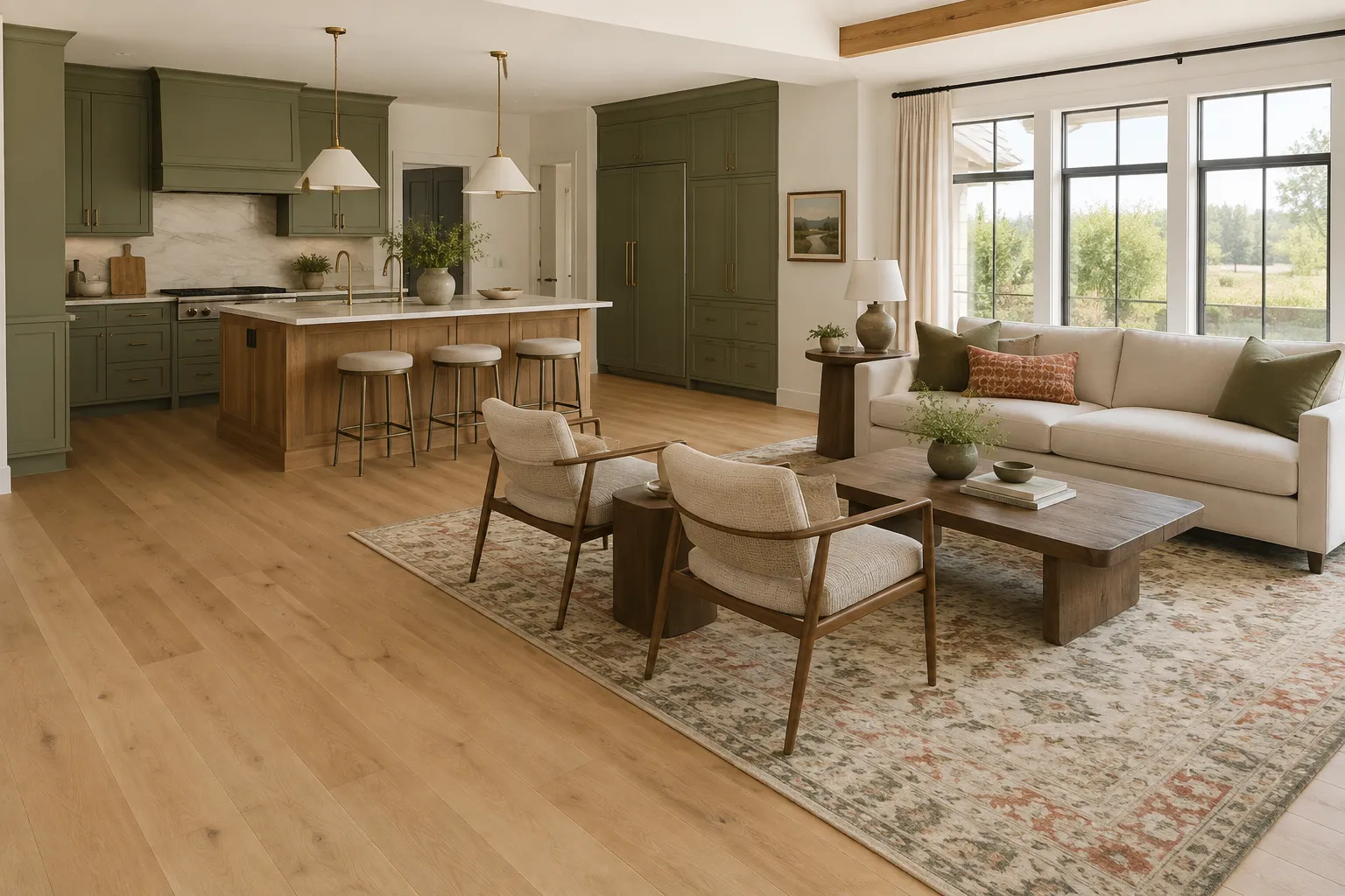
For example, highly figured stone may pair best with a quieter floor and simple cabinet finish. Character-rich wood flooring can be balanced with painted cabinetry and restrained countertop movement. When both floors and cabinets are wood, aim for contrast rather than a near match: combine light with medium, or warm with slightly deeper neutral tones, while keeping the undertones related.
Compare cabinet finishes beside flooring samples in the same light. Then add the countertop sample and view the group vertically as well as flat on a table; materials can look different in their installed orientation.
6. Balance Hard Flooring With Area Rugs and Textiles
Hard flooring gives a room continuity, but textiles make it feel finished. An area rug introduces softness, sound absorption, color and a sense of place. In an open living area, it can define the seating zone without interrupting the flooring beneath it.
The rug should relate to the floor without disappearing into it. On a warm medium wood, try an ivory, rust, olive, muted blue or patterned rug with enough contrast to create a clear boundary. On pale flooring, a deeper or more textured rug adds weight. If the floor already contains strong color variation, choose a rug with a calmer field; if the floor is quiet, the rug can carry more pattern.
Browse area rugs alongside your flooring sample so you can judge contrast, pile, pattern scale and edge detail together.
7. Create Flow Between Connected Rooms
A cohesive home does not require the same flooring in every room. It requires intentional transitions. Use continuous flooring across the largest connected areas when function allows, then change material where there is a clear reason, such as softness in a bedroom, water resistance in a laundry room or traction on a stair.
When materials change, connect them through at least one shared design element: undertone, color family, texture or pattern scale. A warm-oak hardwood can transition to a taupe carpet, a limestone-look tile or a wood-look LVP with a related neutral base. The materials are different, but the palette still feels planned.
Transitions should also occur at logical architectural boundaries, such as a doorway, threshold or change in level. Avoid small isolated patches of flooring or too many materials visible from one viewpoint; both can make the home feel fragmented.
For moisture-prone or high-use areas, luxury vinyl flooring can provide a wood-inspired visual connection while offering easier everyday care. In bedrooms, family rooms and stairs, carpet can add comfort and acoustic softness without breaking the overall color story.
8. Test the Full Palette in the Actual Light
Showroom lighting is useful for comparison, but the final decision should account for the home’s daylight direction, artificial lighting and surrounding colors. North-facing rooms often make colors appear cooler; warm bulbs can intensify yellow or red undertones. A floor can also look different in the morning, afternoon and evening.
Bring the core samples together: flooring, cabinet door, countertop, tile, paint and one or two textiles. View them on the floor and, when relevant, hold cabinet and wall samples vertically. Move the group between rooms. Look at the materials from several feet away as well as close up. This simple step helps reveal undertone conflicts, insufficient contrast and patterns that become too active at scale.
9. How Flooring Shapes Interior Design: Common Mistakes
- Choosing paint first. Paint is easier to adjust than a floor, cabinet or stone surface.
- Trying to match every wood exactly. Near matches often look accidental; controlled contrast feels more intentional.
- Ignoring undertones. Materials with similar surface colors can still conflict beneath the surface.
- Using too many statement materials. Strong floor variation, dramatic stone, bold tile and patterned fabric need visual breathing room.
- Judging a product from one small sample. Natural variation, carpet repeats and large-format veining should be reviewed at a larger scale whenever possible.
- Forgetting transitions. The meeting point between materials is part of the design and should be planned early.
- Selecting for appearance alone. A cohesive room must also suit moisture, traffic, pets, maintenance and comfort needs.
10. Build a Material Palette Before You Order
A material palette is more useful than a collection of individual favorites. Start with the floor, then add the fixed surfaces and one or two supporting finishes. The goal is not for every sample to be exciting on its own; it is for the group to feel balanced.
|
Layer |
What to Evaluate |
Design Question |
|
Flooring |
Undertone, variation, sheen, scale |
Does it create the right foundation? |
|
Cabinetry |
Wood tone or paint color, door style |
Is there enough contrast from the floor? |
|
Countertop |
Base color, veining, movement |
Which material should lead visually? |
|
Tile |
Format, grout, texture, pattern |
Does it connect or introduce a new idea? |
|
Paint |
Light reflectance and undertone |
Does it support the fixed finishes? |
|
Textiles & rug |
Color, softness, pattern scale |
Does the room feel layered and comfortable? |
|
Metal & lighting |
Finish, temperature, contrast |
Do the final accents repeat the palette? |
Before ordering, photograph the palette in natural light and keep a record of exact product names, colors, finishes and lot information. This makes later selections—and communication with installers and trades—more reliable.
Bring the Whole Design Together in One Showroom
Understanding how flooring shapes interior design makes it easier to build a coordinated home, even when the project is completed in stages. Seeing flooring beside cabinetry, countertops, tile and rugs helps catch color conflicts early and creates a home that feels connected from room to room.
At Karpet King Design Center in Rockville, homeowners, designers and contractors can compare materials side by side and receive interior design guidance for flooring, kitchen and bath selections. Bring photos, measurements and any samples you already love; we can help turn them into a coordinated palette that fits the architecture, lifestyle and budget of your project.
Visit our showroom at 751 East Gude Drive, Rockville, MD 20850, call (301) 770-4110, email [email protected], or contact us online to plan your visit.
Frequently Asked Questions