How to Choose Kitchen Cabinet Colors That Will Still Look Beautiful in 10 Years
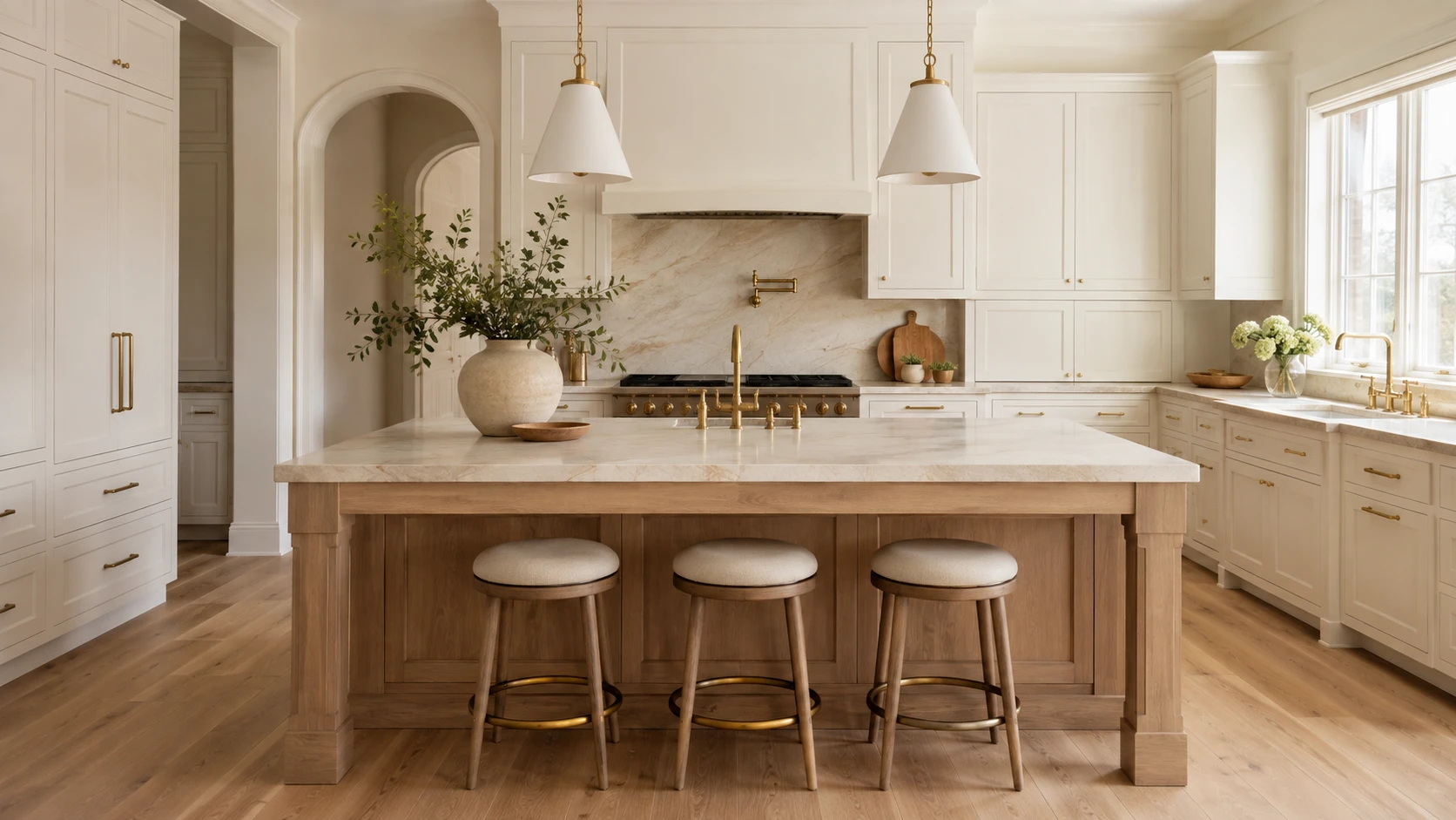
Choosing a kitchen cabinet color can feel more permanent than almost any other design decision. Wall paint, lighting, and accessories can be replaced relatively easily, but cabinetry covers a large portion of the room and represents a significant investment.
The goal is not simply to choose the safest color or copy the latest kitchen trend. The goal is to select a finish that works with your home’s architecture, natural light, flooring, countertops, and overall atmosphere—so the kitchen continues to feel balanced and intentional years from now.
Before choosing your kitchen cabinetry, use the following principles to create a palette that feels current today but remains adaptable for the future.
What Current Kitchen Research Tells Us
According to the 2026 Houzz Kitchen Trends Study, wood became the most selected cabinet finish among renovating homeowners, narrowly moving ahead of white. Medium and light wood tones accounted for most wood selections, while off-white remained an important choice. Green also moved slightly ahead of gray.
The 2026 NKBA Kitchen Trends Report similarly points toward neutrals, greens, blues, natural materials, and wood grain. It also shows that homeowners and designers are increasingly using stronger colors on islands, backsplashes, and decorative features instead of applying them to every surface.
These findings do not mean that one color is guaranteed to remain timeless. They show a broader movement toward warmth, natural texture, and colors that feel connected to the rest of the home.
1. Start With the Permanent Materials
Do not begin with a cabinet paint swatch. Begin with the elements that will be the most expensive or difficult to replace:
- Flooring
- Countertops
- Natural stone
- Backsplash
- Existing woodwork
- Adjacent-room finishes
- Large appliances that will remain
2. Understand Undertones
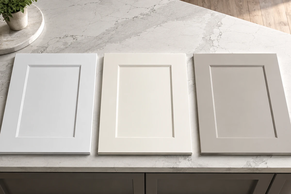
Two colors may both be called white, beige, gray, green, or blue but look completely different once installed. Common undertones include:
Yellow or cream
- Pink or red
- Green
- Blue
- Violet
- Brown
- Gray
3. Consider How You Want the Kitchen to Feel
Color psychology can be useful, but it should be treated as a guide rather than a strict formula.
A 2025 systematic review of 132 peer-reviewed studies found that people form recurring emotional associations with color. Lightness, saturation, and hue all influence those associations, but culture, personal experience, context, and surrounding materials also matter.
In a kitchen, these general impressions may help guide your selection:
Warm white and off-white
These colors can make a kitchen feel bright, gentle, and welcoming, especially when paired with warm flooring and natural materials.
Natural wood
Wood often creates a grounded, tactile, and organic atmosphere. The visible grain adds movement and character without requiring a strong painted color.
Muted green
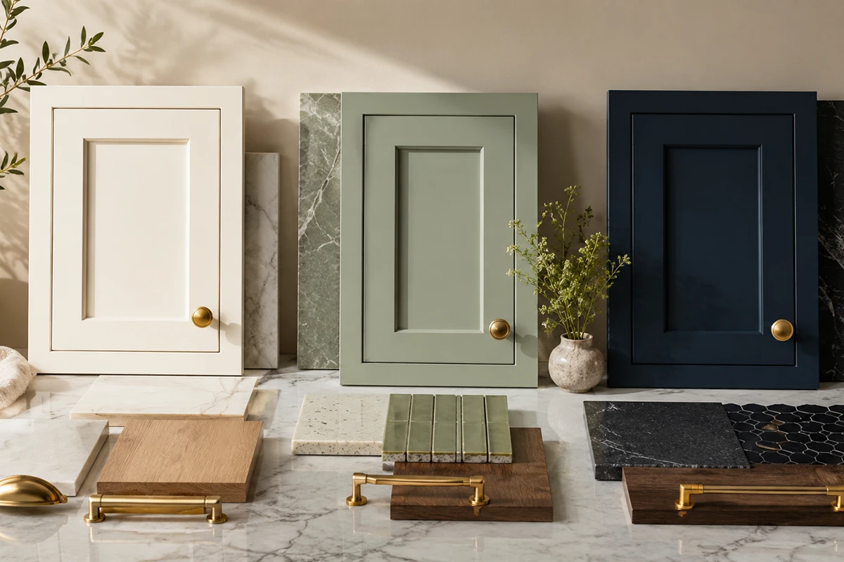
Sage, olive, and gray-green finishes can feel calm and connected to nature. A muted green usually adapts more easily than a highly saturated emerald or lime.
Blue and navy
Soft blue can feel relaxed and composed. Navy creates greater contrast, formality, and visual depth.
Taupe, mushroom, and greige
These shades can create a quiet, layered neutral palette without the sharpness of bright white or the coolness of traditional gray.
Burgundy and deep red
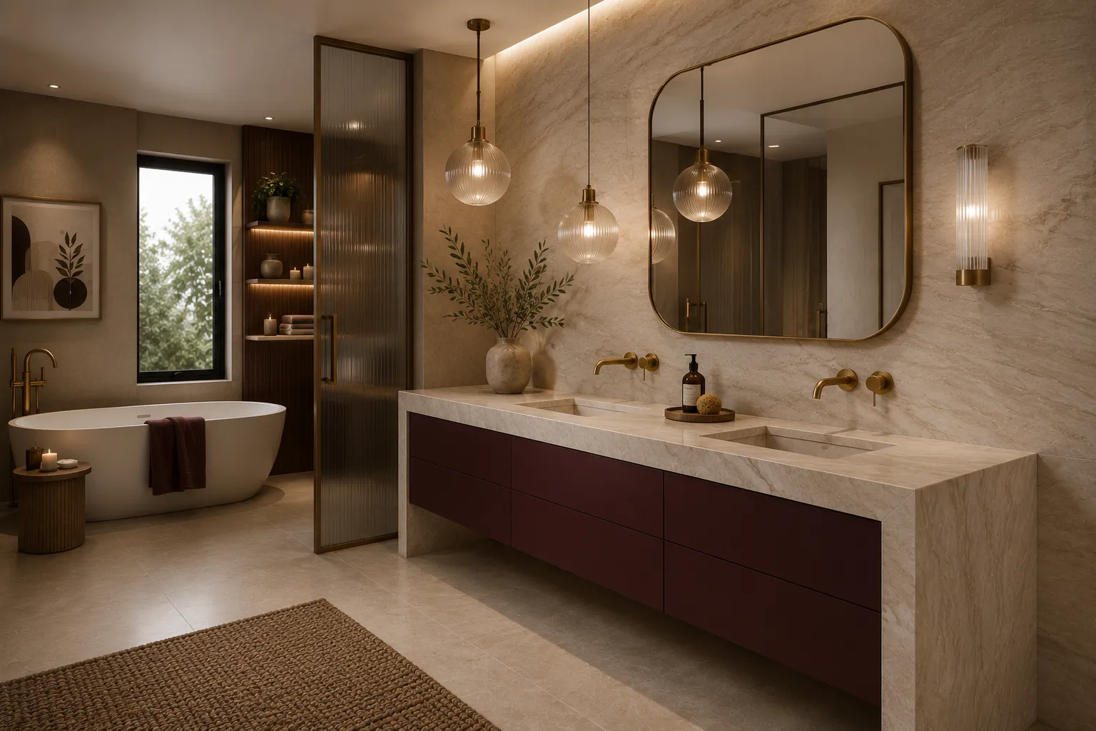
These colors feel warmer, richer, and more expressive. They may work best as a carefully coordinated statement rather than an automatic neutral.
Do not assume that every green will feel calming or every white will make a room feel larger. A bright, highly saturated green can feel energetic, while a gray-green sage may feel softer. The complete effect depends on lighting, surface area, saturation, and the materials around it.
Ask yourself:
How do I want this kitchen to feel during everyday life?
4. Choose a White That Works With the Home
White cabinetry can still be a long-lasting choice, but stark white is not always the most adaptable option.
Very bright or blue-white cabinetry may feel harsh in a room with:
-
- Warm wood flooring
- Creamy countertops
- Limited natural light
- Beige or warm-gray walls
- Brass or bronze finishes
Softer alternatives include:
-
- Warm white
- Creamy white
- Soft ivory
- Off-white
- Pale greige
- Light mushroom
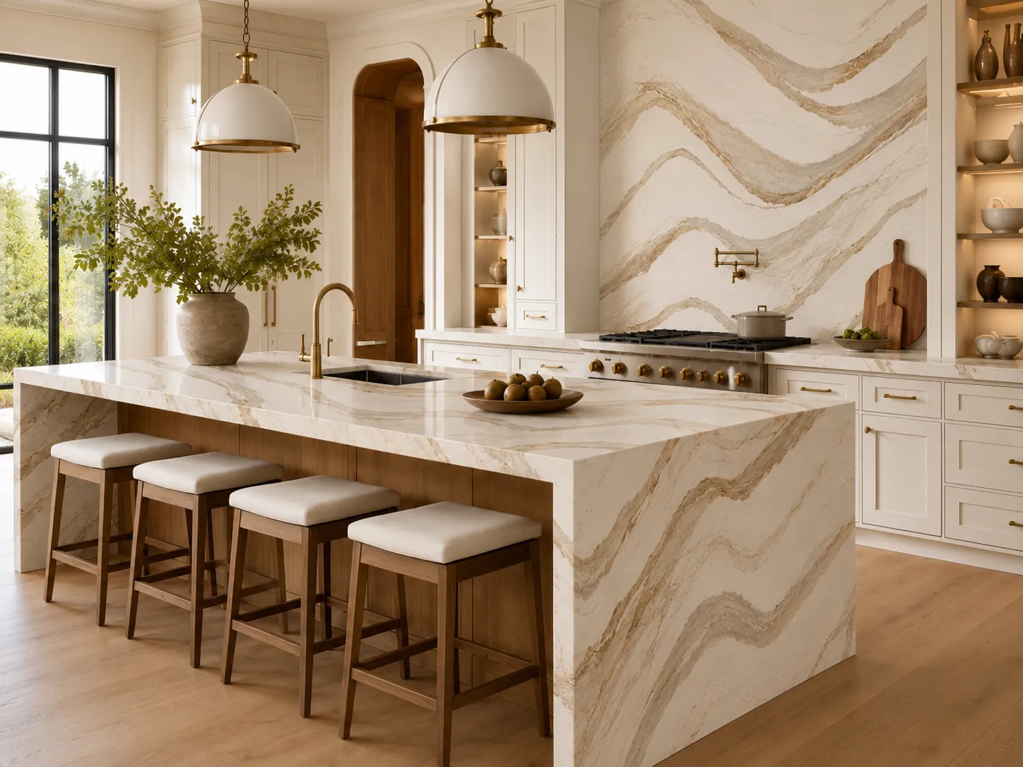
These finishes can keep the kitchen feeling bright while creating a softer relationship with wood, natural stone, and adjoining living spaces. Always compare the cabinet sample with the countertop. A cabinet may look warm white by itself but suddenly appear yellow, gray, or pink beside the chosen stone.
5. Treat Natural Wood as a Neutral
The final result depends on:
- Wood species
- Grain pattern
- Stain color
- Door profile
- Hardware
- Countertop
- Backsplash
- Overall architecture
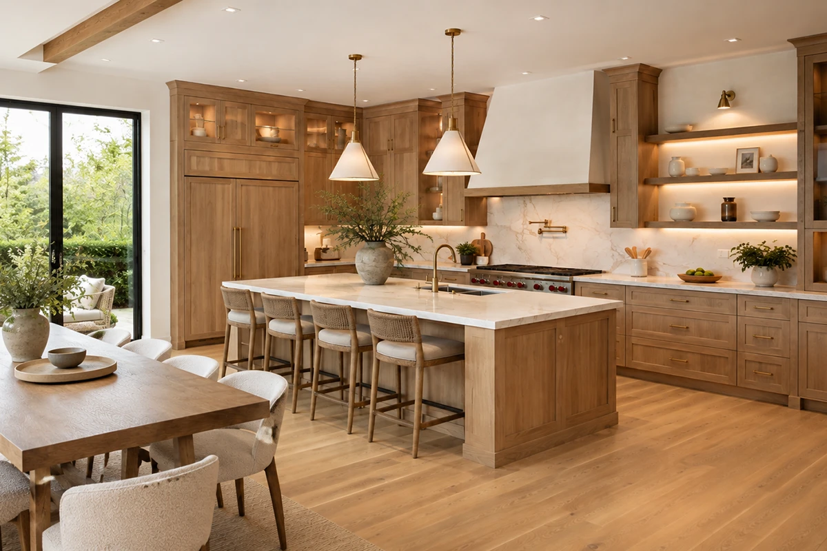
White oak, walnut, maple, and other wood finishes can work in modern, organic, transitional, and classic kitchens.
For a design that can adapt over time, consider:
- Natural or lightly stained wood
- Light or medium wood tones
- Low-sheen finishes
- Simple Shaker or flat-panel doors
- Stains that allow the grain to remain visible
The 2026 NKBA report identified wood grain as a growing cabinet direction and white oak as the leading wood species among surveyed professionals.
Avoid choosing an intense stain only because it is temporarily popular. A finish that respects the wood’s natural character is often easier to coordinate with future paint, hardware, and décor changes.
6. Choose Grounded Colors Instead of Extremely Saturated Ones
Colorful cabinets can age beautifully when the shade is connected to natural materials and the architecture of the home.
Potentially adaptable colors include:
- Muted sage
- Deep olive
- Soft blue-gray
- Navy
- Warm taupe
- Mushroom
- Deep burgundy
The difference is often in the saturation.
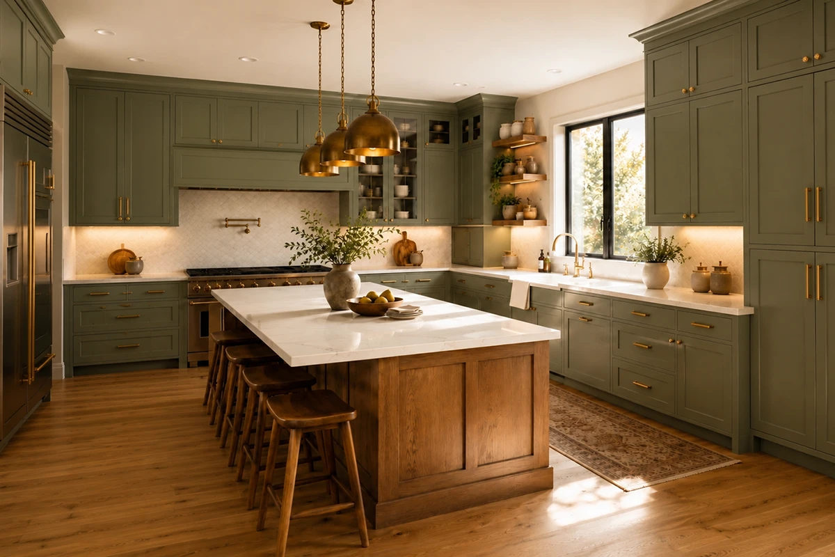
A gray-green sage may behave almost like a neutral. A bright, highly saturated green may dominate the entire room and limit future changes.
Before ordering colorful cabinetry, ask:
- Does it coordinate with the flooring?
- Does it appear in the countertop veining?
- Does it work in both daylight and artificial light?
- Can the hardware be changed later without disrupting the palette?
- Would I still choose it if it were not currently trending online?
7. Use a Contrasting Island Strategically
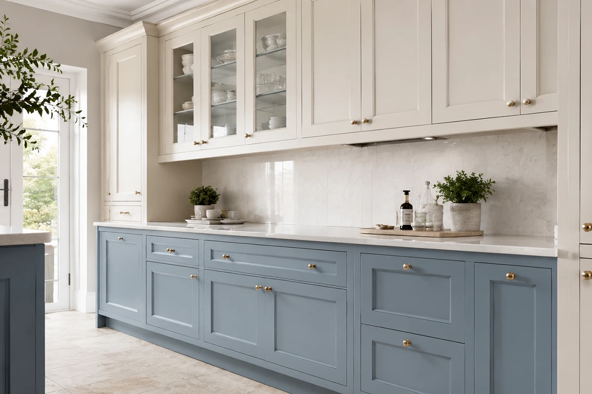
A two-tone kitchen can feel custom and layered, but the island should relate to another element in the room.
Successful combinations may include:
- Warm white cabinets with a natural oak island
- Navy cabinets with a warm white island
- Muted green cabinets with a light wood island
- Off-white cabinets with a taupe island
- Natural wood cabinets with a soft painted island
The contrasting color might connect with the floor, countertop veining, hardware, nearby furniture, or architectural details.
Current NKBA research suggests that islands are one of the leading locations for statement color, making them a practical way to introduce personality without applying a bold finish throughout the entire kitchen.
When developing a two-tone palette, treat the cabinets, island, flooring, countertops, and backsplash as one coordinated kitchen remodeling design, not as separate purchases.
8. Test Large Samples in the Actual Lighting
Cabinet colors can change dramatically throughout the day. A finish may appear:
- Darker in a north-facing room
- Warmer in afternoon sunlight
- Greener beside warm wood
- Bluer under cool LED bulbs
- Flatter in a room with limited daylight
- More intense across an entire wall than on a small sample
Whenever possible, review a full cabinet-door sample rather than a small paint chip.
Place it vertically, because cabinet doors will not be viewed flat on a table. Observe it in:
- Morning daylight
- Afternoon light
- Evening light
- Ceiling lighting
- Pendant lighting
- Under-cabinet lighting
Natural and task lighting are major considerations in current kitchen planning, so the cabinet finish should be evaluated under the lighting that will actually be used in the completed room.
During an interior design consultation, cabinet doors can be compared with stone, flooring, tile, paint, and hardware before the order is placed. Karpet King’s consultation service specifically includes color-palette development and coordination among these materials.
9. Think Beyond the Current Trend Cycle
Trends can provide inspiration, but they should not be the only reason behind a permanent design decision.
Ask yourself:
- Does this color suit the age and architecture of the home?
- Does it work with the permanent materials?
- Would I still like it if I stopped seeing it on social media?
- Can I refresh the kitchen later with different hardware or wall paint?
- Does the color support the atmosphere I want?
- Does it connect naturally with adjoining rooms?
A timeless kitchen does not have to be white, beige, or conservative. A navy, green, wood, or burgundy kitchen can remain beautiful when the color has a clear relationship with the rest of the design.
10. Consider the Material Beneath the Finish
The same color can appear different depending on whether it is applied to:
- Solid wood
- MDF
- Wood veneer
- Plywood
- Another engineered material
Painted MDF may create a very smooth, consistent surface. Painted solid wood may retain subtle grain and may show fine movement at the joints over time.
Stained cabinetry behaves differently because the wood species affects how the stain is absorbed. The same stain may look warmer, darker, or more varied on oak, maple, cherry, or walnut.
Common Cabinet-Color Mistakes
Choosing from a small swatch
A small sample cannot show how a color will feel across an entire wall of cabinetry. Request the largest sample available.
Ignoring the flooring
Cabinets and floors occupy large visual areas. Conflicting undertones can make the entire kitchen feel disconnected.
Selecting the countertop afterward
Cabinetry and countertops should be developed together. Neither should become an afterthought.
Copying a kitchen with different lighting
A deep green kitchen shown in a large, sunny home may look very different in a smaller room with limited daylight.
Using too many competing finishes
Cabinets, island, flooring, stone, tile, wall paint, hardware, and lighting should not all compete for attention. Decide which element will lead the design.
Choosing a trend instead of a complete palette
A fashionable cabinet color does not guarantee a successful kitchen. Coordination is more important than popularity.
For broader project planning, read How to Plan a Kitchen Remodel Without Stress in the DMV Area.
Showroom Checklist: What to Bring
Bring the following items when comparing cabinet colors:
- Flooring sample
- Countertop or stone sample
- Backsplash ideas
- Photos of the kitchen in daylight
- Photos of adjoining rooms
- Approximate measurements
- Inspiration images
- Existing finishes that must remain
- Appliance colors
- Preferred hardware finishes
At the showroom:
- View cabinet doors vertically
- Compare warm and cool versions of the same color
- Place the cabinet, countertop, flooring, and hardware together
- Look at the samples under more than one light source
- Ask about the cabinet material and finish
- Ask whether touch-up products are available
- Photograph the complete combination for later review
A cabinet color that remains beautiful for years is not necessarily the palest or safest option. It is the color that works with the home’s architecture, permanent materials, lighting, and the emotional atmosphere you want the kitchen to create.
Current research points toward natural wood, softened whites, grounded neutrals, greens, and blues. However, long-term satisfaction depends more on careful coordination than on choosing the most popular color of the year.
Compare real cabinet doors with your flooring, countertop, backsplash, and hardware before making the final decision. The goal is not to find one universally timeless color. It is to create a kitchen that feels personal, balanced, and adaptable.
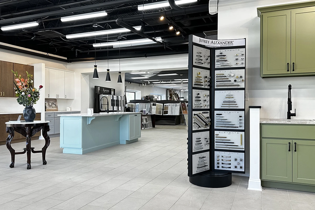
Visit our Rockville showroom to compare cabinetry, countertops, flooring, tile, and hardware in person.
Book an interior design consultation at Karpet King Design Center in Rockville, Maryland.