How to Build the Perfect Bathroom Color and Material Palette

How to Build the Perfect Bathroom Color and Material Palette
How to Build the Perfect Bathroom Color and Material Palette

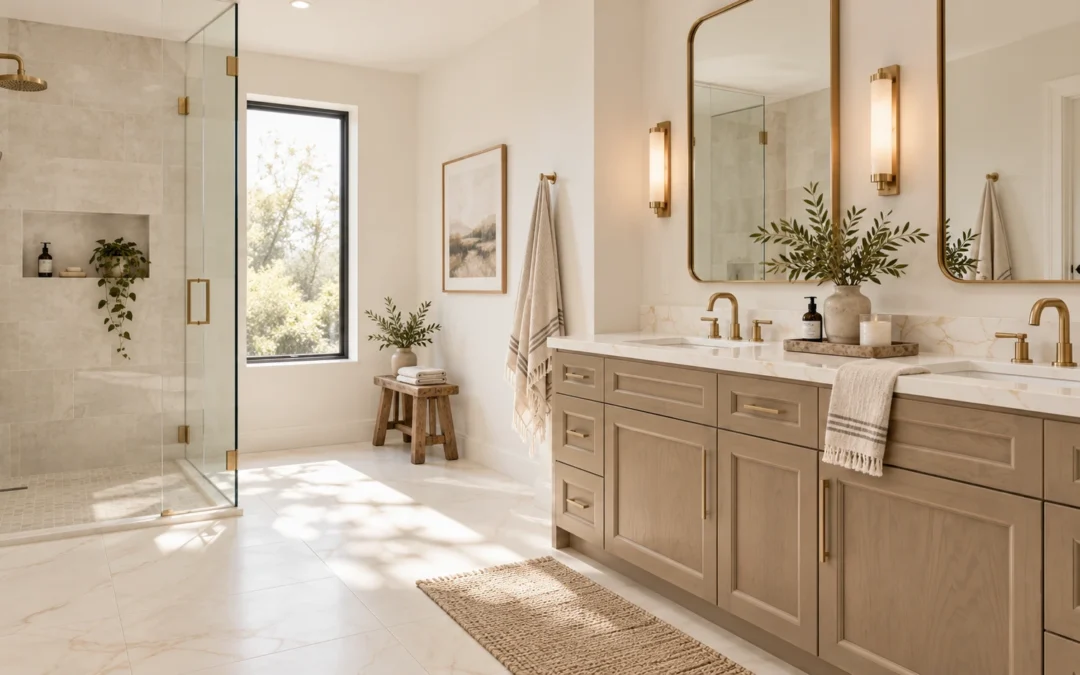
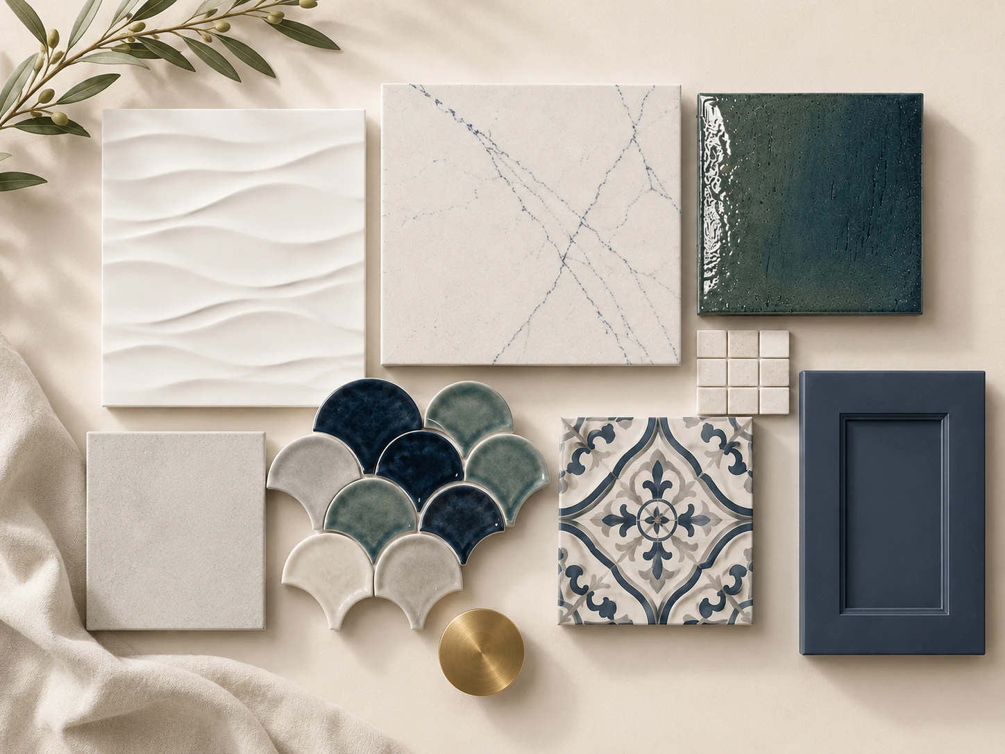
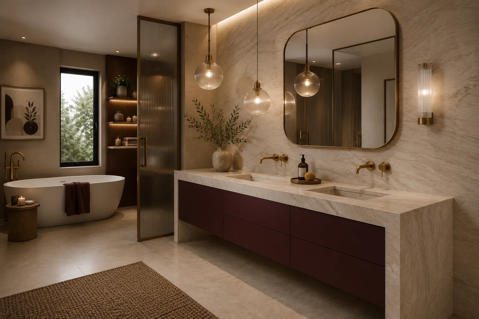
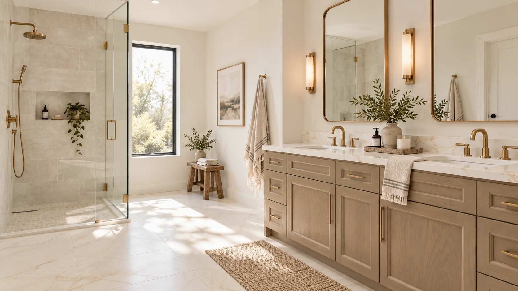
Bathroom color and material palette with coordinated tile, cabinetry and countertop finishes

A successful bathroom should feel good at 7 a.m. on a busy weekday and still feel relaxed at the end of the day. It needs to manage water, humidity, storage, lighting and daily traffic while also supporting the style of the home. That combination of beauty and performance is what turns a collection of attractive products into a well-designed bathroom.

Recent industry research shows that homeowners are asking bathrooms to do more. The National Kitchen & Bath Association's 2026 Bath Trends Report describes bath design as increasingly personal, with wellness, technology, storage and lifestyle shaping the room. Houzz's 2025 U.S. Bathroom Trends Study found that 36% of renovated bathrooms included wellness-oriented features, while 68% of homeowners considered special needs in their projects. The message is clear: a bathroom renovation is not only about choosing a tile you love; it is about designing a room that will work comfortably for years.

If you are beginning a bathroom remodel, use the decisions below as a planning sequence. Start with function and wet-area performance, then build the visual palette around materials that suit the way the room will actually be used.

1. Start With the Feeling You Want the Bathroom to Have

Before choosing a tile color, decide how you want the room to feel. Calm and spa-like? Warm and organic? Crisp and architectural? Colorful and collected? That first decision gives every later material a filter.

A calm organic bathroom might begin with warm stone, soft ivory, sage or natural wood. A more tailored bathroom could use a cooler white, deep navy cabinetry and brushed metal. A colorful bathroom can still feel sophisticated when the permanent finishes share an undertone and only one or two surfaces carry the strongest color.

Current research supports the move toward softer, nature-connected palettes. NKBA’s 2026 Bath Trends Report found neutrals to be the dominant bath color family, while sage and olive were the strongest green directions among surveyed industry professionals. The same report identified timeless/transitional, organic/natural and modern/minimal design as leading style directions.

Trends are useful for context, but they should not make the decision for you. The best palette is one that fits the architecture of the home, the light in the room and the way you want to live with the space.

2. Choose One Anchor Material First

Instead of trying to choose six finishes at once, select one anchor material,  the surface with the most visual influence or the one you are least willing to compromise on.
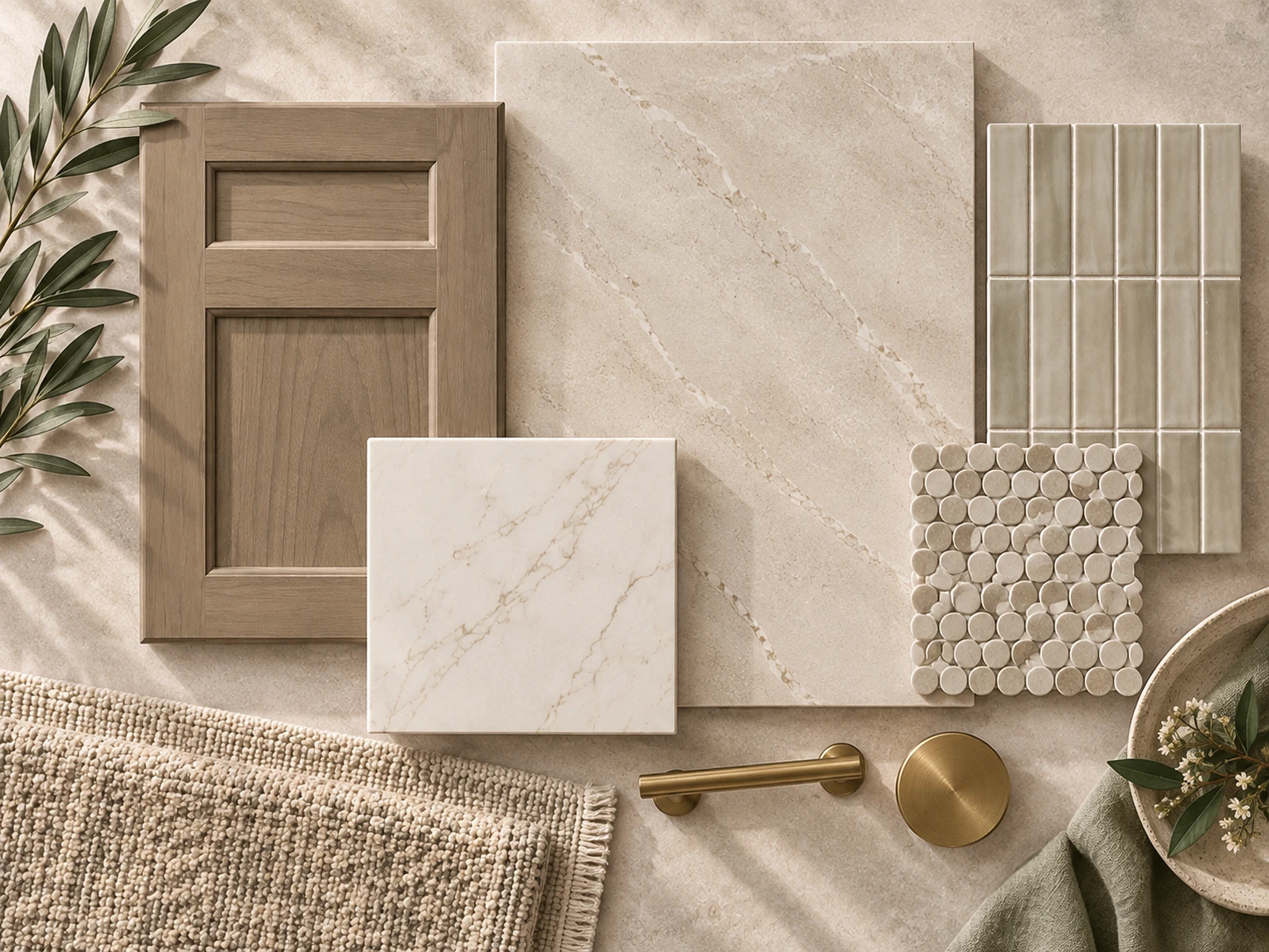
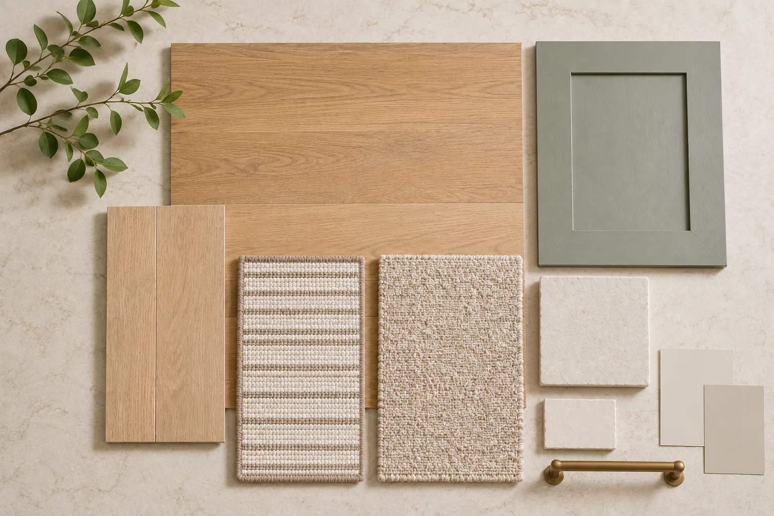
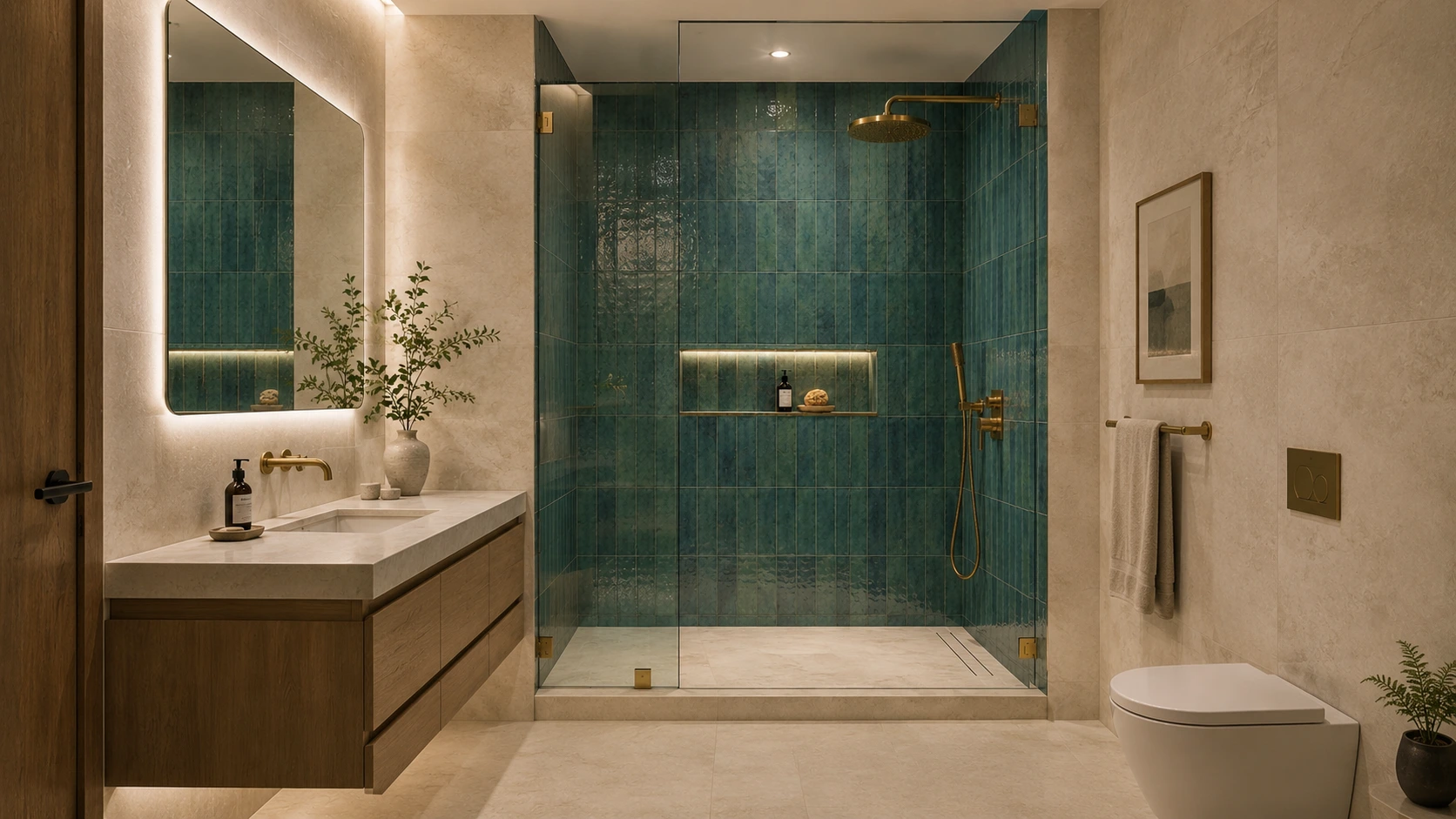
Bathroom material palette with tile, stone, cabinetry and finish samples

Your anchor could be a large-format floor tile, a dramatic shower wall, a quartzite countertop, a painted vanity color or a wood cabinet finish. Once that material is established, every other sample has a job: support it, balance it or provide controlled contrast.

For example, if the countertop has expressive veining, you may not need a heavily patterned floor and a decorative shower wall. If a sage vanity is the main color moment, quieter stone-look tile can give that cabinetry room to stand out.

This is one of the simplest ways to keep a bathroom from becoming visually crowded.

3. Read the Undertones Before You Read the Color Name

Two materials can both be described as “white” and still fight each other.

One white may lean creamy or yellow, another blue-gray, and another almost neutral. Beige can lean pink, gold, gray or green. The same is true of natural stone, porcelain, paint and cabinet finishes.
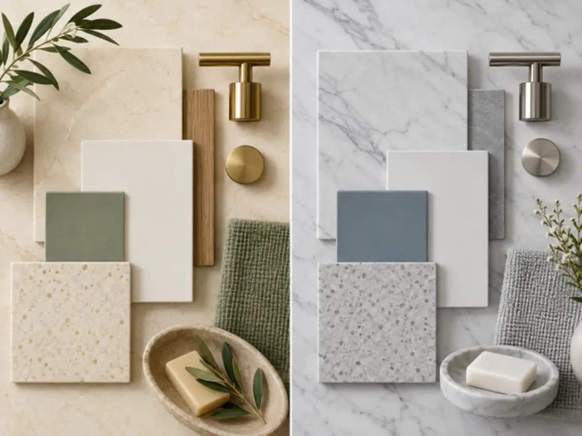
Warm and cool bathroom material samples showing different undertones

Place samples directly beside each other instead of evaluating them separately. Look for the quiet color beneath the obvious color. If the floor has a warm gold vein, a slightly warm countertop often feels more intentional than a stark blue-white surface. If the shower tile is cool gray, a very yellow cream beside it may make both finishes look less attractive.

The goal is not to make every undertone identical. It is to understand when you are creating harmony and when you are creating deliberate contrast.

4. Build a Hierarchy: Foundation, Supporting Materials and Accent

A cohesive bathroom is easier to design when every finish is not competing for equal attention.

Think of the palette in three levels:

  • Foundation materials: the largest surfaces, such as the main bathroom floor and major wall tile.
  • Supporting materials: vanity cabinetry, countertop and quieter secondary tile.
  • Accent materials: a shower niche detail, decorative mosaic, stronger paint color or metal finish.

This hierarchy prevents a common mistake: choosing a “favorite” floor, a “favorite” countertop, a “favorite” accent tile and a “favorite” cabinet color that were never meant to live in the same room.

5. Coordinate the Bathroom Floor and Shower — Do Not Treat Them as the Same Problem

The main bathroom floor and the shower floor are connected visually, but they have different technical demands.

Large-format tile can create a quieter look across the main floor. NKBA’s 2026 research found strong expectations for large-format bath flooring and reduced grout lines, alongside a high priority on durability and practical maintenance.
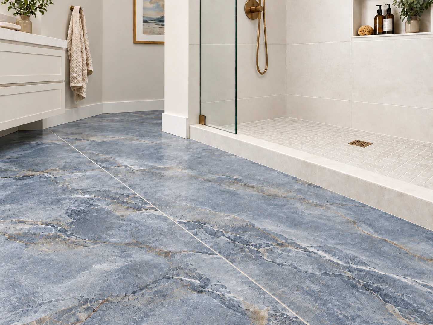
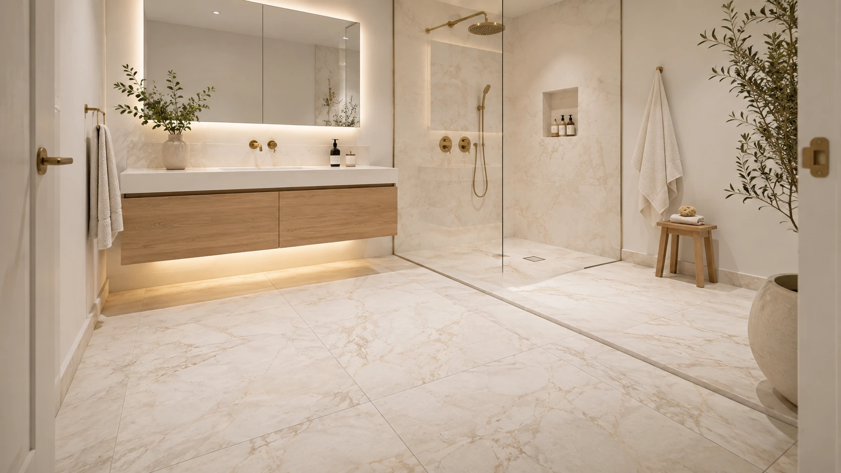
Coordinated bathroom floor tile and shower floor material transition

Inside the shower, however, material suitability depends on the complete installation: drainage, surface structure, tile size, grout joints, expected contaminants and barefoot use. The Tile Council of North America notes that DCOF alone should not be used as the sole predictor of slip risk, and ANSI A326.3 specifically treats shower-floor suitability as a combination of factors rather than one universal number. 

Design-wise, the two surfaces do not need to match. A large warm-white porcelain floor can transition beautifully into a smaller mosaic that repeats the same color family. The result feels connected without pretending the two surfaces have the same job.

6. Pair the Vanity and Countertop as One Composition

Cabinetry and countertop should be tested together, not selected weeks apart.

If the vanity is painted, the countertop should either reinforce its temperature or intentionally contrast with it. If the vanity is natural wood, pay attention to whether the stone veining feels warm, cool or neutral against the wood grain.
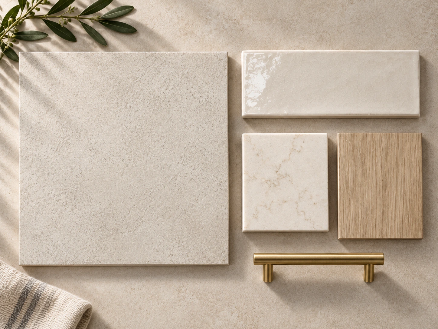
Bathroom material palette combining matte, glazed and textured finishes

Houzz’s 2025 bathroom research found wood tones leading vanity colors among renovating homeowners, while white remained the dominant countertop color. Engineered quartz was the most selected countertop material in the study, followed by quartzite, granite and marble. 

Those numbers do not mean every bathroom should use wood and white. They do show why this pairing works so often: a visually grounded cabinet finish below a lighter horizontal surface creates clear hierarchy and gives the countertop room to reflect light.

7. Control Pattern Scale and Movement

Pattern is not only about whether a tile is “busy.” Scale matters just as much.

A bathroom with broad marble-like veining on the floor, fine veining on the countertop and a tiny patterned mosaic can work because each pattern operates at a different scale. Three materials with equally strong, similarly sized movement are much more likely to compete.
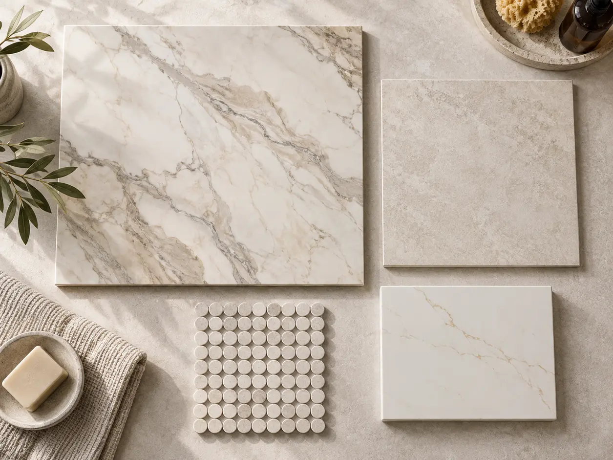
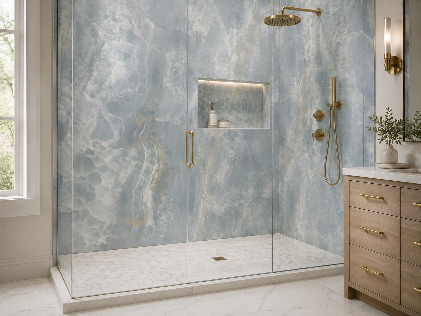
Bathroom material board showing coordinated pattern scale and stone veining

When using a dramatic stone or stone-look surface, give it visual breathing room. Repeat one of its quieter colors elsewhere instead of introducing another unrelated pattern.

Textured and patterned tile is gaining prominence in current bath design, according to NKBA, but that does not require using pattern everywhere. One controlled feature is often more memorable than four competing ones.

8. Use Texture and Sheen to Add Depth Without Adding More Color

A bathroom can be almost monochromatic and still feel layered when the surfaces respond to light differently.

Try combining a matte stone-look floor with a softly glazed shower tile, a smooth countertop and a wood or painted vanity. This creates depth through finish rather than relying on additional colors.
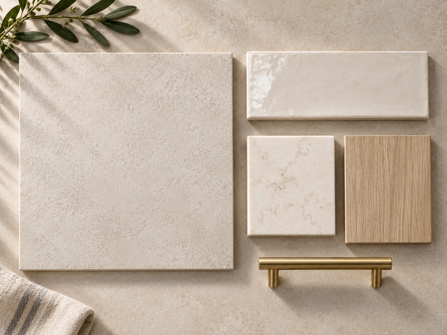
Bathroom material palette combining matte, glazed and textured finishes

Metal finish matters here too. NKBA’s 2026 report found matte, brushed and satin faucet finishes receiving more support than polished finishes among surveyed professionals. A brushed metal usually reads softer beside stone and wood than a very reflective finish, though polished metal can be beautiful when a more formal result is intended.

9. Choose the Metal Finish After the Main Palette Is Working

Faucets and hardware should complete the palette, not rescue it.

Once the tile, cabinet and countertop are working together, place the metal finish beside them. Brushed brass can warm blue, green, cream and natural wood. Nickel and chrome can sharpen cooler stone palettes. Matte black can create strong contrast, but it should repeat somewhere intentionally rather than appearing as one isolated dark element.

You do not have to make every metal identical. If you mix finishes, give one finish the dominant role and use the second as a controlled accent.

10. Test the Palette in the Light the Bathroom Actually Has

Showroom lighting is useful for comparing materials, but it is not the same as the light in your home.

Take the final samples into the bathroom whenever possible. View them in morning daylight, afternoon light and with the fixtures you expect to use at night. A warm cabinet color can become grayer in cool northern light. White tile can become creamy under a warm bulb. Reflective finishes may look much brighter beside a window than they did under showroom lighting.
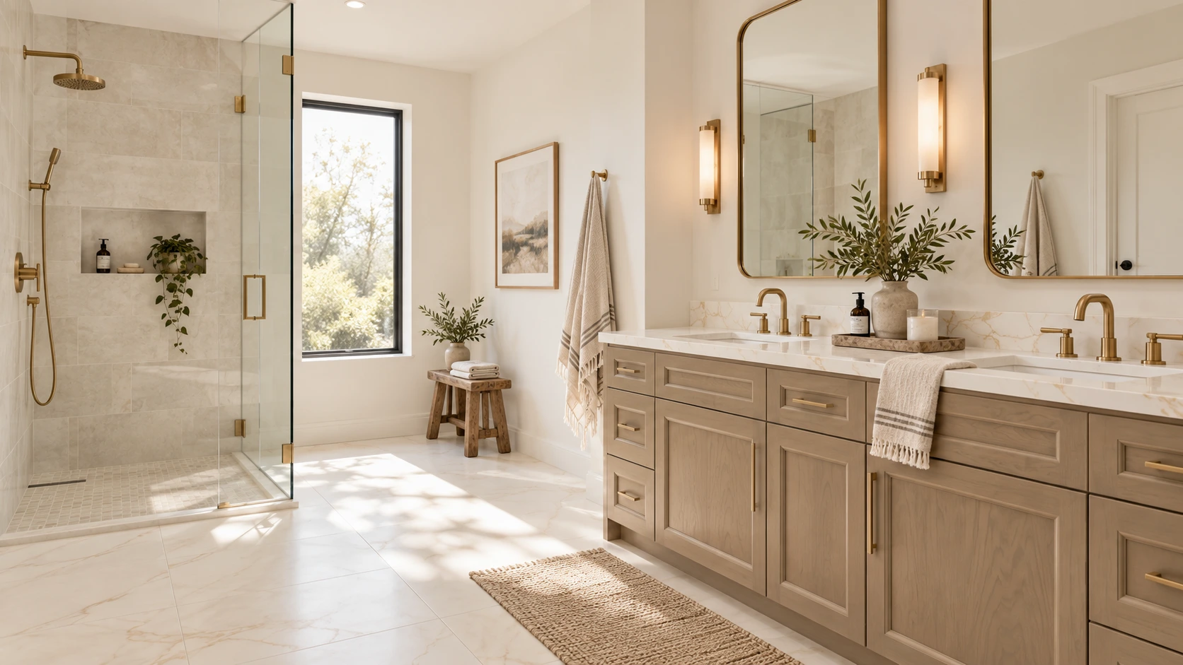
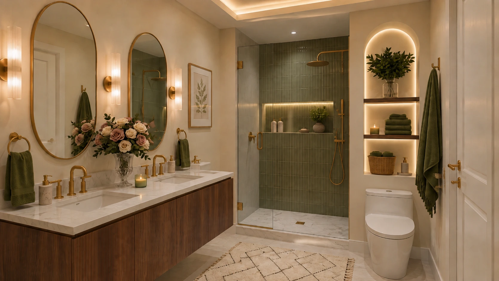
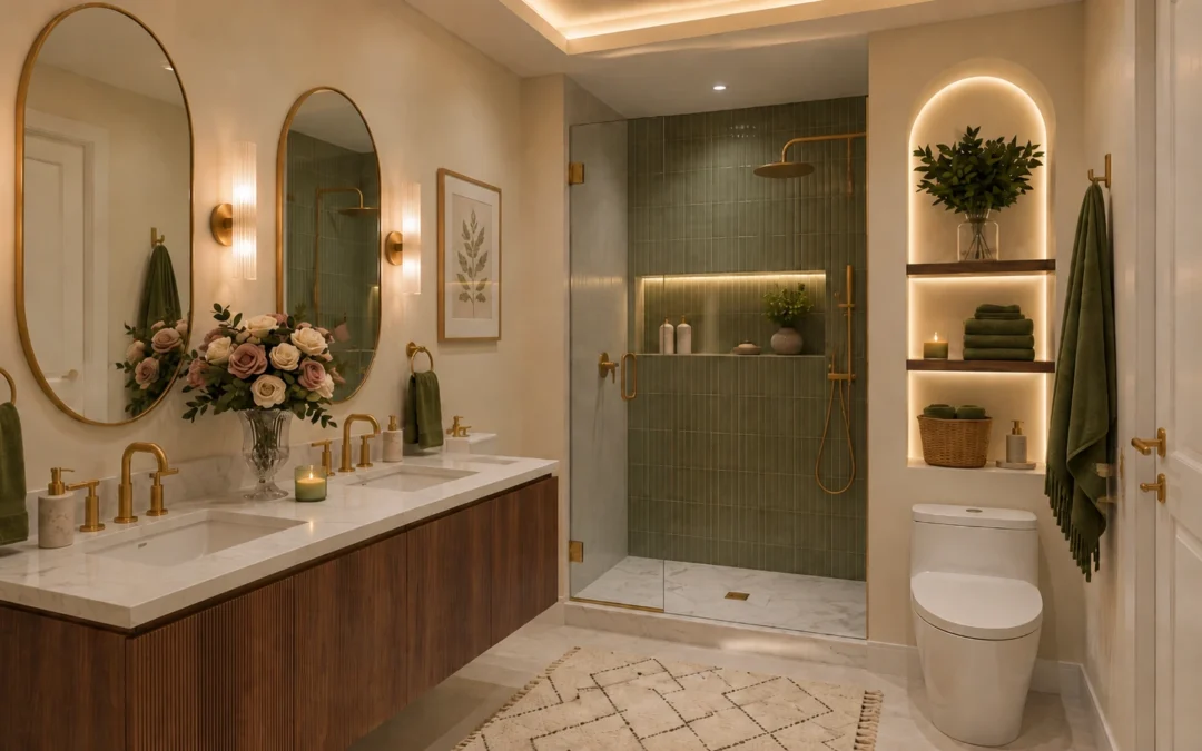
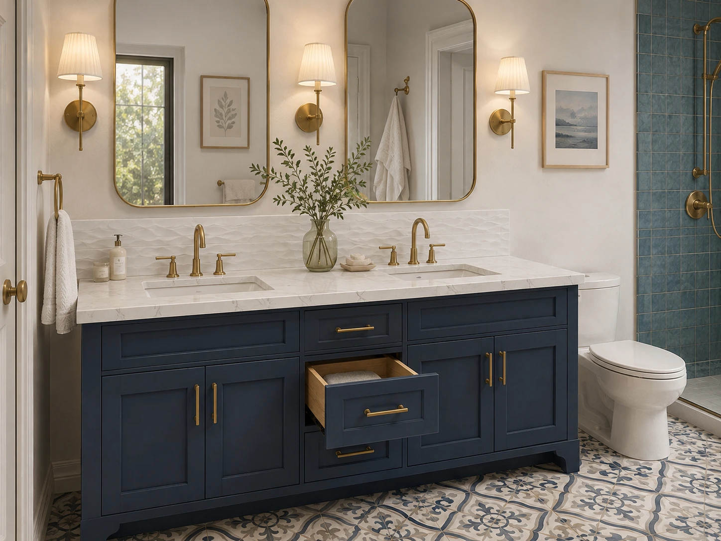
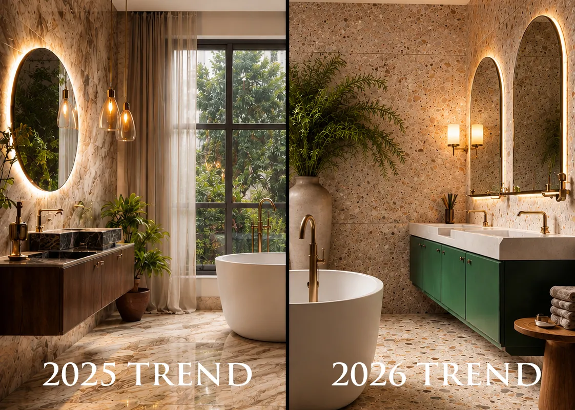
Coordinated bathroom color and material palette with warm stone tile, sage vanity and brass fixtures

Lighting itself is a major part of current bathroom planning. NKBA’s 2026 research identified lighting quality as a top bath-design consideration and strongly supported layered lighting, including task lighting.

That is why material selection and lighting should not be treated as completely separate decisions.

11. Create a Physical Sample Board Before You Order

Once the palette is close, bring the real samples together at the same time, Here is our bathroom design guide.

Your board should include the main floor, shower wall, shower floor, vanity finish, countertop, backsplash or accent tile, and at least one sample of the metal finish. If the bathroom connects directly to a bedroom or hallway, add a sample or photograph of the adjoining flooring too.

Then ask five questions:

  • Which material is the focal point?
  • Do the undertones support one another?
  • Are too many materials patterned at the same scale?
  • Does the palette have enough contrast to avoid looking flat?
  • Does anything look as though it belongs to a different bathroom?

At Karpet King Design Center, this is one of the biggest advantages of working with the materials in one showroom: tile, cabinetry and countertops can be placed together before the order is finalized rather than being chosen in isolation.

12. Current Bathroom Trends Worth Knowing — Without Designing Around Trends Alone

Current data points in a clear direction: bathrooms are becoming warmer, more natural and more personal.

NKBA’s 2026 Bath Trends Report found very strong support for light neutrals, sage and olive, timeless and organic styles, large-format flooring, wood-faced vanities and lower-sheen metal finishes. Houzz’s 2025 study also found wood tones leading upgraded vanity colors, white leading countertop colors and natural stone remaining important alongside engineered quartz.

That does not mean your bathroom needs to look beige, green or wood-toned. The useful lesson is broader: homeowners and designers are moving toward materials that feel calmer, more tactile and easier to live with over time.

Use trends as a reference point, not as the palette itself.

13. Five Bathroom Palette Mistakes to Avoid

Choosing each finish separately: A material can look beautiful alone and still be wrong beside the rest of the room.

Using too many statement surfaces: If the floor, shower, countertop and backsplash all demand attention, nothing becomes the focal point.

Ignoring undertones: Warm and cool neutrals can clash even when they have the same color name.

Choosing from small online images only: Scale, texture, sheen and true color are difficult to judge accurately on a screen.

Waiting until the end to think about lighting and hardware: Both change the way the completed palette is perceived.

14. A Simple Bathroom Material Palette Checklist

  • Define the mood and overall color temperature.
  • Choose one anchor material.
  • Select the main bathroom floor.
  • Coordinate the shower wall and shower-floor materials.
  • Pair the vanity finish and countertop together.
  • Add backsplash or accent tile only if the composition needs it.
  • Select the dominant metal finish.
  • Test all samples together under the bathroom’s real lighting.
  • Photograph the final sample board before ordering so you have a reference during installation.

The Best Bathroom Palette Looks Collected — Not Matched

The most successful bathroom color and material palette is rarely the one where every surface matches. It is the one where each material has a role.

Let one or two finishes lead. Repeat undertones intentionally. Vary pattern scale. Use texture to create depth. Test everything together before ordering.

When the floor, shower, vanity, countertop and hardware are considered as one composition, the room feels designed rather than assembled.

Planning a Bathroom in Rockville, Maryland?

At Karpet King Design Center, you can compare bathroom tile, cabinetry, countertops and coordinating finishes side by side in our Rockville showroom.

Bring your inspiration photos, paint colors, room measurements or existing flooring samples, and our team can help you narrow the palette before you make final selections.
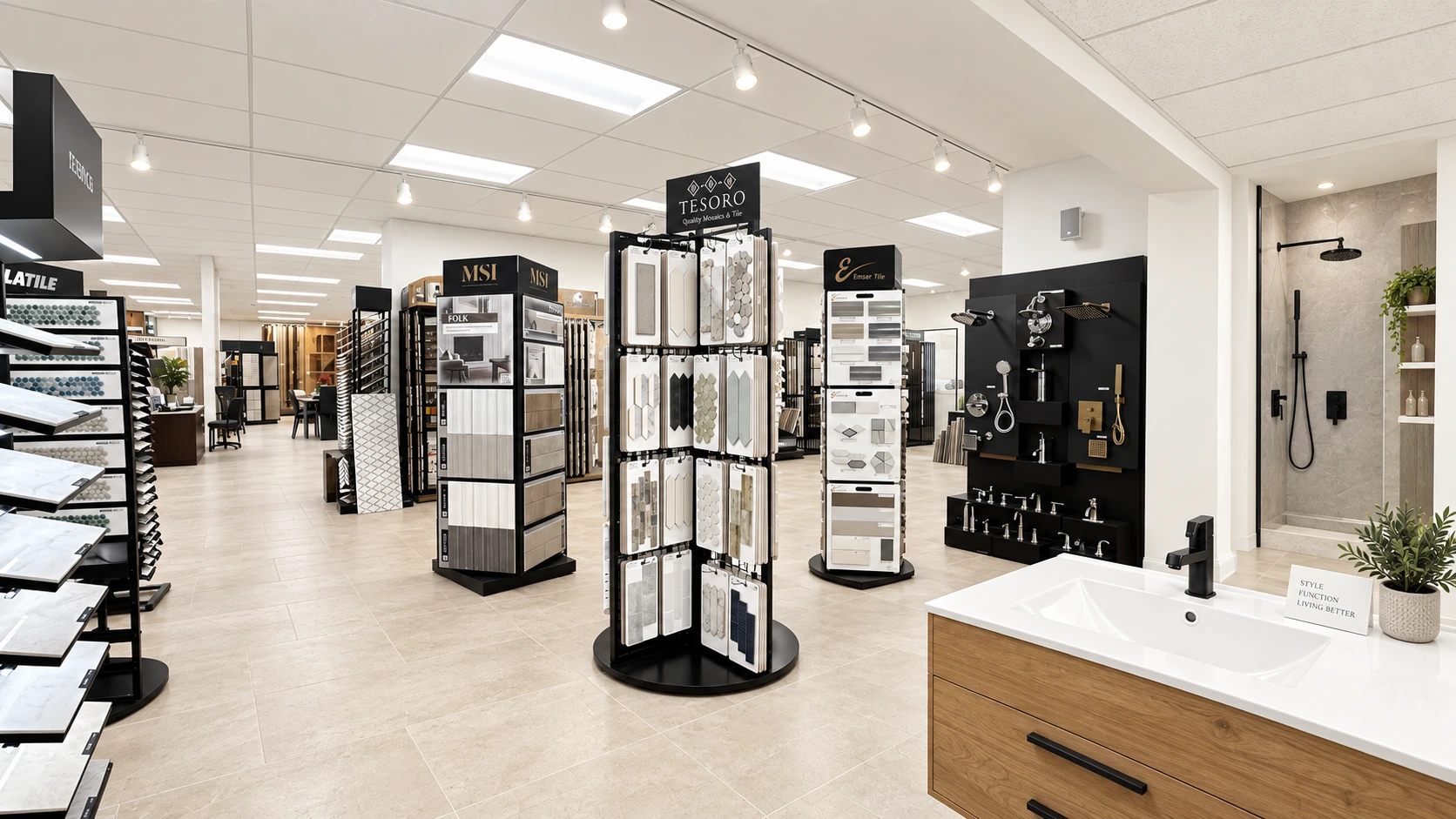
Bathroom tile, cabinetry and countertop samples at Karpet King Design Center in Rockville Maryland

Bathroom Color & Material Palette FAQs

There is no fixed number. A useful approach is to choose a dominant neutral or foundation, one supporting cabinet or tile color, and a smaller accent. The materials can contain additional natural variation as long as the overall hierarchy remains clear.

They do not need to match. They should relate through color, undertone, texture or pattern while still being selected for their specific location and installation requirements.

Either can work. What matters is having enough contrast to separate the cabinetry from the floor while keeping their undertones compatible.

Yes, but it should look intentional. A balanced neutral can bridge warm and cool finishes, or one temperature can dominate while the other appears as a controlled accent.

If the tile already has strong pattern or movement, a quieter countertop often creates better balance. Pulling one subtle color from the tile into the countertop is a reliable way to connect the surfaces.

Bring room photos, approximate measurements, inspiration images, paint colors and any material that will remain in or directly beside the bathroom. These references make it easier to build a coordinated palette.

Related Blogs

Bathroom Design Guide: How to Create a Beautiful and Functional Bathroom

Bathroom Design Guide: How to Create a Beautiful and Functional Bathroom

Bathroom Design Guide: How to Create a Beautiful and Functional Bathroom

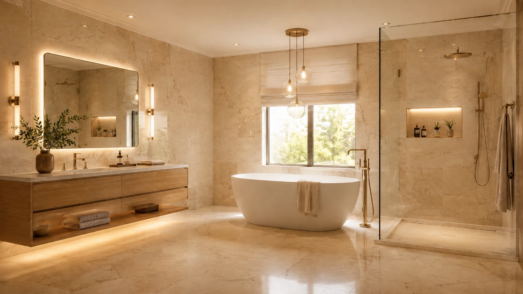
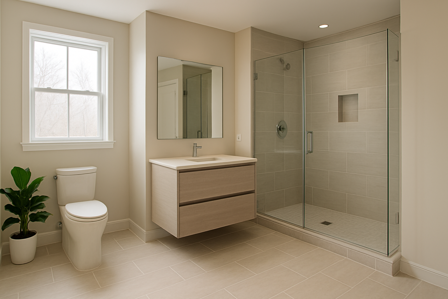
Modern primary bathroom with coordinated tile, vanity, countertop and walk-in shower

A successful bathroom should feel good at 7 a.m. on a busy weekday and still feel relaxed at the end of the day. It needs to manage water, humidity, storage, lighting and daily traffic while also supporting the style of the home. That combination of beauty and performance is what turns a collection of attractive products into a well-designed bathroom.

Recent industry research shows that homeowners are asking bathrooms to do more. The National Kitchen & Bath Association's 2026 Bath Trends Report describes bath design as increasingly personal, with wellness, technology, storage and lifestyle shaping the room. Houzz's 2025 U.S. Bathroom Trends Study found that 36% of renovated bathrooms included wellness-oriented features, while 68% of homeowners considered special needs in their projects. The message is clear: a bathroom renovation is not only about choosing a tile you love; it is about designing a room that will work comfortably for years.

If you are beginning a bathroom remodel, use the decisions below as a planning sequence. Start with function and wet-area performance, then build the visual palette around materials that suit the way the room will actually be used.

1. Start With the People, Routines and Priorities

Before you choose a floor tile, vanity color or faucet finish, define how the bathroom needs to function. A primary bathroom used by two adults has different priorities from a guest bath, powder room, children's bath or an aging-in-place renovation.

Write down the routines that happen in the room. Do two people get ready at the same time? Is counter space more valuable than a second sink? Do you need enclosed storage for medicine, hair tools or cleaning products? Is a bathtub genuinely used, or would a larger shower provide more value? Do you want the room to feel energizing in the morning, quiet at night, or both?

This early conversation prevents an expensive mistake: designing around what a bathroom is supposed to contain instead of how the household actually lives. NKBA's 2026 survey reinforces this shift. More than half of respondents said a larger shower is becoming more important than having a bathtub in the primary bath, while personalized storage and wellness features continue to gain attention. That does not mean every tub should disappear; it means each fixture should earn its place in the layout.

  • Who uses the bathroom and at what times?
  • Single or double vanity?
  • Walk-in shower, tub, or both?
  • How much closed storage is needed?
  • Which items need outlets or charging inside cabinetry?
  • Are there mobility or future-accessibility considerations?
  • What is the realistic cleaning and maintenance tolerance?

2. Plan the Layout Before Falling in Love With Materials

Good circulation is one of the quiet differences between a bathroom that photographs well and a bathroom that is genuinely pleasant to use. Plan door swings, drawer clearances, shower entry, toilet privacy, towel locations and walking paths before finalizing product sizes.


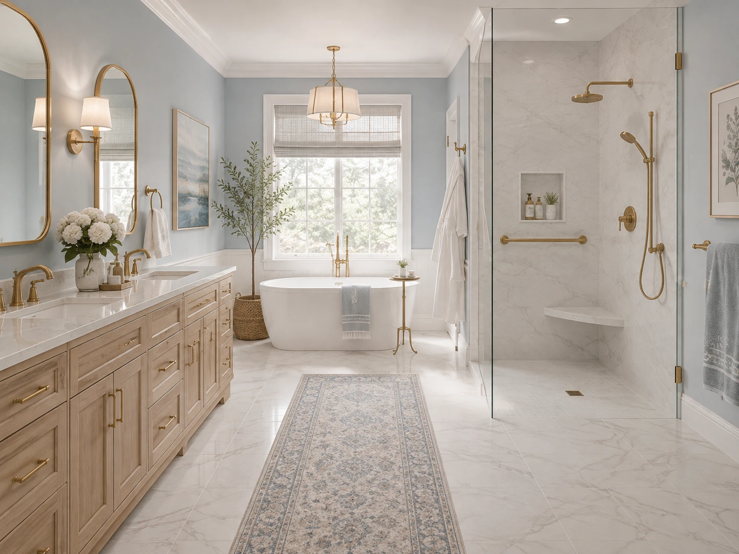
Functional bathroom layout with walk-in shower, vanity and defined bathroom zones

In a smaller bathroom, keeping major plumbing locations may help control the scope and cost of work. In a larger renovation, changing the layout can be worthwhile when it solves a persistent problem such as a cramped shower, poorly placed vanity, blocked window or awkward door swing. Any plumbing, electrical or structural changes should be reviewed by the appropriate qualified professional and checked against local requirements.

Think about the room in zones: dry grooming/storage, wet shower or tub, toilet, and circulation. Then test whether two people can use the space without competing for the same narrow pathway. For a long-term home, it is also worth asking whether a low-threshold or curb less shower, a bench, wider entry, better lighting or blocking for future grab bars can be incorporated elegantly now rather than added reactively later.

3. Treat Waterproofing and Ventilation as Design Decisions

The most important bathroom materials are sometimes the ones you never see after installation. Tile is a finish surface; the complete wet-area assembly is what manages water. The Tile Council of North America (TCNA) specifically notes that grout joints are not waterproof and that wet areas such as showers rely on the selected installation method and substrate to protect adjoining construction from water.

That means shower waterproofing should be specified as a system, not assumed because a tile is labeled porcelain or because the grout looks dense. The shower pan or receptor, membrane, drain connection, wall backing, transitions, penetrations and installation products all need to work together according to the chosen system and manufacturer instructions.

Ventilation matters for the same reason. Hot showers add moisture to indoor air, and ENERGY STAR notes that adequate ventilation helps control moisture and odors. A properly selected bathroom exhaust fan should vent to the outdoors and be installed so it can deliver its intended airflow. The fan is not a decorative afterthought; it is part of how the bathroom performs.

TECHNICAL DESIGN NOTE

Do not describe tile or grout alone as a complete waterproofing system.

For showers and other wet areas, follow the selected TCNA/ANSI method, manufacturer instructions and local code requirements.

Coordinate waterproofing, drain type, shower slope, niches, benches and curbs before tile installation begins.

4. Choose Bathroom Flooring for Wet Use, Maintenance and Scale

Bathroom flooring has to do several jobs at once. It should coordinate with the overall palette, tolerate routine water exposure, clean reasonably easily and provide suitable traction for the way the space will be used.

Porcelain tile is a common bathroom choice because of its low water absorption, durability and range of looks, including stone, limestone, travertine, terrazzo, concrete and wood-inspired designs. But appearance alone should never determine suitability. Check the manufacturer's intended-use classification for the specific product and finish.

ANSI A326.3 classifies hard surface flooring for different use conditions. For level interior areas expected to be walked on when wet, the Interior Wet category uses a wet DCOF of 0.42 or a manufacturer-declared classification. Shower floors are more nuanced: the standard does not assign one universal DCOF cutoff because tile size, drainage, grout joints, surface texture and barefoot use all affect suitability. In practical terms, choose shower-floor products specifically recommended for that application and confirm the complete assembly with the installer or specifier.

Scale also affects the room visually. NKBA's 2026 research found strong industry expectations for large-format flooring and fewer grout lines, reflecting homeowners' interest in easier upkeep and a calmer visual field. Large-format tile can work beautifully in small or large bathrooms when the layout, cuts, flatness and drainage conditions are appropriate.

Large-format porcelain bathroom floor tile with minimal grout lines

5. Design the Shower as a Complete System

The shower often becomes the visual focal point of the bathroom, but it is also the most demanding wet zone. Design it from the drain outward rather than selecting wall tile first and resolving the details later.

Begin with the shower footprint, entry type, curb or curbless condition, drain location and slope. Then determine the wall tile, shower-floor tile, niche, bench or ledge, plumbing locations and glass. A large tile on the walls can create a quieter look with fewer grout lines, while a smaller mosaic or small-format floor tile may be useful because it follows the slope and introduces more grout joints. Suitability still depends on the product and installation, so do not assume that small tile automatically makes a floor safe.

For visual interest, choose one main moment. It could be a textured shower wall, a beautifully framed niche, a distinctive shower-floor mosaic or a slab-like large-format surface. When the floor, walls, niche and hardware all compete for attention, the shower can feel smaller and busier than it is.

Walk-in shower with large-format wall tile and mosaic shower floor

6. Build a Material Palette Instead of Shopping One Product at a Time

Many bathroom design problems begin with a series of individually beautiful choices. The floor looks great on one display. The countertop looks great under another light. The vanity color looks perfect online. Then the samples meet and the undertones fight each other.

Build the bathroom as a material palette. Put the main floor, shower wall, shower floor, vanity finish, countertop, backsplash or accent tile and metal finish together before ordering. Look at the group from a few feet away as well as close up.

Start by identifying the visual leader. If the shower tile has strong movement, let the countertop and floor become quieter. If the vanity is a rich color or warm wood, choose tile that supports it rather than introducing another unrelated undertone. Matching is not the goal; coordination is.

Current bath research supports a warmer, more natural direction. NKBA's 2026 report found light neutrals dominant, with sage and olive among the more prominent green families and wood-faced vanities expected to remain strong. These are useful signals, but they should be treated as a palette direction rather than a rule. The most durable design is the one that belongs to the house and the homeowner.

Bathroom material palette with tile, vanity finish, countertop and hardware samples

7. Choose the Vanity Around Storage, Not Only Sink Count

The vanity has a major visual presence, but its day-to-day value comes from storage and counter organization. Before deciding between single and double sinks, list what needs to be stored and how often each item is used.

Drawers are often easier to organize than deep door cabinets because items remain visible and accessible. A tall tower can add useful vertical storage when wall space allows. Consider dedicated spaces for hair tools, makeup, medicine, towels and cleaning items, plus safe electrical integration where appropriate. NKBA's 2026 report specifically highlights item-specific storage, organizers and integrated charging as growing parts of bath cabinetry planning.

Then choose the cabinet to finish. Natural wood can bring warmth to stone and porcelain; painted green, blue, cream or warm neutral cabinetry can become the room's main color. Floating vanities can visually open the floor area, while furniture-style or built-in cabinetry can provide a more grounded look. The right choice depends on the architecture, storage requirements and installation conditions.

8. Coordinate the Countertop, Backsplash and Sink as One Composition

The vanity top sits between cabinetry, wall finish, plumbing and mirror, so it should be selected as part of that full composition. Bring the cabinet sample and tile to the countertop selection rather than evaluating a surface in isolation.

Quartz is frequently chosen for bathrooms because it offers consistent patterns and straightforward routine care. Natural stone can provide unique movement and character, but maintenance needs vary by stone type and finish. Whatever surface you choose, confirm fabrication details, edge profile, sink type, faucet configuration and splash height early enough to coordinate with plumbing and mirror placement.

A backsplash can disappear quietly into the palette or become a deliberate feature. If the countertop already has strong veining, a simple backsplash often gives it room to breathe. If the vanity wall is otherwise calm, a textured or handmade-look tile can add depth without taking over the entire bathroom.

Bathroom vanity with coordinated storage, countertop and backsplash design

9. Layer the Lighting

Lighting affects how the bathroom functions and how every material reads. A warm beige tile can appear gray under one lamp and creamy under another. A vanity can look flat if light comes only from a ceiling fixture.

NKBA's 2026 report found that 91% of respondents consider lighting quality a top bath-design priority, with task lighting, natural light and nighttime-specific lighting receiving strong support. A practical lighting plan usually includes several layers: general light for the whole room, task light at the mirror, and softer accent or nighttime lighting where useful.

Whenever possible, evaluate finish samples under the actual bathroom lighting before final approval. If the room has daylight, look at the materials in morning and afternoon conditions as well. The goal is not to make the room as bright as possible; it is to make the light comfortable, accurate and useful at different times of day.

Layered bathroom lighting with vanity, shower and nighttime lighting

10. Specify Water-Efficient Fixtures Without Sacrificing the Design

Water efficiency is easiest to build into the project when fixtures are selected early. The U.S. EPA's WaterSense program independently certifies products that meet both efficiency and performance criteria.

WaterSense-labeled bathroom sink faucets use a maximum of 1.5 gallons per minute, compared with the 2.2 gpm federal standard referenced by EPA. WaterSense-labeled showerheads use no more than 2.0 gpm, and labeled toilets use 1.28 gallons per flush or less. These performance criteria make the label a useful filter when comparing fixtures across styles and price points.

Choose the plumbing configuration before finalizing countertop drilling, shower rough-in, wall backing and tile layout. This is especially important for wall-mounted faucets, multiple shower outlets, handhelds, body sprays, freestanding tubs and smart fixtures, where dimensions and valve locations can affect framing and waterproofing.

11. Design for Long-Term Usability and Accessibility

Accessibility does not need to look institutional. A well-detailed curbless shower, integrated bench, handheld shower, wider entry, good task lighting and thoughtfully placed grab bars can feel like premium design features while making the room easier to use.

Houzz's 2025 bathroom study found that 68% of homeowners considered special needs in their renovation, with many planning for future requirements rather than only current ones. NKBA's 2026 report similarly describes aging-in-place elements such as curbless entries, benches and grab bars as increasingly integrated into attractive mainstream bathroom design.

Even if full universal design is not part of the project, small decisions can create flexibility: improve floor traction, avoid unnecessary level changes, provide strong lighting, allow comfortable shower entry and consider reinforcement where future support hardware might be needed.

Accessible bathroom design with curbless shower and built-in bench

12. Balance Current Style with Materials You Can Live With

A bathroom is usually a long-term renovation, so permanent surfaces should not depend entirely on a short trend cycle. NKBA's 2026 research places transitional/timeless design at the top of expected styles, followed closely by organic/natural design. That combination explains why warm neutrals, stone-inspired surfaces, natural wood, soft greens, brushed finishes and restrained texture feel so relevant right now.

Use trends as inspiration rather than a checklist. Keep difficult-to-replace surfaces relatively versatile if you prefer flexibility, then add personality through the vanity color, decorative tile, mirrors, lighting, paint, artwork and textiles. If you genuinely love a bold tile enough to make it the long-term focal point, let it lead and simplify the surrounding materials.

13. Review Real Samples Together — in the Actual Light

Screens are useful for inspiration, but they are not reliable enough for final color coordination. Tile texture, stone movement, cabinet sheen and metal finish can all change dramatically with scale and lighting.

Before ordering, place the actual samples together and photograph the palette. Check them under daylight and the planned artificial lighting. Look for undertones that repeat across the group and make sure the visual weight feels balanced. Record exact product names, colors, finishes and lot information where applicable so the selections remain clear for purchasing and installation.

This is one reason a multi-category showroom can be valuable during a bathroom project: seeing flooring, tile, cabinetry and countertops side by side can reveal conflicts that are easy to miss when materials are chosen from separate websites or showrooms.

Common Bathroom Design Mistakes to Avoid

  • Choosing tile before confirming the layout, shower dimensions and drain strategy.
  • Treating tile or grout as the waterproofing system instead of specifying the complete wet-area assembly.
  • Selecting bathroom floor tile only by color and ignoring intended use, traction and maintenance.
  • Using too many statement materials in a small visual field.
  • Choosing a double vanity automatically when counter space or storage would be more useful.
  • Planning lighting after the mirror, cabinetry and electrical locations have already been fixed.
  • Leaving ventilation as an afterthought.
  • Ordering materials without viewing the real samples together.
  • Ignoring future usability when a simple layout or blocking decision could provide more flexibility.
  • Forgetting that fixture rough-ins, niche positions and tile layouts need to be coordinated before installation.

A Simple Bathroom Planning Order

  1. Define users, routines, priorities and budget range.
  2. Confirm the layout and major fixture locations.
  3. Select the wet-area construction/waterproofing approach with the project team.
  4. Choose the main floor and shower materials based on performance and design.
  5. Build the full palette with vanity, countertop, backsplash and metal finishes.
  6. Finalize plumbing fixtures, drain, glass and accessory locations.
  7. Plan storage and electrical needs inside/around cabinetry.
  8. Complete the lighting and ventilation plan.
  9. Review accessibility and long-term-use details.
  10. Approve real samples in the actual light before ordering.

Bringing the Bathroom Together

A beautiful bathroom is not created by the most expensive tile or the latest fixture. It comes from making the decisions in the right order and understanding how the hidden performance details support the visible design.

Start with the people who will use the room. Build a layout that feels comfortable. Treat waterproofing, drainage, traction and ventilation as essential parts of the design. Then coordinate flooring, shower tile, cabinetry, countertops, lighting and fixtures as one material story rather than separate purchases.

When those layers work together, the bathroom can feel calm, personal and polished while still being practical enough for everyday life.

Planning a Bathroom Remodel in Rockville, Maryland?

At Karpet King Design Center, homeowners can compare bathroom tile, flooring, cabinetry, vanities, countertops and coordinating finishes in one Rockville showroom. Seeing materials together makes it easier to catch undertone conflicts, understand scale and create a bathroom palette that feels intentional before products are ordered.

Our design team can help you narrow the material options around your room, style, maintenance priorities and project goals, whether you are refreshing finishes or planning a complete bathroom remodel.

Frequently Asked Questions

There is no single best product for every bathroom, but porcelain tile is a common choice because it is durable, has low water absorption and is available in many looks. For any hard-surface floor, confirm the specific product is intended for the expected wet-use conditions and consider traction, maintenance, grout, floor flatness and installation requirements.

Tile can be highly water resistant, but the finished tile surface is not the same thing as a complete waterproofing system. TCNA notes that grout joints are not waterproof. Showers and other wet areas depend on the selected substrate, membrane or other approved water-management method, drain connection and installation system.

It does not need to match. A coordinated bathroom often uses related undertones or repeated colors while changing scale or texture. For example, a quiet stone-look floor can support a textured shower wall, or the shower floor can repeat a smaller version of a color already present elsewhere.

Yes. Large-format tile can create a quieter visual field and fewer grout lines, even in a small room. The final result depends on the room dimensions, tile layout, cut sizes, substrate flatness and, in wet areas, drainage and slope requirements.

Start with function and layout before products. Once the major fixture and shower decisions are clear, choose an anchor material such as the main floor, shower wall or vanity finish, then build the remaining palette around it.

There is no fixed rule. As a design guideline, many bathrooms feel cohesive with a restrained set of surfaces: a main floor, a shower wall and, where needed, a separate shower-floor or accent material. More materials can work when the colors, undertones and pattern scales are carefully controlled.

Yes. WaterSense-labeled bathroom faucets, showerheads and toilets are independently certified to meet EPA efficiency and performance criteria. They can reduce water use while still meeting the program’s performance requirements.

Early in the design. Vanity lighting affects mirror size and electrical locations, while shower lighting and exhaust ventilation can affect ceiling work and wiring. Planning them before finishes are installed reduces conflicts and helps the bathroom perform better.

Related Blogs

Hardwood Flooring Guide for Maryland Homes: 10 Smart Decisions Before You Buy

Hardwood Flooring Guide for Maryland Homes: 10 Smart Decisions Before You Buy

Hardwood Flooring Guide for Maryland Homes: 10 Smart Decisions Before You Buy

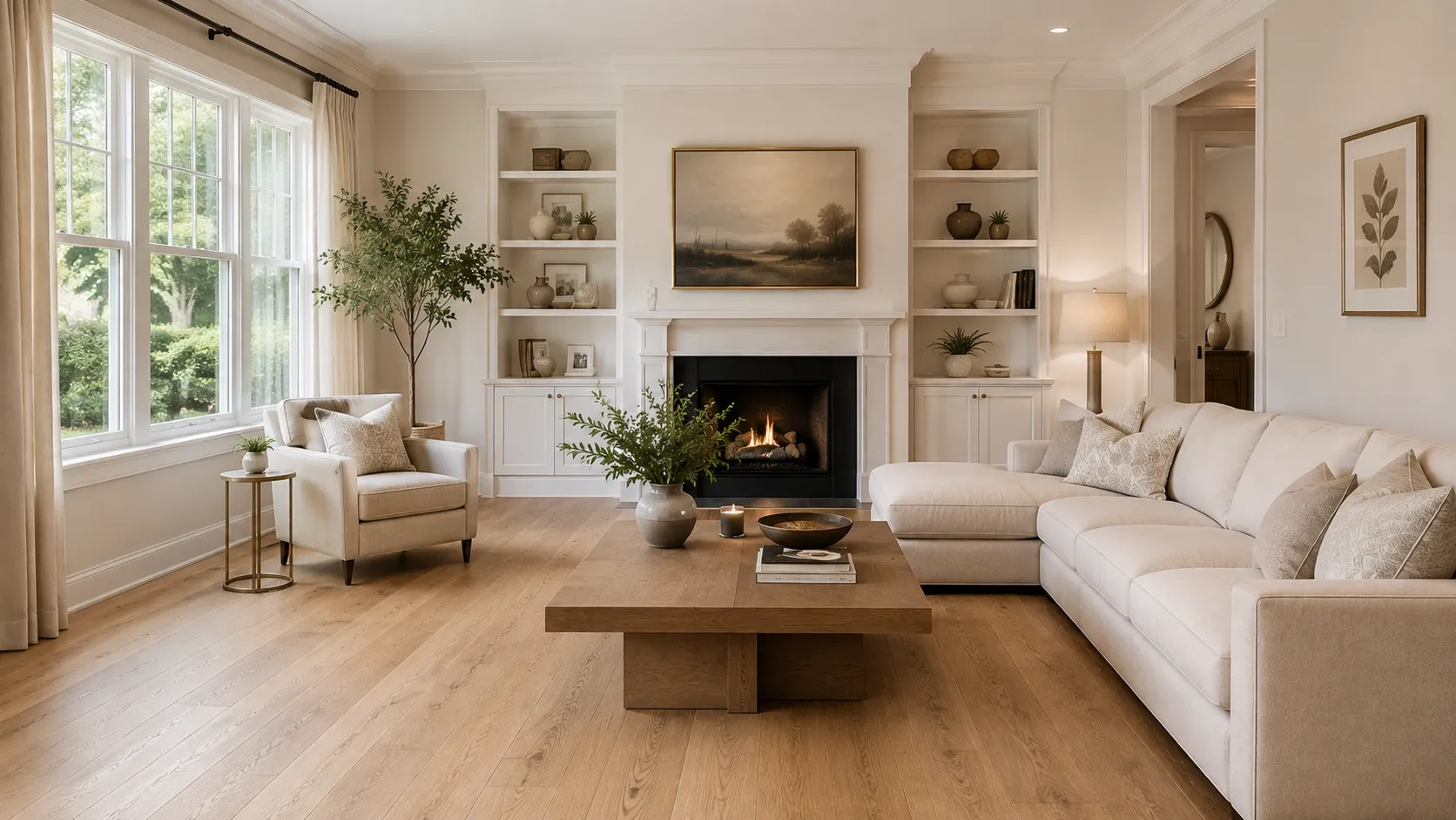
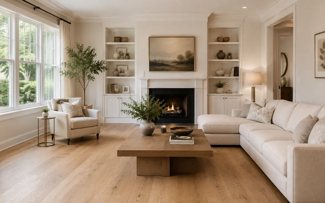
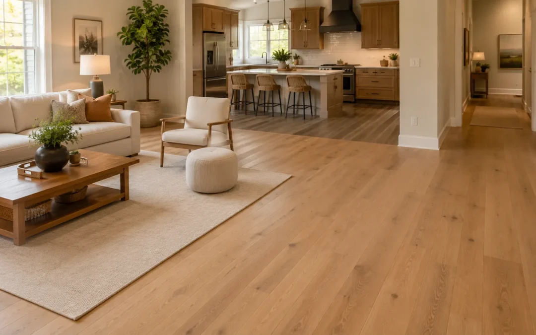
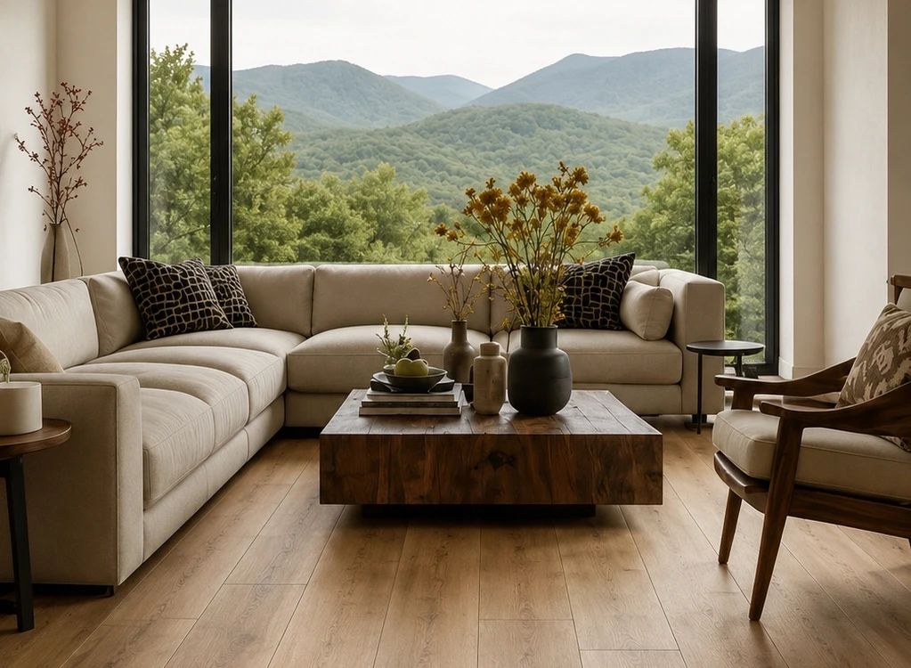
Wide-plank natural oak hardwood flooring in a bright open-plan living room with soft neutral furniture

Choosing hardwood flooring is one of the most permanent design decisions in a home. The right floor has to work with your architecture, daily routine, lighting, cabinetry and long-term maintenance expectations - not just look good on a small sample board.

This hardwood flooring guide is designed for Maryland homeowners who want to understand the choices before they buy. It covers solid and engineered construction, species, natural variation, undertone, plank width, layout, finish, moisture, care and refinishing. If you are shopping locally, you can also compare full-size hardwood samples at Karpet King Design Center in Rockville before making a final decision.

QUICK ANSWER

For many Maryland homes, engineered hardwood is a practical place to start because its layered construction generally moves less with changes in temperature and humidity than solid wood. That does not make it automatically better. The best choice depends on the exact product, subfloor, room location, desired plank width, refinishing expectations and manufacturer requirements. Always evaluate the specific floor rather than the category name alone.

Hardwood Flooring Guide at a Glance

Decision

What to compare

Why it matters

Construction

Engineered vs. solid

Affects dimensional stability, installation options and future refinishing potential.

Species

White oak, red oak, maple, hickory, walnut

Changes grain, natural color, variation and overall design character.

Grain & variation

Subtle vs. expressive

Determines whether the floor feels quiet and refined or organic and character-rich.

Undertone

Warm, neutral, cool, red/yellow/gray influence

Changes how the floor coordinates with cabinets, walls, stone and furniture.

Plank width

Wide vs. narrow

Changes the visual rhythm and perceived scale of the room.

Pattern

Straight, herringbone, chevron

Adds different levels of movement and architectural detail.

Finish

Matte, satin and texture

Changes reflectivity, surface character and how everyday marks are perceived.

Site conditions

Subfloor, moisture, humidity, grade level

Can affect which products and installation methods are appropriate.

Long-term care

Cleaning, recoating, refinishing

Affects how the floor ages and whether it can be renewed later.

1. Start With the Room, Not the Color

Before comparing oak tones or stain colors, identify where the hardwood will be installed and what the room asks of the floor. A main-level living room, upstairs bedroom, kitchen and below-grade basement do not create the same site conditions. The subfloor, moisture exposure, traffic level, pets, direct sun and connection to adjacent rooms can all influence the best product.

For open plans, think beyond one room. A floor may continue through an entry, living room, dining room and kitchen, so plank direction and transitions should be planned as part of the architecture. In smaller spaces, consider how much of the floor will actually remain visible after furniture and rugs are placed.

Designer tip: take photos of the room in daylight and evening light, and bring cabinet doors, countertop samples, paint colors or rug swatches when you compare flooring. Hardwood is a large visual surface; judging it alone can create undertone surprises later.

2. Compare Engineered Hardwood vs. Solid Hardwood

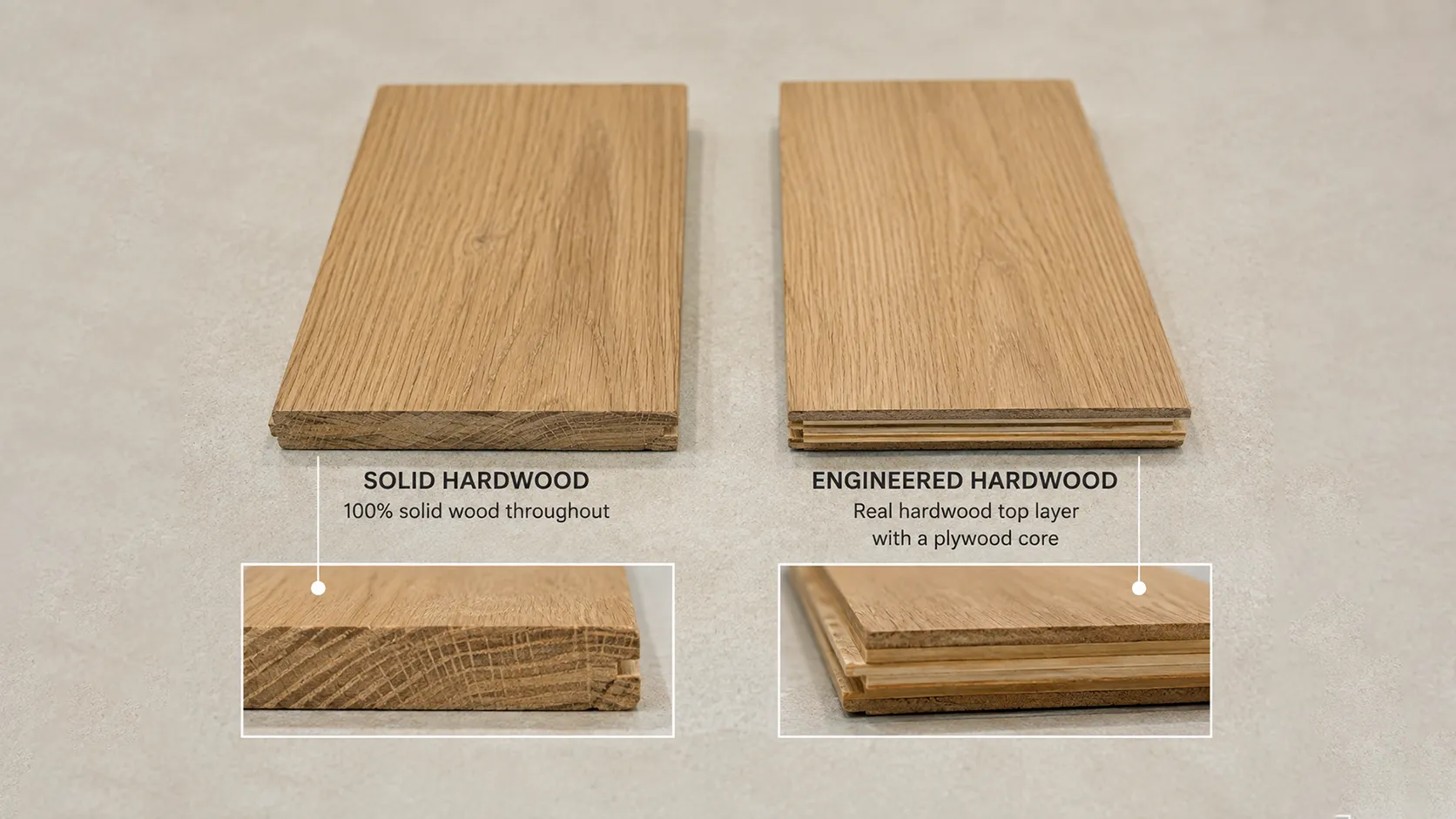
Both are real wood flooring, but their construction is different. The National Wood Flooring Association (NWFA) describes solid flooring as one piece of wood from top to bottom, while engineered flooring uses multiple layers with real wood at the surface. Engineered wood generally expands and contracts less than solid wood, which can make it useful in a wider range of locations.

Wide-plank natural oak hardwood flooring in a bright open-plan living room with soft neutral furniture

Feature

Engineered hardwood

Solid hardwood

Construction

Real hardwood surface over a layered core

One piece of wood from top to bottom

Design range

Often strong in wide-plank, European-oak and contemporary collections

Strong traditional selection with many classic species and profiles

Movement with humidity

Generally less movement than solid wood

More responsive to environmental moisture changes

Below-grade use

Some products may be approved; verify manufacturer and site conditions

Generally reserved for on- or above-grade applications

Refinishing

May be refinishable depending on wear-layer thickness and construction

Can often be refinished more times because there is more solid wood above the tongue

Best choice when...
You want dimensional stability, wide-plank design options or a product approved for the site

You value traditional solid construction and future sanding potential

The category alone is not enough. Engineered floors vary widely in wear-layer thickness, core construction, plank dimensions and installation requirements. Solid floors also vary by species, grade and cut. Compare the exact specifications and warranty for the product you are considering.

3. Plan for Maryland Humidity and Jobsite Conditions

Wood naturally exchanges moisture with the surrounding air, so Maryland's seasonal changes make jobsite preparation important. Current NWFA technical guidance emphasizes checking the actual environment, flooring and substrate rather than relying on a fixed number of acclimation days. The goal is to condition the flooring to the expected living conditions and follow the manufacturer's installation instructions.

The U.S. Environmental Protection Agency recommends keeping indoor relative humidity below 60 percent and ideally around 30-50 percent for general moisture control. For wood flooring, the specific acceptable range should come from the flooring manufacturer and installation guidance for the product.EPA moisture guidance can be useful background for homeowners managing indoor humidity.

What this means for a homeowner: keep HVAC operating normally before and after installation, disclose known moisture issues, and expect the installer to assess the subfloor and site conditions. If a basement, slab or moisture-prone room is part of the project, confirm in writing that the exact hardwood product and installation system are approved for that location.

4. Choose a Wood Species for Character, Not Just a Name

Species influences the floor's natural base color, grain pattern and visual movement. Grade, cut, stain and finish can change the final appearance dramatically, so species should be treated as a starting point rather than a guarantee of one look.

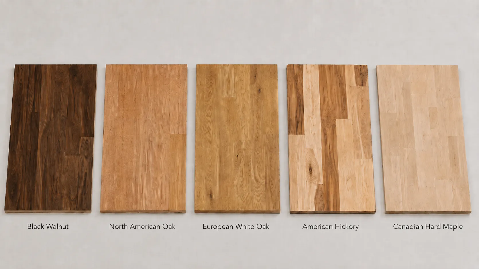
Hardwood flooring guide samples showing white oak, red oak, maple, hickory and walnut

White oak: Refined, versatile grain with a neutral-to-warm base. Works especially well with natural, beige and lightly toned finishes.

Red oak: More visible grain and naturally warmer undertones. Familiar in traditional and transitional interiors.

Maple: Smoother, subtler grain that can create a cleaner visual field. Some maple products show less dramatic grain than oak.

Hickory: Strong contrast and natural variation. A good fit when you want the wood itself to be expressive and character-rich.

Walnut: Naturally deeper brown color and flowing grain. Often chosen for richer, more sophisticated interiors.

Always review the specific collection. A select-grade white oak floor can look very different from a rustic or character-grade white oak floor, even though the species name is identical.

5. Decide How Much Grain and Natural Variation You Want

Two floors in a similar color can create completely different rooms if their grain and variation are different. A subtle grain and consistent board-to-board color creates a cleaner, quieter background. More knots, mineral streaks and color movement make the floor feel more organic and expressive.

Neither is automatically better. The decision is about visual balance. If cabinetry, stone and furniture already carry strong pattern, a quieter floor can give the room breathing space. If the architecture and furnishings are simple, a character-rich floor can become the material that gives the room personality.

Ask to see more than one sample board when variation matters. One attractive plank cannot show the full range of a natural wood collection.

Side-by-side hardwood samples comparing subtle grain with stronger natural grain and color variation

White oak: Refined, versatile grain with a neutral-to-warm base. Works especially well with natural, beige and lightly toned finishes.

Red oak: More visible grain and naturally warmer undertones. Familiar in traditional and transitional interiors.

Maple: Smoother, subtler grain that can create a cleaner visual field. Some maple products show less dramatic grain than oak.

Hickory: Strong contrast and natural variation. A good fit when you want the wood itself to be expressive and character-rich.

Walnut: Naturally deeper brown color and flowing grain. Often chosen for richer, more sophisticated interiors.

Always review the specific collection. A select-grade white oak floor can look very different from a rustic or character-grade white oak floor, even though the species name is identical.

6. Read the Undertone in Your Actual Light

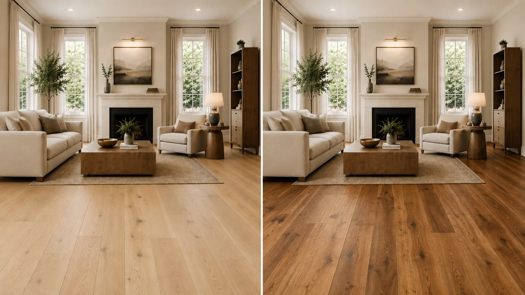
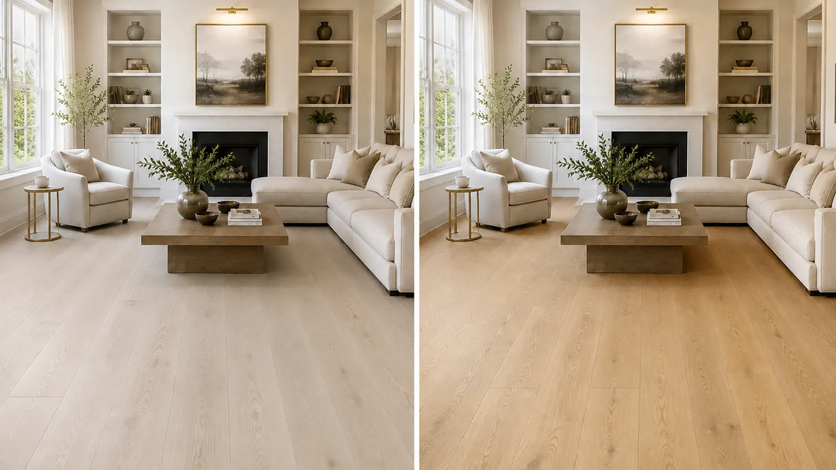
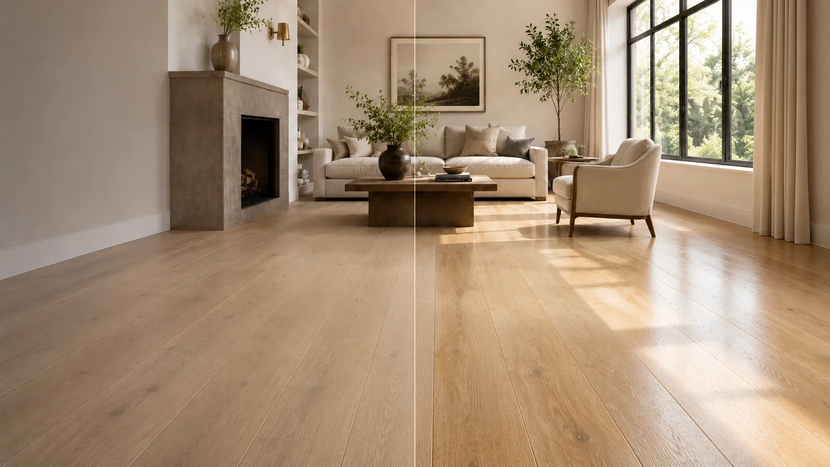
Color names can be misleading. Two floors may both be called “natural oak” while one leans honey or yellow and the other reads beige, taupe or slightly gray. That hidden undertone affects how the floor works with white paint, cabinetry, countertops, rugs and existing furniture.

The safest approach is to compare the floor with the fixed materials that will remain in the room. A warm floor does not require every other material to be warm, but the palette needs a deliberate relationship. Near-matches are often harder to coordinate than clear, controlled contrast.

View samples at different times of day. Morning daylight, afternoon sun and warm evening lamps can shift the appearance of wood. Whenever possible, borrow a larger sample and place it flat on the floor, because vertical showroom displays can read differently from an installed horizontal surface.

For more help building the full palette, see Karpet King's flooring and interior design guide, which explains how flooring relates to cabinetry, countertops, rugs, wall color and connected rooms.

Same living room shown with two natural oak hardwood undertones to compare how the floor changes the overall palette

7. Choose Plank Width and Direction With the Room in Mind

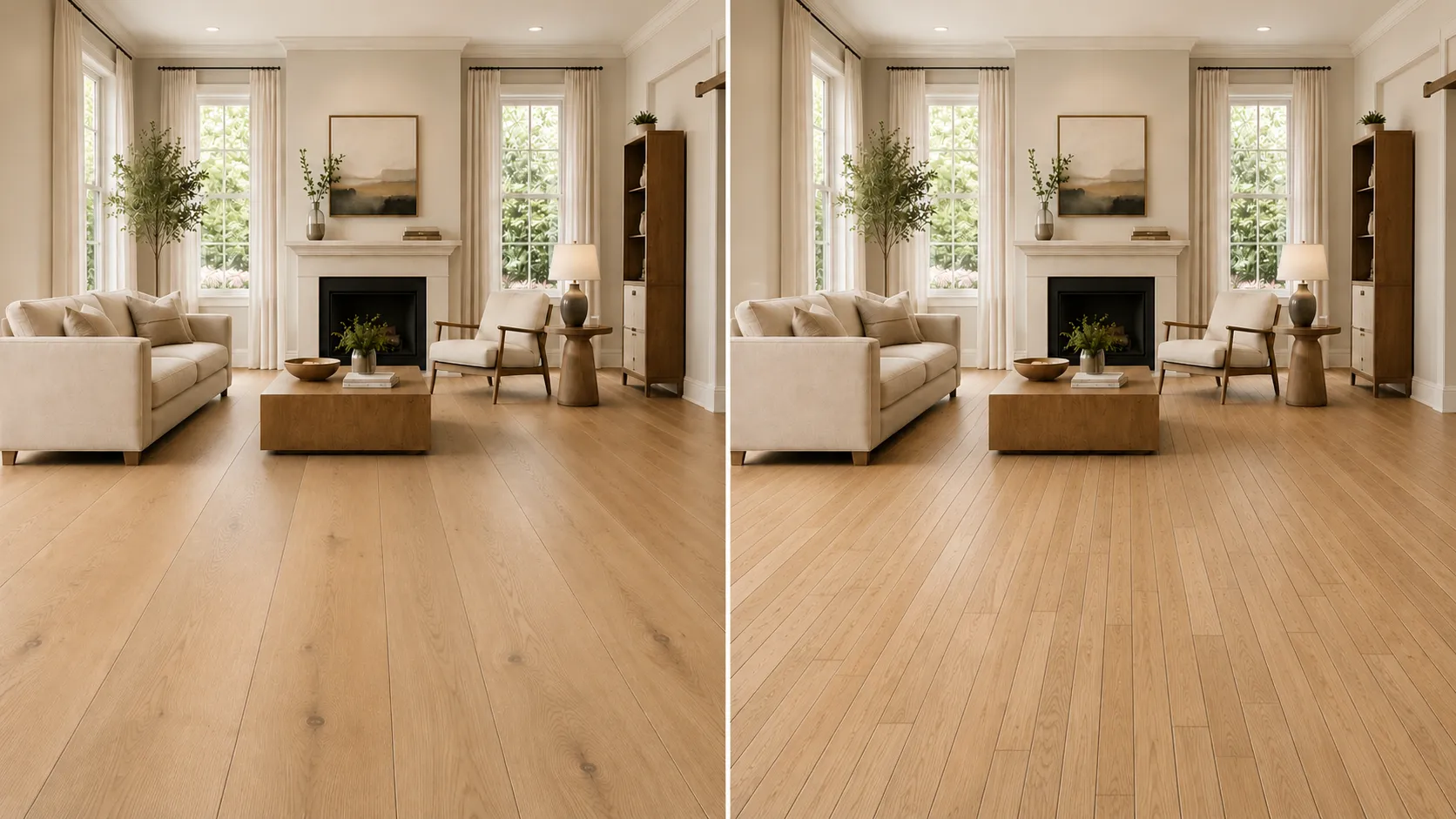
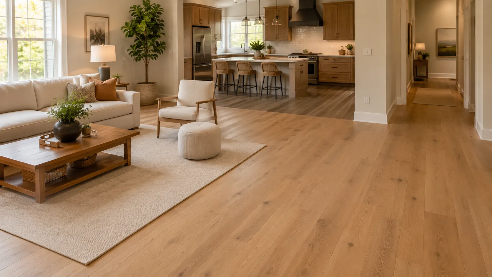
Plank width changes the rhythm of a floor. Wider planks create fewer seams and often make a room feel calmer, more open and more contemporary. Narrower planks create more repeated lines and can feel more traditional or detailed.

Same living room compared with wide-plank and narrow-plank hardwood flooring

Width should also relate to scale. Very wide planks can be beautiful in a large open plan, but the product construction, subfloor and installation requirements matter. Do not choose width only from a lifestyle image; compare a full-size board and understand how many planks will actually span your room.

Plank direction affects sightlines. Straight planks often look best when they support the longest architectural line or the main direction of movement. In connected rooms, avoid unnecessary direction changes unless a doorway, threshold or structural condition gives you a clear reason.

8. Decide Whether the Floor Should Be Quiet or Patterned

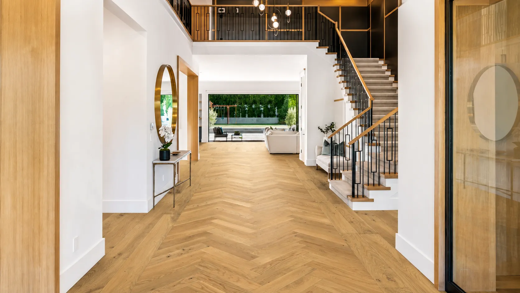
Straight-laid hardwood is the most versatile foundation because it creates a continuous linear field. Herringbone and chevron introduce more movement and architectural detail. They can be especially effective in entries, dining rooms, libraries or larger open areas where the pattern has room to read.

Herringbone hardwood flooring with a straight-plank border in a bright entryway with staircase

 Herringbone uses rectangular pieces arranged in a repeated broken-zigzag pattern. Chevron uses angled ends that meet point-to-point. They are related looks, but they should not be treated as interchangeable when you are ordering material or planning installation.

Patterned hardwood requires more layout planning and can increase material and installation complexity. If you love the look, discuss transitions, borders, room centering and waste allowance before ordering rather than treating the pattern as a last-minute styling choice.

9. Pick Texture and Finish for the Way You Want the Floor to Read

Finish changes the way light moves across wood. Matte and low-sheen finishes keep reflectivity lower and emphasize a more natural, relaxed appearance. Satin reflects more light and can feel slightly more polished. The exact sheen level varies by manufacturer, so compare real samples rather than relying on the finish name alone.

Wire-brushed texture gently emphasizes the grain and can add tactile character. Smooth floors create a cleaner surface appearance. Hand-scraped or distressed looks are more specific style choices and should be evaluated at room scale so the texture does not become visually repetitive.

For active households, also think about what will disguise everyday wear. Mid-tone colors, visible grain, matte finishes and some texture can make small dust, dents or surface marks less noticeable than extremely dark, glossy or highly uniform floors. Product finish systems differ, so ask about the exact care instructions and warranty.

Hardwood flooring shown in the same sunlit room with matte and satin finish reflectivity for comparison

10. Think About Care, Refinishing and the Sample Before You Order

Real wood flooring can be maintained and, in many cases, renewed over time. The NWFA maintenance guidance recommends routine sweeping, dust mopping or vacuuming with a bare-floor setting, wiping spills promptly with a dry or slightly damp cloth, and avoiding wet mops and steam mops. Always use care products approved for the exact finish on your floor.

When a finish becomes dull, a maintenance coat may sometimes restore the surface. A full sand-and-refinish may be appropriate when wear or damage is deeper. The NWFA refinishing guidance notes that the number of times a floor can be sanded depends on factors such as wear-layer thickness, floor condition, equipment and contractor skill. This is especially important for engineered hardwood, where wear-layer thickness varies by product.

Before ordering, ask for the manufacturer care guide, warranty and installation requirements. If future refinishing is a priority, ask specifically about wear-layer thickness and whether the manufacturer permits sanding or recoating.

Finally, compare larger samples in your actual home. A showroom is useful for narrowing the field, but daylight, wall color, cabinetry and surrounding finishes can change how a floor reads. Sample borrowing is one of the most useful steps between “I like this board” and “I want this across the whole room.”

Where Does Hardwood Work Best?

Room

What to consider

Living rooms & dining rooms

A classic use for both solid and engineered hardwood. Focus on design continuity, traffic, furniture protection and sun exposure.

Bedrooms

Hardwood can create a clean, cohesive look, especially when the same floor continues from a hallway. Area rugs can add softness where desired.

Hallways & entries

Excellent places to showcase grain or pattern, but choose a finish and color that fit the traffic level and plan for walk-off mats where exterior moisture enters.

Kitchens

Possible with an appropriate product and household habits, but spills should be cleaned promptly. Confirm manufacturer approval and protect against plumbing or appliance leaks.

Basements

Engineered hardwood is often the starting point because it moves less with humidity than solid wood, but the exact product, slab moisture and installation system must be approved for below-grade use.

Bathrooms & laundry rooms

Real wood is usually not the first choice where repeated water exposure is expected. If considering it, rely on explicit manufacturer approval and realistic moisture management rather than appearance alone.

Common Hardwood Shopping Mistakes to Avoid

  • Choosing the stain color before deciding whether the construction and room conditions are appropriate.
  • Judging natural variation from one small board instead of several samples or a larger display.
  • Ignoring undertone because two products share the same color name.
  • Choosing very wide planks without reviewing the product construction and installation requirements.
  • Assuming every engineered hardwood can be refinished the same number of times.
  • Assuming “water resistant” or a kitchen lifestyle photo means the product is suitable for standing water or every moisture-prone room.
  • Using a steam mop or generic cleaner without checking the finish manufacturer's care instructions.
  • Ordering before planning transitions, stairs, borders, direction changes and adjacent-floor heights.

Compare Hardwood in Person at Karpet King Design Center

A hardwood flooring guide can narrow the choices, but the final decision is easier when you see the materials at full scale. At Karpet King Design Center in Rockville, you can compare engineered and solid hardwood, species, plank widths, grain, finishes and pattern options, then coordinate the floor with rugs, stair runners, cabinetry, countertops and tile.

Start by exploring hardwood flooring in Rockville, MD, then visit the showroom or book an interior design consultation to compare samples with the rest of your project materials.

If you are ready to price the project, request a flooring estimate. Professional flooring installation and hardwood floor refinishing are available as separate services.

KARPET KING DESIGN CENTER

751 East Gude Drive, Rockville, MD 20850  |  (301) 770-4110  |  [email protected]
Serving Rockville and surrounding Montgomery County / DMV communities.

Frequently Asked Questions

Yes. Engineered hardwood has a genuine wood surface layer over a layered core. It is different from laminate and vinyl, which use different surface constructions.

Not automatically. Engineered hardwood generally moves less with changes in humidity and is available in many wide-plank formats, while solid hardwood offers traditional one-piece construction and often greater sanding potential. The best choice depends on the specific product, room, subfloor and installation conditions.

Some engineered hardwood products may be approved for below-grade installations. Solid hardwood is generally used on or above grade. Always verify the manufacturer requirements, slab moisture and installation system for the exact product.

Light-to-medium floors can help a room feel brighter and more open, but color is only one factor. Plank width, direction, continuous flooring, wall color, furniture contrast and daylight also affect perceived size.

Both can work well. Matte finishes reflect less light and may make small dust and surface marks less noticeable. Satin has more reflection and a slightly more polished look. Care requirements depend on the manufacturer's finish system.

Neither is universally better. Wide planks create fewer seams and often feel calmer and more contemporary. Narrow planks create more rhythm and often read as more traditional. Product construction and room scale should also be considered.

Many engineered floors can be recoated or refinished, but not all can be sanded the same way. Wear-layer thickness, floor condition and manufacturer guidance determine what is possible.

Follow the finish manufacturer's instructions. NWFA guidance generally recommends routine sweeping, dust mopping or bare-floor vacuuming, prompt spill cleanup with a dry or slightly damp cloth, and avoiding wet or steam mops.

Use small samples to narrow the options, then compare larger boards or several planks. Natural grain and color variation become much clearer at a larger scale, and home lighting can change the appearance significantly.

Karpet King Design Center at 751 East Gude Drive in Rockville carries hardwood samples and offers design guidance so you can compare construction, species, colors, plank widths and finishes in person.

Use This Hardwood Flooring Guide as a Decision Checklist

The best hardwood floor is not simply the most popular color. It is the product whose construction fits the site, whose grain and variation match the amount of character you want, whose undertone works with the room, and whose plank, pattern and finish support the architecture.

Use this hardwood flooring guide to narrow the direction, then confirm the decision with real samples, manufacturer specifications and professional site evaluation. A thoughtful selection at the beginning can create a floor that feels connected to the home now and still makes sense years from now.

How to Choose the Right Flooring for Every Room

How to Choose the Right Flooring for Every Room

Open-plan warm modern home with hardwood flooring in the living room and wood-look LVP in the kitchen

How to Choose the Right Flooring for Every Room in Your Home

Flooring is one of the largest visual surfaces in a home, but appearance is only part of the decision. The right floor must also match the way a room is used: how much foot traffic it receives, whether water or spills are likely, how much comfort you want underfoot, and how much maintenance fits your lifestyle.

That is why the best flooring for a bedroom may not be the best flooring for a kitchen, basement or busy entryway. A successful whole-home plan balances beauty, performance and continuity instead of forcing one material into every space.

This room-by-room flooring guide compares hardwood, carpet, luxury vinyl plank (LVP) and tile so you can make confident choices for your home in Rockville, Bethesda, Potomac, Chevy Chase, Gaithersburg and across the DMV.

Start With the Room, Not Just the Sample

A flooring sample may look beautiful in a showroom, but the right question is not simply, “Do I like this color?” Before choosing a product, consider how it will perform in the actual room.

  • Traffic: Is the space quiet, moderately used or one of the busiest paths through the home?
  • Moisture: Could the floor face splashes, tracked-in rain, humidity or below-grade moisture?
  • Comfort and sound: Do you want warmth, softness or noise reduction?
  • Children and pets: Will scratches, spills, pet hair or accidents influence the decision?
  • Maintenance: How much routine cleaning and long-term care are you comfortable with?
  • Light and color: How do the room’s natural light, cabinets, paint and furniture affect the flooring undertone?
  • Subfloor and installation: Is the floor above grade, below grade, concrete or wood, and is it flat and dry enough for the chosen product?

Important:  “Water-resistant” and “waterproof” are not interchangeable. Product construction, seams, installation method and the manufacturer’s warranty all matter. Always confirm the exact product specifications for the intended room.

Living Room: Hardwood for Warmth and Long-Term Character

For many living rooms, dining rooms and open-plan main levels, hardwood is a strong first choice. It adds natural variation and warmth, works with styles from traditional to warm modern, and can visually connect several spaces. A matte or low-sheen finish is often easier to live with than a glossy surface because it shows fewer small marks and reflections.

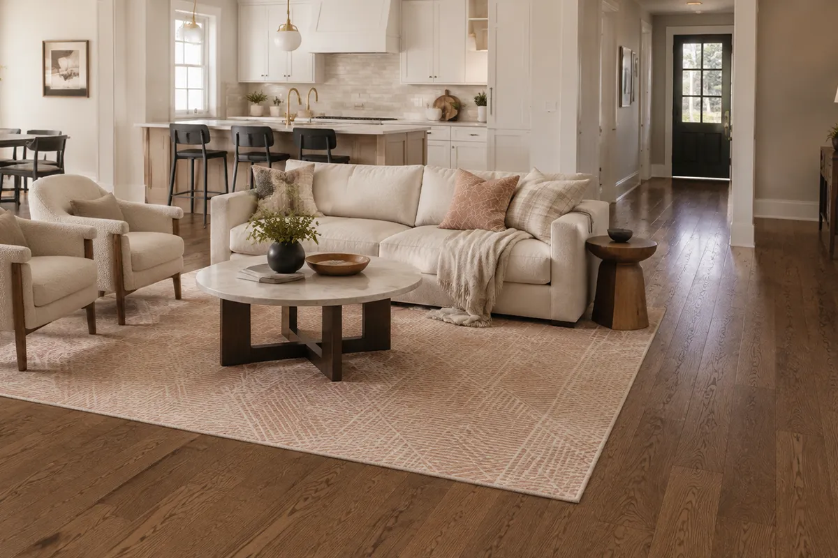
Warm modern living room with Brook red oak hardwood flooring and a blush geometric area rug

If the household includes pets or children, pay attention to wood species, finish, texture and color—not only the word “hardwood.” Mid-tone floors, visible grain and subtle texture tend to disguise everyday wear better than very dark, smooth or high-gloss floors. An area rug can add softness and protect key seating zones without hiding the floor completely.

  • Best fit: Living rooms, dining rooms, hallways and open-plan main floors in appropriate dry conditions.
  • Consider instead: Quality LVP when easy maintenance, moisture performance or budget is the higher priority.
  • Watch for: Direct sun, uncontrolled humidity, standing water and finishes that show every scratch.

Kitchen: Performance LVP or Properly Selected Tile

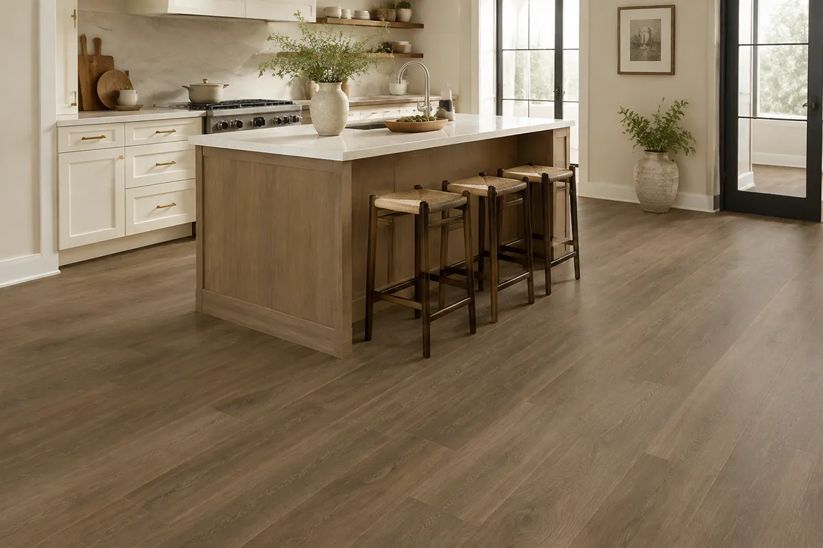
Kitchens need a floor that can handle frequent cleaning, dropped food, chair movement and everyday spills. For many households, wood-look LVP offers a comfortable balance: it can create the visual warmth of wood while providing resilient-flooring performance and simpler maintenance. It is especially useful when you want the kitchen to coordinate with nearby living areas without using natural wood in a higher-risk zone.

Warm modern kitchen with TRUCOR Autumn Oak wood-look luxury vinyl plank flooring

Porcelain or ceramic tile is another durable kitchen option. Porcelain tile is dense and has very low water absorption, but the exact tile still needs to be approved for floor use. Texture and slip classification matter, particularly near sinks and exterior doors. Tile also feels firmer underfoot, so comfort and grout maintenance should be part of the decision.

  • Best fit: LVP for warmth and practical upkeep; tile for durability and a stone or ceramic look.
  • Consider instead: Engineered wood only when the product and installation are appropriate and spills will be addressed quickly.
  • Watch for: Assuming every vinyl product is waterproof or every decorative tile is suitable for a kitchen floor.

Bathroom: Porcelain or Ceramic Tile Designed for Wet Areas

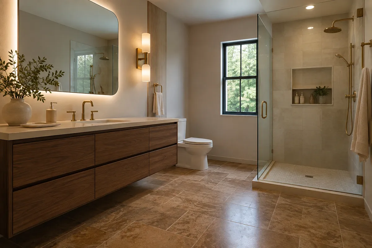
Bathrooms require a material chosen specifically for moisture exposure. Porcelain and ceramic tile are leading choices because they are available in formats, textures and styles suited to bathroom floors. Porcelain is classified as having water absorption of 0.5 percent or less, but low absorption alone does not determine whether a tile is appropriate for every wet application.

Warm contemporary American bathroom with TRUCOR Travertine Noce tile flooring and a floating walnut vanity

Your content goes here. Edit or remove this text inline or in the module Content settings. You can also style every aspect of this content in the module Design settings and even apply custom CSS to this text in the module Advanced settings.

Bedroom: Carpet for Softness, Warmth and Quiet

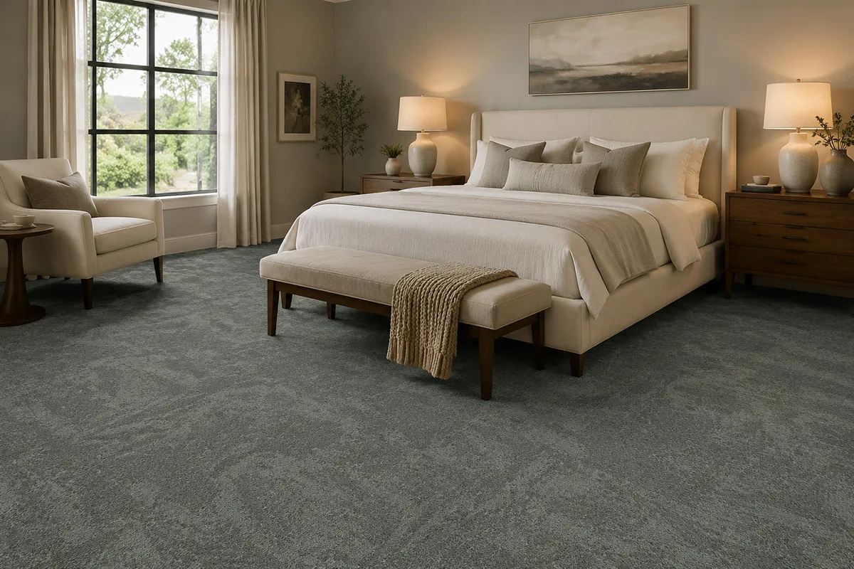
Bedrooms usually receive lighter traffic than kitchens and entryways, allowing comfort to lead the decision. Carpet makes the room feel warmer and softer, reduces footstep noise and creates a comfortable surface when you get out of bed. It is also available in a wide range of fibers, constructions, patterns and colors, so it can be either a calm foundation or a design feature.

Cozy warm modern bedroom with Fabrica BRUSHstrokes carpet in Artist Beret

Your content goes here. Edit or remove this text inline or in the module Content settings. You can also style every aspect of this content in the module Design settings and even apply custom CSS to this text in the module Advanced settings.

Basement: Moisture-Aware LVP

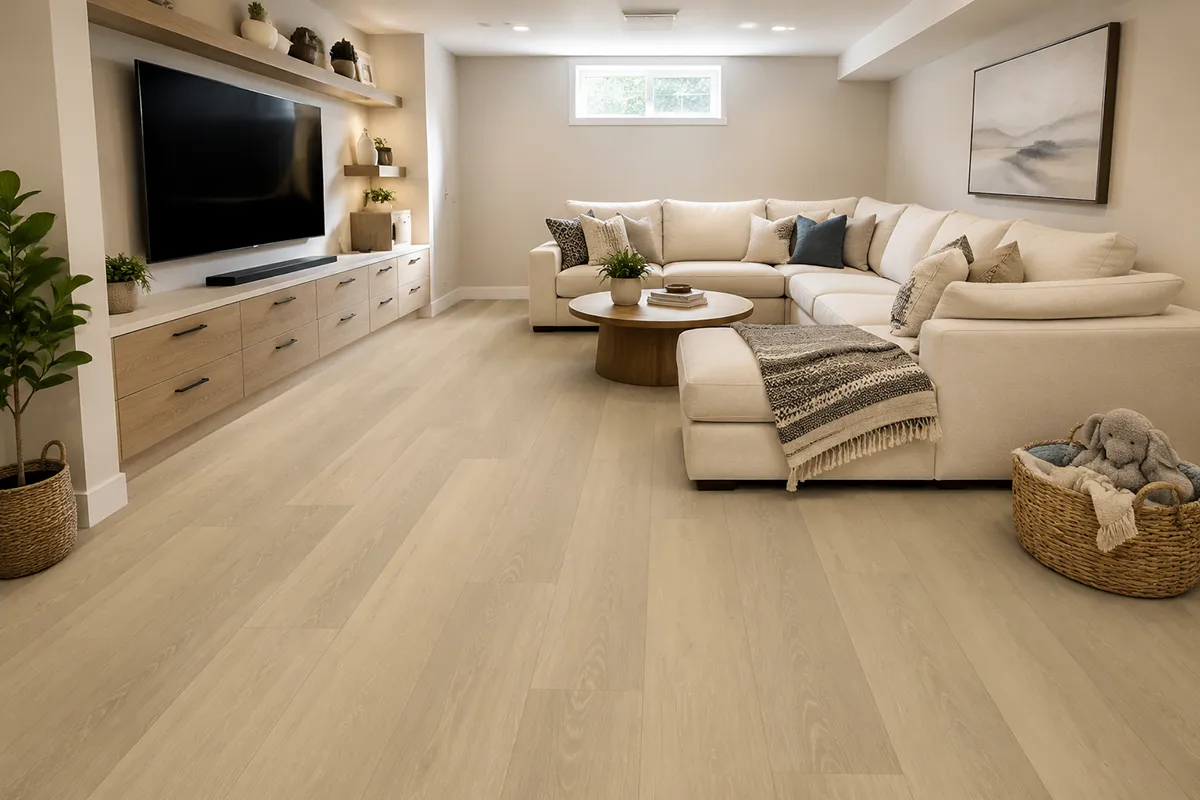
A finished basement can become a family room, playroom, gym, office or media space, but below-grade conditions make moisture evaluation essential. Quality rigid-core or flexible LVP is often considered because it can provide realistic wood visuals, comfortable resilient performance and easier care than many traditional materials.

basement-trucor-prime-xl-ashford-oak-lvp

Your content goes here. Edit or remove this text inline or in the module Content settings. You can also style every aspect of this content in the module Design settings and even apply custom CSS to this text in the module Advanced settings.

Stairs and Hallways: Carpet or a Properly Installed Runner

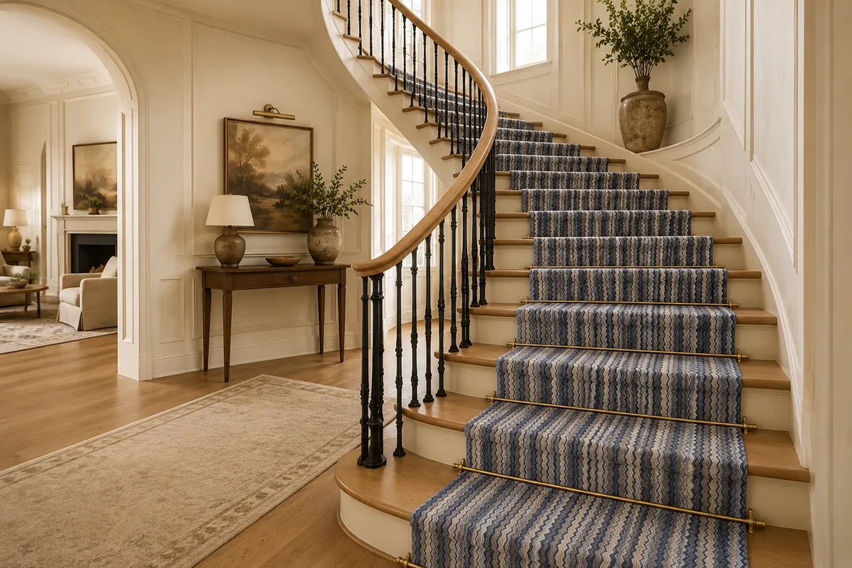
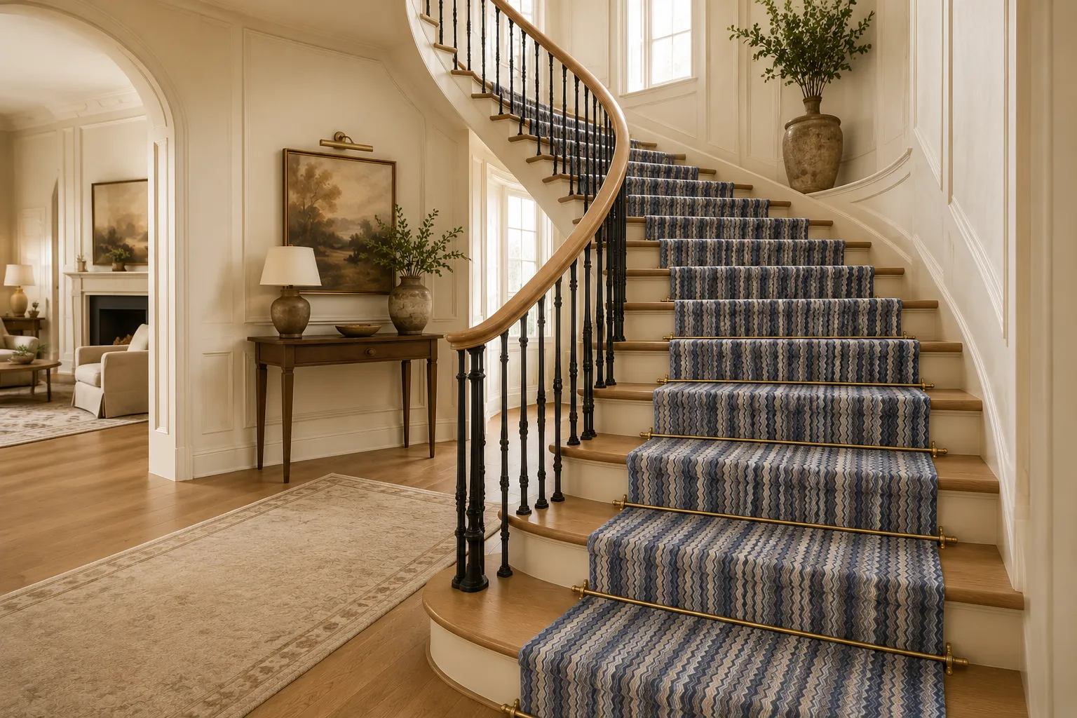
Stairs combine concentrated traffic with safety, comfort and sound concerns. Carpet can soften footsteps, reduce noise and cushion slips or falls. A stair runner also introduces pattern and color while leaving part of the wood stair visible.

Curved hardwood staircase with Prestige Missoni Forlini carpet runner in Cobalt

Your content goes here. Edit or remove this text inline or in the module Content settings. You can also style every aspect of this content in the module Design settings and even apply custom CSS to this text in the module Advanced settings.

Entryway and Mudroom: Tile or High-Performance LVP

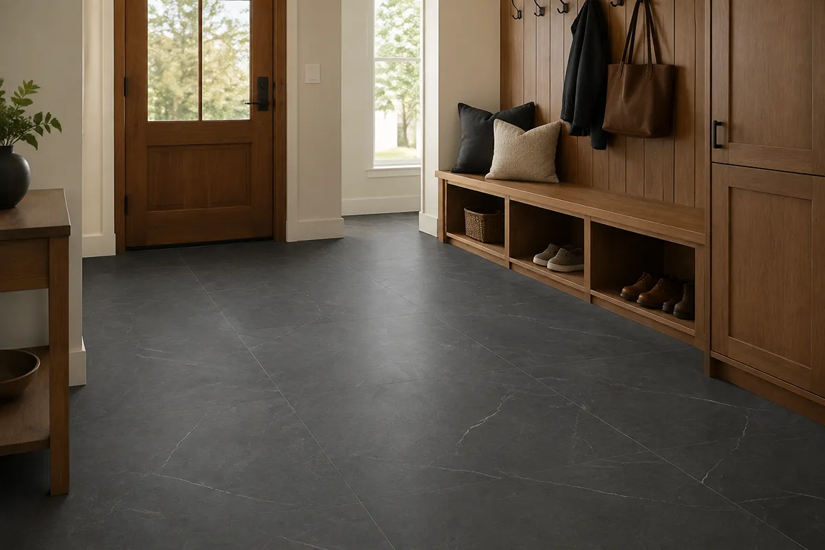
Entryways and mudrooms collect dirt, grit, rain and heavy traffic. Tile or performance LVP can make routine care easier, but the exact surface must be suitable for the expected moisture and wear. In an entry directly connected to the exterior, consider texture and traction as well as color.

Warm modern entryway and mudroom with TRUCOR Emperador Carbon tile flooring and built-in wood storage

Your content goes here. Edit or remove this text inline or in the module Content settings. You can also style every aspect of this content in the module Design settings and even apply custom CSS to this text in the module Advanced settings.

Home Office: Match the Floor to How You Work

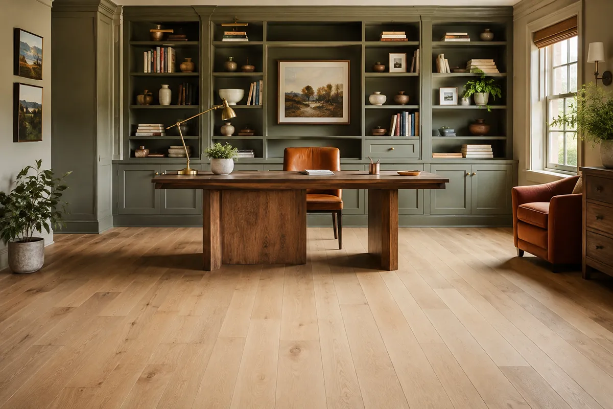
The best home-office floor depends on whether the room needs easy chair movement, quiet acoustics or a more residential feel. Hardwood or LVP allows an office chair to roll more easily and coordinates well with adjacent spaces. Carpet or carpet tile absorbs sound and can make calls and focused work feel quieter.

Warm contemporary home office with Fabrica Calais Basin Oak hardwood flooring and a built-in sage green library

Your content goes here. Edit or remove this text inline or in the module Content settings. You can also style every aspect of this content in the module Design settings and even apply custom CSS to this text in the module Advanced settings.

Laundry Room: Moisture-Tolerant, Easy-Care Flooring

Laundry rooms face splashes, detergent, vibration and the possibility of appliance leaks. Tile and appropriate resilient flooring are common choices because they are easier to clean and can be specified for moisture-prone settings. The floor should be installed over a sound, flat substrate, with transitions planned around adjacent rooms.

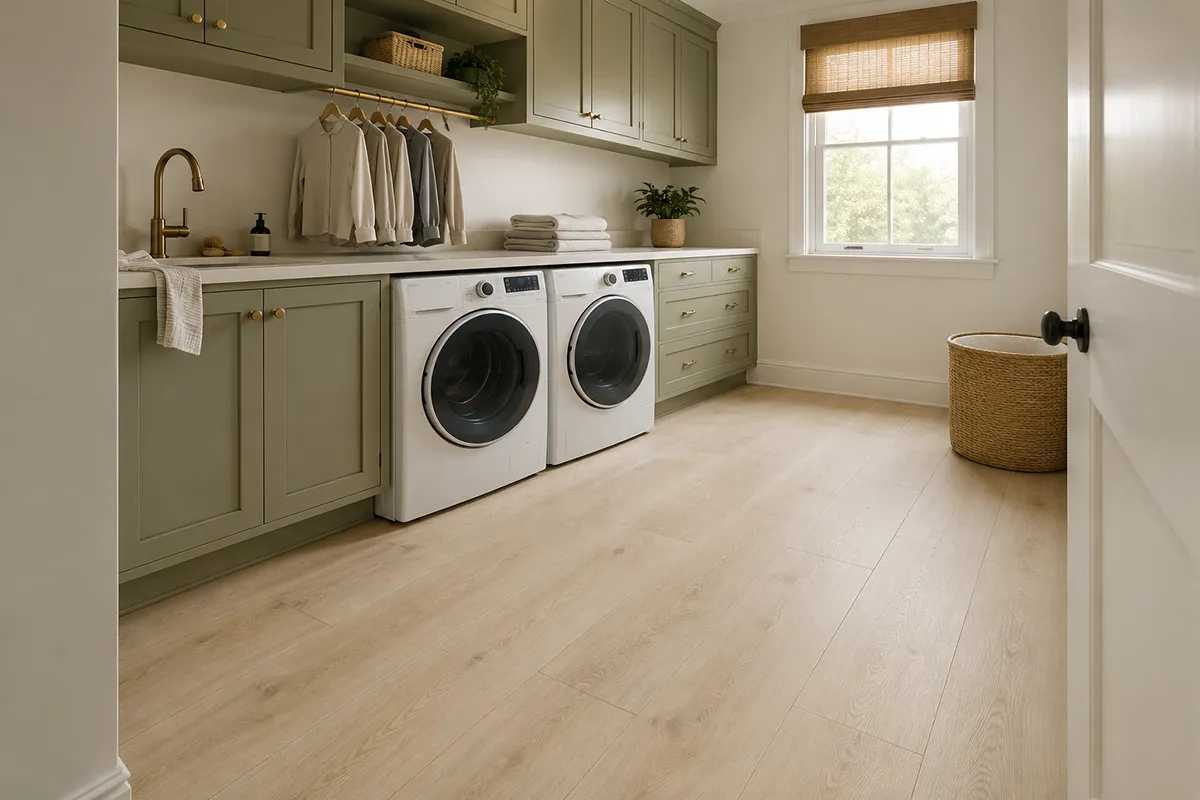
Warm contemporary laundry room with TRUCOR Tymbr XL Marbella flooring and sage green cabinetry

Your content goes here. Edit or remove this text inline or in the module Content settings. You can also style every aspect of this content in the module Design settings and even apply custom CSS to this text in the module Advanced settings.

Quick Room-by-Room Comparison

Room

Strong starting point

Main reason

Key check

Living / Dining

Hardwood

Natural warmth and continuity

Finish, traffic, humidity

Kitchen

LVP or tile

Maintenance and spill performance

Exact warranty and slip rating

Bathroom

Porcelain / ceramic tile

Wet-area suitability

Floor rating and traction

Bedroom

Carpet

Softness, warmth and quiet

Fiber, construction and cushion

Basement

LVP

Below-grade practicality

Moisture and subfloor testing

Stairs

Carpet / runner

Comfort, noise and safety

Stair suitability and pattern repeat

Entry / Mudroom

Tile or performance LVP

Traffic and easier cleaning

Traction and tracked-in moisture

Home Office

Hardwood, LVP or low-pile carpet

Chair movement or acoustics

Caster compatibility

Laundry

Tile or resilient flooring

Moisture-aware maintenance

Leaks, substrate and installation

How to Keep Different Floors Visually Connected

Using more than one flooring type does not have to make a home feel chopped up. The goal is coordination, not exact matching.

  • Repeat warm or cool undertones across adjacent materials.
  • Limit unnecessary transitions, especially in open sight lines.
  • Compare full-size samples beside cabinets, countertops, rugs and paint.
  • Check samples in morning daylight, evening light and the room’s artificial lighting.
  • Plan transition locations before ordering so changes happen at natural architectural boundaries.
  • Use a consistent level of visual movement: a strongly patterned floor usually needs quieter neighboring materials.

Common Flooring Mistakes to Avoid

  • Choosing color before performance: A beautiful floor is disappointing if it is not suitable for the room.
  • Assuming every product in a category is equal: Construction, finish, wear layer, fiber, installation and warranty vary widely.
  • Ignoring the subfloor: Flatness, moisture and preparation can affect appearance, performance and warranty.
  • Ordering from a tiny sample: Color variation, plank movement and carpet pattern scale become clearer in larger samples.
  • Forgetting transitions and stairs: These details influence both the design and the final cost.
  • Using “pet-proof” as a blanket promise: Look for specific stain, soil, scratch and pet-warranty language for the exact product.
  • Selecting each room separately: Materials should be viewed together so undertones and transitions feel intentional

Frequently Asked Questions

Sometimes, especially across an open main level, but one material may not be ideal for every moisture, comfort and traffic condition. Many homes work better with coordinated materials rather than one floor everywhere.

There is no single answer. Consider scratch visibility, stain resistance, cleaning, traction, noise and the manufacturer’s pet warranty. Textured mid-tone hard surfaces and durable stain-resistant carpets are common starting points.

No. Performance depends on the exact construction and manufacturer claims. Even a waterproof plank does not eliminate the need to address seams, perimeter conditions, subfloor moisture or leaks.

It can work in some kitchens when the product, installation and household habits are appropriate, but it requires prompt spill cleanup and moisture control. LVP or tile may be more practical for households prioritizing easier moisture management.

Continuous flooring, fewer transitions, wider visual lines and lighter-to-medium tones can help a space feel more open. The room’s light, plank direction, grout contrast and overall material palette also affect perception.

Yes. Showroom lighting and home lighting can change color and undertones. Whenever possible, compare larger samples in the actual space and beside fixed finishes.

Make the Final Decision With the Materials Together

The best flooring plan is built around the way you live and the conditions of each room. Hardwood can bring natural character to living spaces, carpet can add comfort and quiet to bedrooms and stairs, LVP can offer practical performance in kitchens and basements, and tile can provide a durable solution for bathrooms and busy entries. The right combination should feel connected, perform appropriately and support the home for years—not simply follow a trend.

At Karpet King Design Center, you can compare hardwood, luxury vinyl plank, carpet, custom rugs and tile in one Rockville showroom. Seeing materials together at a larger scale makes it easier to coordinate undertones, textures, transitions and the practical needs of every room.

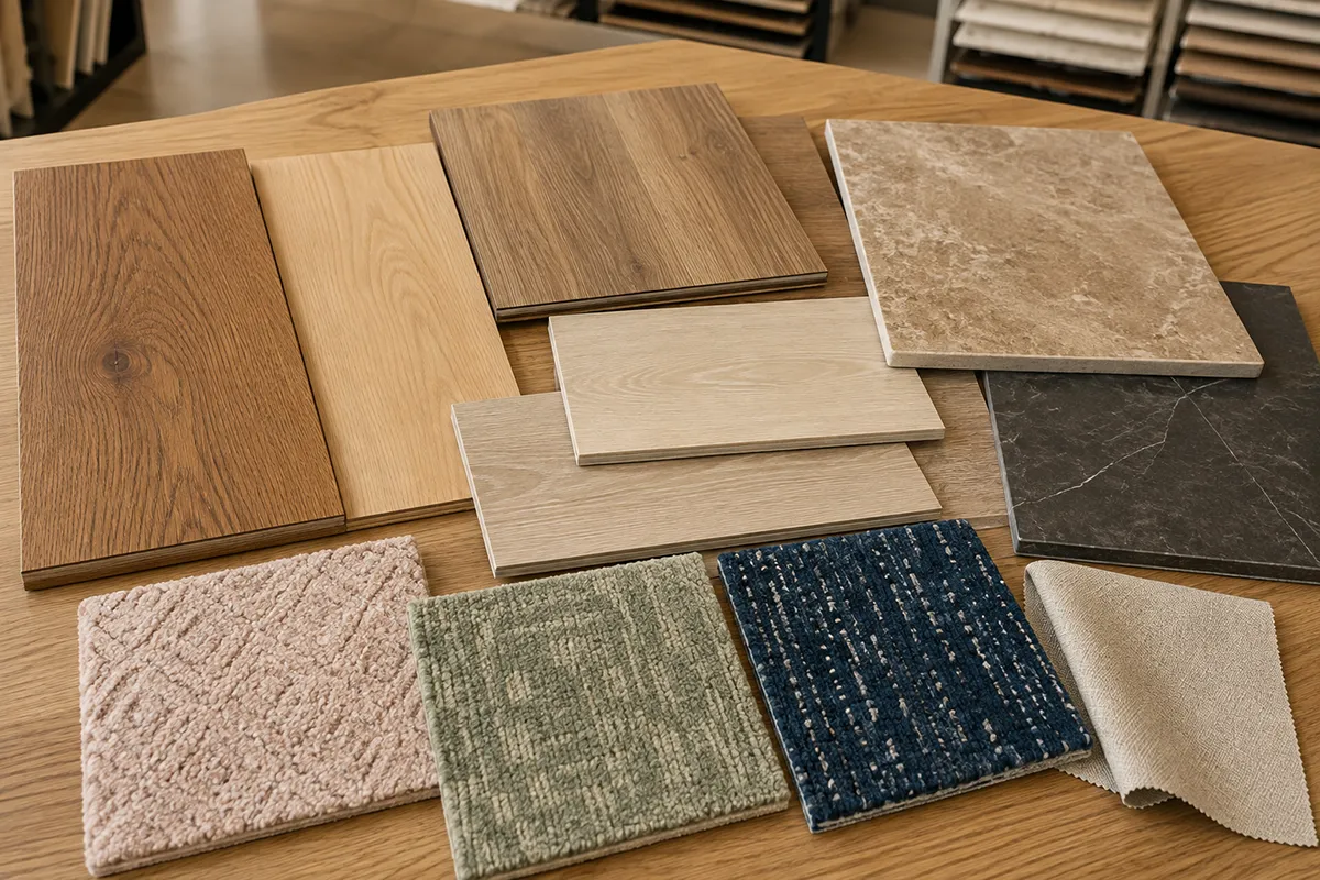
Hardwood, carpet, luxury vinyl plank and tile samples coordinated on a flooring showroom design table

Visit our Rockville showroom:

Karpet King Design Center
751 East Gude Drive
Rockville, MD 20850
Phone: (301) 770-4110
Email: [email protected]

. Serving Rockville, Bethesda, Potomac, Chevy Chase, Gaithersburg, Washington, DC, Northern Virginia and surrounding communities.

How to Choose Kitchen Cabinet Colors That Will Still Look Beautiful in 10 Years

How to Choose Kitchen Cabinet Colors That Will Still Look Beautiful in 10 Years

How to Choose Kitchen Cabinet Colors That Will Still Look Beautiful in 10 Years

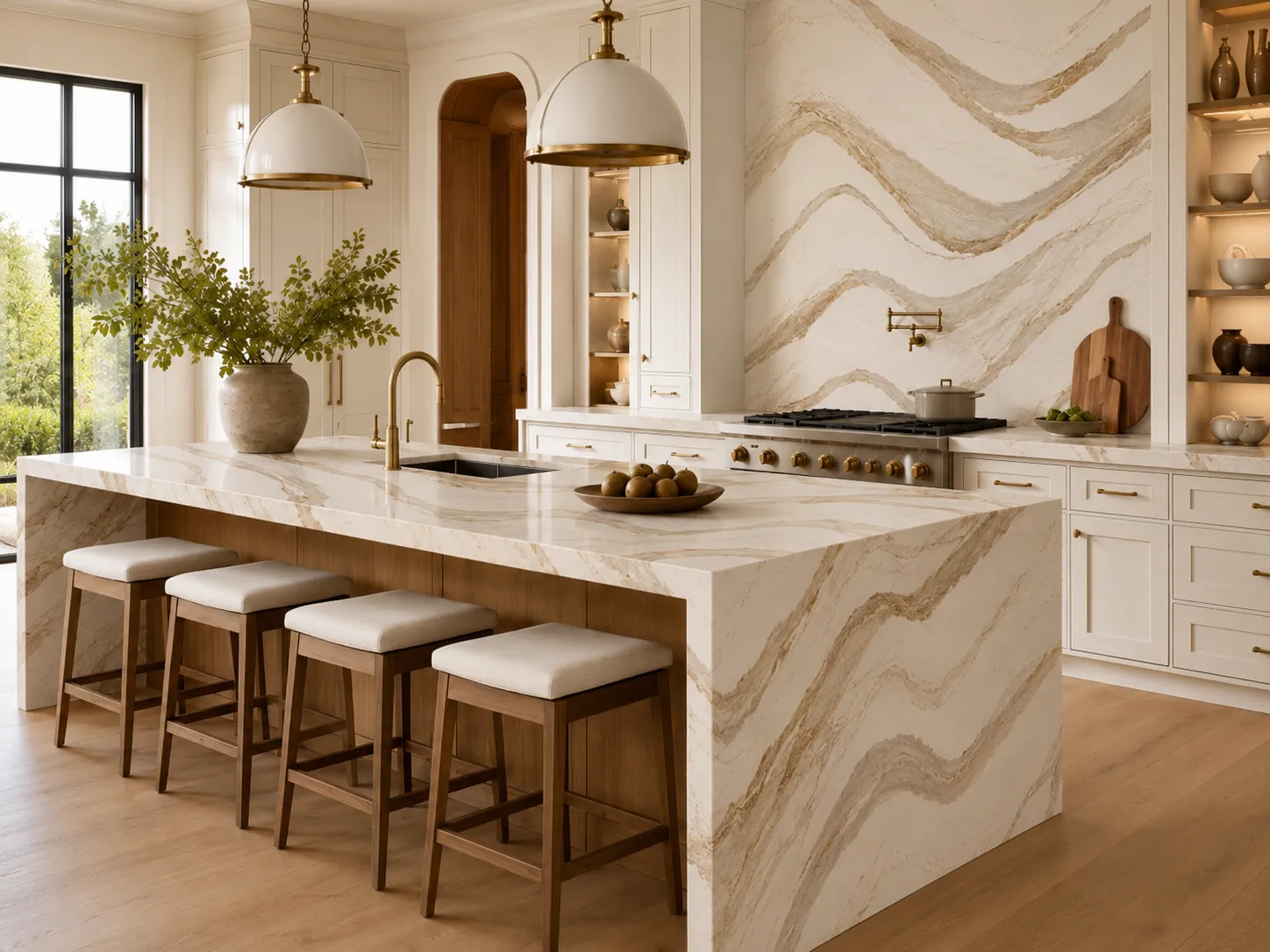
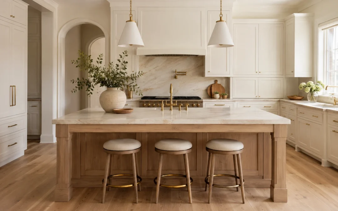
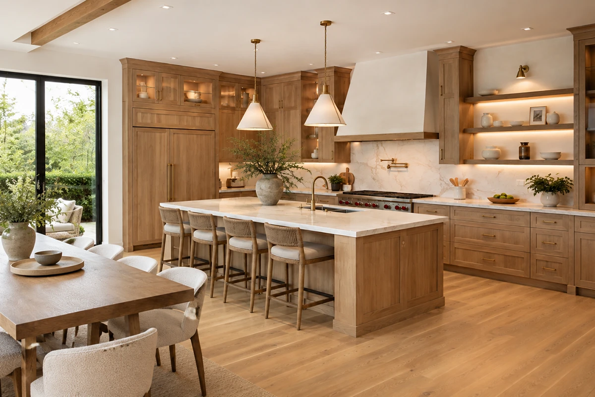
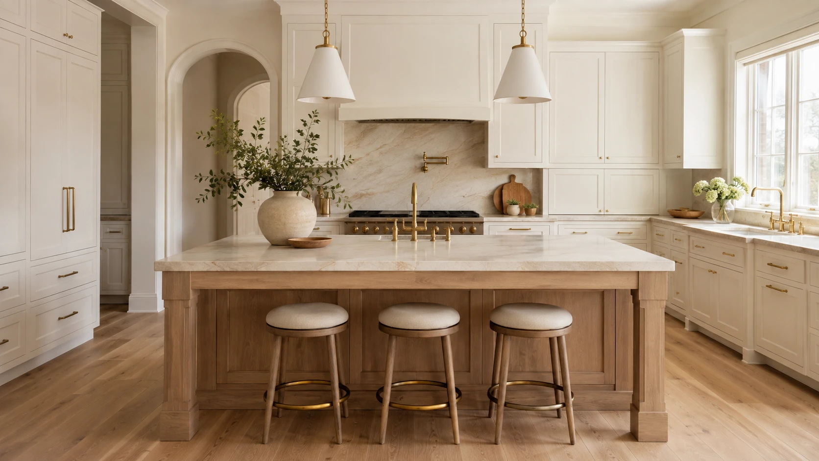
Warm off-white kitchen cabinets with a natural white oak island, creamy stone countertops, brass hardware, and light oak flooring.

Choosing a kitchen cabinet color can feel more permanent than almost any other design decision. Wall paint, lighting, and accessories can be replaced relatively easily, but cabinetry covers a large portion of the room and represents a significant investment.

The goal is not simply to choose the safest color or copy the latest kitchen trend. The goal is to select a finish that works with your home’s architecture, natural light, flooring, countertops, and overall atmosphere—so the kitchen continues to feel balanced and intentional years from now.

Before choosing your kitchen cabinetry, use the following principles to create a palette that feels current today but remains adaptable for the future.

What Current Kitchen Research Tells Us

According to the 2026 Houzz Kitchen Trends Study, wood became the most selected cabinet finish among renovating homeowners, narrowly moving ahead of white. Medium and light wood tones accounted for most wood selections, while off-white remained an important choice. Green also moved slightly ahead of gray.

The 2026 NKBA Kitchen Trends Report similarly points toward neutrals, greens, blues, natural materials, and wood grain. It also shows that homeowners and designers are increasingly using stronger colors on islands, backsplashes, and decorative features instead of applying them to every surface.

These findings do not mean that one color is guaranteed to remain timeless. They show a broader movement toward warmth, natural texture, and colors that feel connected to the rest of the home.

1. Start With the Permanent Materials

Do not begin with a cabinet paint swatch. Begin with the elements that will be the most expensive or difficult to replace:

  • Flooring
  • Countertops
  • Natural stone
  • Backsplash
  • Existing woodwork
  • Adjacent-room finishes
  • Large appliances that will remain

2. Understand Undertones

Two colors may both be called white, beige, gray, green, or blue but look completely different once installed. Common undertones include:

Yellow or cream

  • Pink or red
  • Green
  • Blue
  • Violet
  • Brown
  • Gray
Cool white, warm white, and soft greige Shaker cabinet door samples displayed together on a light stone countertop.

3. Consider How You Want the Kitchen to Feel

Color psychology can be useful, but it should be treated as a guide rather than a strict formula.

A 2025 systematic review of 132 peer-reviewed studies found that people form recurring emotional associations with color. Lightness, saturation, and hue all influence those associations, but culture, personal experience, context, and surrounding materials also matter.

In a kitchen, these general impressions may help guide your selection:

Warm white and off-white

These colors can make a kitchen feel bright, gentle, and welcoming, especially when paired with warm flooring and natural materials.

Natural wood

Wood often creates a grounded, tactile, and organic atmosphere. The visible grain adds movement and character without requiring a strong painted color.

Warm white, muted sage green, and navy cabinet door samples coordinated with stone, tile, wood, and brass hardware.

Muted green

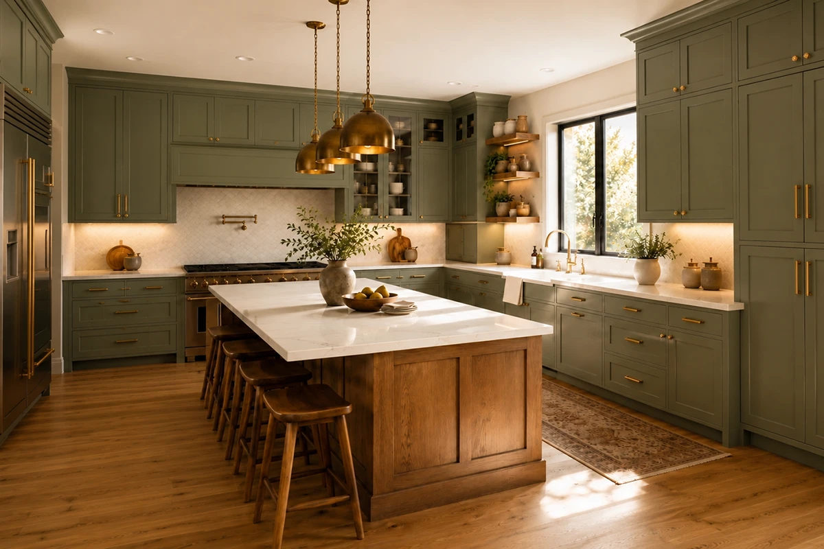
Sage, olive, and gray-green finishes can feel calm and connected to nature. A muted green usually adapts more easily than a highly saturated emerald or lime.

Blue and navy

Soft blue can feel relaxed and composed. Navy creates greater contrast, formality, and visual depth.

Taupe, mushroom, and greige

These shades can create a quiet, layered neutral palette without the sharpness of bright white or the coolness of traditional gray.

Burgundy and deep red

These colors feel warmer, richer, and more expressive. They may work best as a carefully coordinated statement rather than an automatic neutral.

Do not assume that every green will feel calming or every white will make a room feel larger. A bright, highly saturated green can feel energetic, while a gray-green sage may feel softer. The complete effect depends on lighting, surface area, saturation, and the materials around it.

Ask yourself:

How do I want this kitchen to feel during everyday life?

4. Choose a White That Works With the Home

White cabinetry can still be a long-lasting choice, but stark white is not always the most adaptable option.

Very bright or blue-white cabinetry may feel harsh in a room with:

    • Warm wood flooring
    • Creamy countertops
    • Limited natural light
    • Beige or warm-gray walls
    • Brass or bronze finishes

Softer alternatives include:

    • Warm white
    • Creamy white
    • Soft ivory
    • Off-white
    • Pale greige
    • Light mushroom

These finishes can keep the kitchen feeling bright while creating a softer relationship with wood, natural stone, and adjoining living spaces. Always compare the cabinet sample with the countertop. A cabinet may look warm white by itself but suddenly appear yellow, gray, or pink beside the chosen stone.

5. Treat Natural Wood as a Neutral

The final result depends on:

  • Wood species
  • Grain pattern
  • Stain color
  • Door profile
  • Hardware
  • Countertop
  • Backsplash
  • Overall architecture

White oak, walnut, maple, and other wood finishes can work in modern, organic, transitional, and classic kitchens.

For a design that can adapt over time, consider:

  • Natural or lightly stained wood
  • Light or medium wood tones
  • Low-sheen finishes
  • Simple Shaker or flat-panel doors
  • Stains that allow the grain to remain visible

The 2026 NKBA report identified wood grain as a growing cabinet direction and white oak as the leading wood species among surveyed professionals.

Avoid choosing an intense stain only because it is temporarily popular. A finish that respects the wood’s natural character is often easier to coordinate with future paint, hardware, and décor changes.

Close-up of light natural oak kitchen cabinets with subtle wood grain, creamy stone countertops, and brushed brass hardware.

6. Choose Grounded Colors Instead of Extremely Saturated Ones

Colorful cabinets can age beautifully when the shade is connected to natural materials and the architecture of the home.

Potentially adaptable colors include:

  • Muted sage
  • Deep olive
  • Soft blue-gray
  • Navy
  • Warm taupe
  • Mushroom
  • Deep burgundy

The difference is often in the saturation.

Timeless olive green Shaker kitchen cabinets with a natural wood island, white stone countertops, brass hardware, warm lighting, and oak flooring.

A gray-green sage may behave almost like a neutral. A bright, highly saturated green may dominate the entire room and limit future changes.

Before ordering colorful cabinetry, ask:

  • Does it coordinate with the flooring?
  • Does it appear in the countertop veining?
  • Does it work in both daylight and artificial light?
  • Can the hardware be changed later without disrupting the palette?
  • Would I still choose it if it were not currently trending online?

7. Use a Contrasting Island Strategically

A two-tone kitchen can feel custom and layered, but the island should relate to another element in the room.

Successful combinations may include:

  • Warm white cabinets with a natural oak island
  • Navy cabinets with a warm white island
  • Muted green cabinets with a light wood island
  • Off-white cabinets with a taupe island
  • Natural wood cabinets with a soft painted island

The contrasting color might connect with the floor, countertop veining, hardware, nearby furniture, or architectural details.

Current NKBA research suggests that islands are one of the leading locations for statement color, making them a practical way to introduce personality without applying a bold finish throughout the entire kitchen.

When developing a two-tone palette, treat the cabinets, island, flooring, countertops, and backsplash as one coordinated kitchen remodeling design, not as separate purchases.

Timeless olive green Shaker kitchen cabinets with a natural wood island, white stone countertops, brass hardware, warm lighting, and oak flooring.

8. Test Large Samples in the Actual Lighting

Cabinet colors can change dramatically throughout the day. A finish may appear: 

  • Darker in a north-facing room
  • Warmer in afternoon sunlight
  • Greener beside warm wood
  • Bluer under cool LED bulbs
  • Flatter in a room with limited daylight
  • More intense across an entire wall than on a small sample

Whenever possible, review a full cabinet-door sample rather than a small paint chip.

Place it vertically, because cabinet doors will not be viewed flat on a table. Observe it in:

  • Morning daylight
  • Afternoon light
  • Evening light
  • Ceiling lighting
  • Pendant lighting
  • Under-cabinet lighting

Natural and task lighting are major considerations in current kitchen planning, so the cabinet finish should be evaluated under the lighting that will actually be used in the completed room.

During an interior design consultation, cabinet doors can be compared with stone, flooring, tile, paint, and hardware before the order is placed. Karpet King’s consultation service specifically includes color-palette development and coordination among these materials.

9. Think Beyond the Current Trend Cycle

Trends can provide inspiration, but they should not be the only reason behind a permanent design decision.

Ask yourself:

  • Does this color suit the age and architecture of the home?
  • Does it work with the permanent materials?
  • Would I still like it if I stopped seeing it on social media?
  • Can I refresh the kitchen later with different hardware or wall paint?
  • Does the color support the atmosphere I want?
  • Does it connect naturally with adjoining rooms?

A timeless kitchen does not have to be white, beige, or conservative. A navy, green, wood, or burgundy kitchen can remain beautiful when the color has a clear relationship with the rest of the design.

10. Consider the Material Beneath the Finish

The same color can appear different depending on whether it is applied to:

  • Solid wood
  • MDF
  • Wood veneer
  • Plywood
  • Another engineered material

Painted MDF may create a very smooth, consistent surface. Painted solid wood may retain subtle grain and may show fine movement at the joints over time.

Stained cabinetry behaves differently because the wood species affects how the stain is absorbed. The same stain may look warmer, darker, or more varied on oak, maple, cherry, or walnut.

Common Cabinet-Color Mistakes

Choosing from a small swatch

A small sample cannot show how a color will feel across an entire wall of cabinetry. Request the largest sample available.

Ignoring the flooring

Cabinets and floors occupy large visual areas. Conflicting undertones can make the entire kitchen feel disconnected.

Selecting the countertop afterward

Cabinetry and countertops should be developed together. Neither should become an afterthought.

Copying a kitchen with different lighting

A deep green kitchen shown in a large, sunny home may look very different in a smaller room with limited daylight.

Using too many competing finishes

Cabinets, island, flooring, stone, tile, wall paint, hardware, and lighting should not all compete for attention. Decide which element will lead the design.

Choosing a trend instead of a complete palette

A fashionable cabinet color does not guarantee a successful kitchen. Coordination is more important than popularity.

For broader project planning, read How to Plan a Kitchen Remodel Without Stress in the DMV Area.

Showroom Checklist: What to Bring

Bring the following items when comparing cabinet colors:

  • Flooring sample
  • Countertop or stone sample
  • Backsplash ideas
  • Photos of the kitchen in daylight
  • Photos of adjoining rooms
  • Approximate measurements
  • Inspiration images
  • Existing finishes that must remain
  • Appliance colors
  • Preferred hardware finishes

At the showroom:

  • View cabinet doors vertically
  • Compare warm and cool versions of the same color
  • Place the cabinet, countertop, flooring, and hardware together
  • Look at the samples under more than one light source
  • Ask about the cabinet material and finish
  • Ask whether touch-up products are available
  • Photograph the complete combination for later review

A cabinet color that remains beautiful for years is not necessarily the palest or safest option. It is the color that works with the home’s architecture, permanent materials, lighting, and the emotional atmosphere you want the kitchen to create.

Current research points toward natural wood, softened whites, grounded neutrals, greens, and blues. However, long-term satisfaction depends more on careful coordination than on choosing the most popular color of the year.

Compare real cabinet doors with your flooring, countertop, backsplash, and hardware before making the final decision. The goal is not to find one universally timeless color. It is to create a kitchen that feels personal, balanced, and adaptable.

Visit our Rockville showroom to compare cabinetry, countertops, flooring, tile, and hardware in person.

Book an interior design consultation at Karpet King Design Center in Rockville, Maryland.

Kitchen cabinet showroom featuring white, blue, and sage green display cabinets, countertop samples, sinks, and a central hardware selection tower.

How to Build the Perfect Bathroom Color and Material Palette

How to Build the Perfect Bathroom Color and Material Palette A successful bathroom should feel good at 7 a.m. on a busy weekday and still feel relaxed at the end of the day. It needs to manage water, humidity, storage, lighting and daily traffic while also supporting...
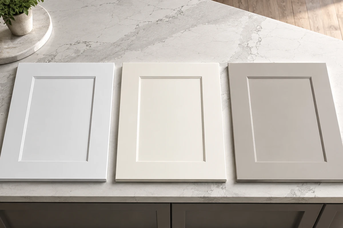
Bathroom Design Guide: How to Create a Beautiful and Functional Bathroom

Bathroom Design Guide: How to Create a Beautiful and Functional Bathroom A successful bathroom should feel good at 7 a.m. on a busy weekday and still feel relaxed at the end of the day. It needs to manage water, humidity, storage, lighting and daily traffic while also...
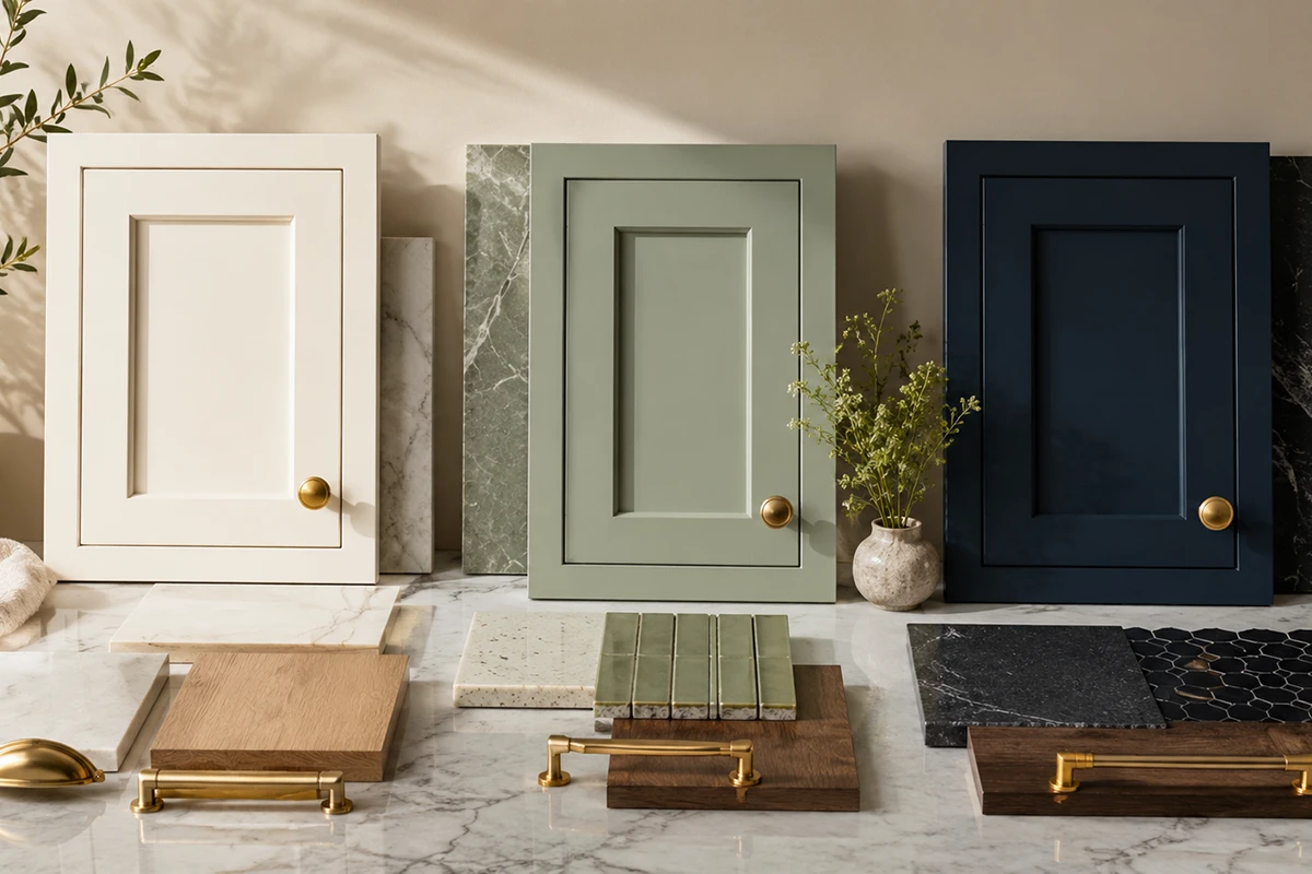
Hardwood Flooring Guide for Maryland Homes: 10 Smart Decisions Before You Buy

Hardwood Flooring Guide for Maryland Homes: 10 Smart Decisions Before You Buy Choosing hardwood flooring is one of the most permanent design decisions in a home. The right floor has to work with your architecture, daily routine, lighting, cabinetry and long-term...

How to Choose the Right Flooring for Every Room

How to Choose the Right Flooring for Every Room in Your Home Flooring is one of the largest visual surfaces in a home, but appearance is only part of the decision. The right floor must also match the way a room is used: how much foot traffic it receives, whether water...

How to Choose Kitchen Cabinet Colors That Will Still Look Beautiful in 10 Years

How to Choose Kitchen Cabinet Colors That Will Still Look Beautiful in 10 Years Choosing a kitchen cabinet color can feel more permanent than almost any other design decision. Wall paint, lighting, and accessories can be replaced relatively easily, but cabinetry...

Shaker vs. Flat-Panel Cabinets: Which Style Is Right for Your Kitchen?

Shaker vs. Flat-Panel Cabinets: Which Style Is Right for Your Kitchen? Choosing between Shaker cabinets vs. flat-panel cabinets is one of the most important visual decisions in a kitchen remodel. Cabinet doors cover a large portion of the room, so their profile...

How to Create a Warm Modern Interior Without Making It Dark

How to Create a Warm Modern Interior Without Making Your Home Feel Dark Warm modern design in 2026 is no longer limited to cream walls, pale oak, and layers of beige. Today’s interiors are becoming richer, more natural, and more personal, with medium-toned woods,...

Statement Stone & Large Slab Surfaces Are Taking Over Luxury Interiors

Statement Stone & Large Slab Surfaces Are Taking Over Luxury Interiors QUARTZ  : Cambria, Brittanicca Gold WarmTM Luxury interiors are becoming warmer, bolder, and more architectural. One of the biggest design shifts leading this change is the rise of statement stone...

Bathroom Remodeling Trends Defining Luxury Homes in 2026

Bathroom Remodeling Trends Defining Luxury Homes in 2026 For years, luxury bathrooms were defined by bright white finishes, cool gray palettes, and minimalist styling. While those trends once felt modern, homeowners in 2026 are embracing something warmer, richer, and...

2026 Luxury Kitchen Trends Maryland Homeowners Are Choosing

2026 Luxury Kitchen Trends Maryland Homeowners Are Choosing Kitchen design is evolving rapidly, and in 2026 luxury kitchens are becoming warmer, more personalized, and more connected to the way families live every day. Across Maryland, Washington DC, and Northern...

Shaker vs. Flat-Panel Cabinets: Which Style Is Right for Your Kitchen?

Shaker vs. Flat-Panel Cabinets: Which Style Is Right for Your Kitchen?

Shaker vs. Flat-Panel Cabinets: Which Style Is Right for Your Kitchen?

Side-by-side kitchen comparison showing slim Shaker cabinets and flat-panel cabinets in the same warm neutral finish.

Choosing between Shaker cabinets vs. flat-panel cabinets is one of the most important visual decisions in a kitchen remodel. Cabinet doors cover a large portion of the room, so their profile affects the kitchen’s character, perceived size, maintenance needs, and relationship with the rest of the home.

Shaker cabinets introduce subtle framing and architectural depth. Flat-panel cabinets create a smoother, more continuous appearance. Neither is automatically more timeless or higher quality, the right option depends on your architecture, lifestyle, materials, and preferred level of visual detail.

Before selecting your kitchen cabinetry, compare how each door style will function throughout the entire room, not only how one sample looks in isolation.

What Current Kitchen Research Shows

Shaker remains the most widely selected cabinet-door style among renovating homeowners. The 2025 U.S. Houzz Kitchen Trends Study found that 61% of homeowners chose Shaker-style doors, compared with 22% who selected flat-panel doors and 12% who selected raised-panel designs.

At the same time, flat-panel cabinetry is gaining attention in forward-looking kitchen design. The NKBA’s 2026 Kitchen Trends Report found that 69% of surveyed professionals identified flat slab cabinet doors as a feature expected to gain popularity, alongside minimalist layouts and integrated appliances.

Together, these findings suggest that Shaker remains the established favorite, while flat-panel cabinetry is an increasingly important choice for contemporary and visually quiet kitchens.

First, Understand the Difference

A Shaker-style door has a simple rectangular frame surrounding a recessed center panel. It provides definition without the carving or ornamentation found on many traditional raised-panel doors.

A flat-panel, or slab, door has a smooth front with no raised or recessed center panel. MasterBrand distinguishes the two by describing Shaker doors as simple recessed-panel designs and slab doors as flat surfaces that are neither raised nor recessed.

The phrase flat panel can occasionally cause confusion because some manufacturers also use it to describe the flat center panel inside a framed door. When speaking with a showroom consultant, clarify whether you mean:

  • A five-piece recessed-panel Shaker door
  • A completely smooth slab door

Option A: Shaker Cabinets

What Do Shaker Cabinets Look Like?

Shaker cabinets feature rails and stiles forming a rectangular frame around a recessed center panel. The design is structured but restrained, making it less ornate than traditional cabinetry and more detailed than a slab front.

Not all Shaker doors look the same. The width of the frame has a significant effect:

  • Standard Shaker: wider rails and stiles with a classic, substantial appearance
  • Slim Shaker: narrower framing with a cleaner, more contemporary character
  • Shaker with slab drawers: framed doors paired with smooth drawer fronts
  • Five-piece drawer Shaker: matching framed profiles on doors and drawers

Always review the exact door style on several cabinet sizes before ordering.

Transitional kitchen with warm Shaker cabinets, recessed panel doors, stone countertops, and understated metal hardware.

Why Shaker Cabinets Remain Popular

They adapt to many design styles

Shaker cabinets can work in:

  • Transitional kitchens
  • Classic interiors
  • Modern farmhouse homes
  • Organic-modern kitchens
  • Coastal spaces
  • Updated traditional homes

Their appearance changes according to the finish and surrounding materials. Warm white Shaker doors can feel classic, while slim white-oak Shaker cabinets can feel clean and contemporary.

They add architectural depth

The recessed panel creates subtle shadow lines across the cabinetry. This helps define large cabinet walls and adds structure without requiring decorative molding or carving.

Shaker doors can be particularly effective when paired with:

  • Quiet countertops
  • Simple backsplashes
  • Paneled appliances
  • Traditional trim
  • Furniture-style islands
  • Glass-front accent cabinets
They offer broad hardware flexibility

Shaker cabinets coordinate easily with many hardware styles:

  • Traditional knobs
  • Cup pulls
  • Short bar pulls
  • Long contemporary pulls
  • Brass, bronze, nickel, or black finishes

Changing the hardware in the future can refresh the kitchen without replacing the cabinetry.

They bridge traditional and modern design

A standard Shaker profile tends to feel more classic, while a slim Shaker profile can create a cleaner and more architectural appearance.

This makes Shaker useful for homeowners who want an updated kitchen that still feels connected to the age or architecture of the home.

Potential Drawbacks of Shaker Cabinets

They require more detailed cleaning

The inside edges surrounding the recessed panel can collect dust, crumbs, or cooking residue. Routine cleaning is still straightforward, but it takes slightly more attention than wiping a completely smooth slab door.

Wide frames can create visual busyness

In a kitchen with many narrow doors and drawers, Shaker framing introduces repeated horizontal and vertical lines.

This can feel crowded when combined with:

  • Highly patterned countertops
  • Decorative backsplash tile
  • Elaborate hardware
  • Extensive molding
  • Many small cabinet sections

A slim Shaker profile or slab drawer front can reduce that visual weight.

Door proportions matter

A frame that looks elegant on a tall pantry door may feel compressed on a narrow cabinet or shallow drawer.

Ask to see the chosen profile on:

  • Small drawer fronts
  • Wide drawers
  • Narrow wall cabinets
  • Tall pantry cabinets
  • Appliance panels

Shaker Cabinets Are Best For

Shaker may be the stronger choice when you want:

  • Architectural detail without ornament
  • A transitional or classic foundation
  • Flexibility with hardware and finishes
  • A style that works with changing décor
  • Broad appeal for future resale
  • A balance between traditional and contemporary design

Option B: Flat-Panel Cabinets

What Do Flat-Panel Cabinets Look Like?

Flat-panel cabinets use smooth slab doors without a separate surrounding frame or recessed center.

Because the surface is uninterrupted, the eye focuses more strongly on:

  • Cabinet proportions
  • Alignment
  • Wood grain
  • Finish quality
  • Door spacing
  • Hardware placement
  • Material texture

Flat-panel doors are often paired with frameless cabinet construction to create tighter reveals and a more continuous façade.

Modern kitchen with smooth flat-panel cabinets, natural wood grain, minimal hardware, and integrated appliances.

Why Homeowners Choose Flat-Panel Cabinets

They create a cleaner visual field

Flat-panel doors reduce the number of lines across the room. This can make cabinetry feel quieter, more integrated, and more architectural.

They are especially effective when the kitchen already contains a strong focal point, such as:

  • Dramatic stone
  • A full-height backsplash
  • Sculptural lighting
  • A statement island
  • Strong wood grain
  • Large architectural windows
They showcase materials

A broad slab surface is ideal for highlighting:

  • Natural oak or walnut veneer
  • Sequence-matched wood grain
  • Matte paint
  • Textured laminate
  • Acrylic
  • High-gloss finishes
  • Engineered wood surfaces

MasterBrand notes that contemporary cabinet materials such as veneer, laminate, and acrylic can offer consistent color, grain, and finish options.

With natural wood slab doors, the grain itself becomes a primary design feature.

They are generally quicker to wipe

A flat surface has no recessed corners or frame edges. This can make routine cleaning simpler.

However, the finish still matters. Dark matte doors may reveal fingerprints, while glossy doors may show reflections and smudges more readily.

They work well in compact kitchens

Flat-panel fronts can reduce repeated visual interruptions in a small room. They may help a compact kitchen feel calmer, especially when paired with a light or medium finish and consistent hardware.

They do not automatically make the room larger, though. Lighting, contrast, cabinet height, and layout remain equally important.

Potential Drawbacks of Flat-Panel Cabinets

Alignment must be precise

Simple cabinet fronts make inconsistencies easier to notice. Uneven gaps, misaligned drawers, or poorly placed fillers can stand out more clearly than they might on a detailed door.

Professional measurement and installation are particularly important.

Some combinations can feel cold

Flat-panel cabinets are not inherently cold, but an all-white glossy kitchen with cool lighting and minimal texture may feel clinical.

To create warmth, consider pairing slab doors with:

  • Natural wood
  • Warm stone
  • Brass or bronze hardware
  • Textured tile
  • Soft lighting
  • Handmade accessories
  • Low-sheen finishes
Edge quality becomes more visible

Because slab doors do not have a frame, their edges are an important part of the finished appearance.

Ask:

  • Is the door solid wood, MDF, veneer, laminate, or acrylic?
  • How are the edges finished?
  • Is edge banding visible?
  • Can grain be matched across adjoining fronts?
  • Is the finish repairable?
  • Are replacement doors available?
Handleless systems require planning

Flat-panel kitchens are often shown without visible hardware, but handleless cabinetry may require:

  • Integrated channels
  • Finger pulls
  • Push-to-open mechanisms
  • Recessed rails
  • Additional appliance coordination

Test the system in person. A minimal appearance is not useful if the doors feel uncomfortable to open every day.

Flat-Panel Cabinets Are Best For

Flat-panel cabinetry may suit:

  • Contemporary kitchens
  • Minimal interiors
  • Mid-century-inspired homes
  • Modern open-concept spaces
  • Small kitchens needing less visual interruption
  • Natural wood designs where grain is the focal point
  • Homeowners who prioritize quick surface cleaning
  • Projects with integrated appliances and precise architectural lines

Shaker vs. Flat-Panel Cabinets: Side-by-Side Comparison

Comparing cabinet doors under the same lighting makes differences in profile, material, and visual weight easier to see.

Standard Shaker, slim Shaker, painted slab, and wood flat-panel cabinet samples displayed with stone and hardware.


Consideration Shaker Cabinets Flat-Panel Cabinets
Appearance Framed and dimensional Smooth and uninterrupted
Typical direction Transitional, classic, farmhouse Modern, contemporary, minimal
Visual detail More shadow lines and structure Fewer lines and less interruption
Cleaning Frame edges require more attention Smooth fronts are generally quicker to wipe
Material emphasis Highlights profile and craftsmanship Highlights color, grain, and finish
Hardware Works with traditional or modern hardware Often paired with minimal or integrated pulls
Small kitchens Slim Shaker can work well Creates a quieter façade
Installation Alignment still matters Small alignment issues may be more visible
Natural wood Adds depth and visible construction Allows grain to become the main feature
Style flexibility Broad and highly adaptable Strongly shaped by finish and material
Comparison of cleaning a smooth flat-panel cabinet beside a framed Shaker cabinet door in a residential kitchen.

For a Busy Family Kitchen

Either style can work, but finish selection may matter more than the door profile.

Consider:

  • A durable low-sheen finish
  • Medium or softened colors
  • Easy-to-grasp hardware
  • Full-extension drawers
  • Soft-close hinges
  • Manufacturer-approved cleaning products

Flat-panel fronts may be faster to wipe, but a very dark matte slab can show fingerprints more easily than a medium-tone Shaker door.

For a Transitional Home

Shaker is often the most natural fit because it connects updated materials with traditional architectural details.

Consider:

  • Standard or slim Shaker doors
  • Warm white, mushroom, sage, or natural wood
  • Simple brass, nickel, or black hardware
  • Quiet stone
  • Restrained backsplash patterns

For a Modern Home

Flat-panel cabinets typically support contemporary architecture more naturally.

Consider:

  • Frameless cabinet construction
  • Full-overlay slab doors
  • Natural oak or walnut
  • Matte painted finishes
  • Integrated appliances
  • Minimal pulls
  • Carefully aligned horizontal and vertical lines

The NKBA’s 2026 report supports this direction, identifying minimalism, slab cabinet doors, integrated appliances, and solid-surface backsplashes as features expected to grow.

For a Homeowner Seeking a Timeless Kitchen

Shaker has the stronger historical association with classic American cabinetry and currently has the broadest homeowner adoption.

However, flat-panel cabinets can also age beautifully when they use:

  • Natural materials
  • Warm colors
  • Thoughtful proportions
  • Quality hardware
  • Precise installation
  • Restrained detailing

A trend-heavy finish is more likely to date a kitchen than the slab door itself.

For a Small Kitchen

Flat-panel fronts may reduce visual repetition, especially in a light or medium tone.

A slim Shaker door can provide a similar sense of simplicity while retaining subtle architectural depth.

Good options for compact kitchens include:

  • Light oak
  • Warm white
  • Soft mushroom
  • Muted blue-gray
  • Pale sage

For Natural Wood Cabinetry

Choose Shaker when you want visible structure and furniture-like craftsmanship.

Choose flat-panel when you want uninterrupted grain to become the central design feature.

For slab doors, ask whether the veneer can be sequence-matched across nearby doors and drawers.

For a Home With Traditional Architecture

Shaker cabinetry often connects more naturally with:

  • Crown molding
  • Arched openings
  • Paneled walls
  • Traditional window trim
  • Historic architecture

Flat-panel cabinetry can still work, but materials such as warm wood, natural stone, and aged metal can help bridge the contrast between contemporary cabinets and traditional surroundings.

Can You Mix Shaker and Flat-Panel Cabinets?

Yes. The combination should feel intentional rather than accidental.

Possible approaches include:

  • Shaker perimeter cabinets with a slab-front island
  • Shaker doors with slab drawer fronts
  • Flat-panel cabinetry with one framed furniture-style section
  • Slim Shaker upper cabinets with slab base drawers
  • Shaker pantry cabinets with a flat-panel beverage center

When combining profiles, keep at least two elements consistent:

  • Cabinet color
  • Finish
  • Hardware
  • Wood species
  • Countertop
  • Door proportions

Avoid mixing multiple door styles, multiple cabinet colors, several metals, dramatic stone, and patterned tile at the same time. Establish one clear focal point.

Common Cabinet-Style Mistakes

Yes. The combination should feel intentional rather than accidental.

Possible approaches include:

  • Shaker perimeter cabinets with a slab-front island
  • Shaker doors with slab drawer fronts
  • Flat-panel cabinetry with one framed furniture-style section
  • Slim Shaker upper cabinets with slab base drawers
  • Shaker pantry cabinets with a flat-panel beverage center

When combining profiles, keep at least two elements consistent:

  • Cabinet color
  • Finish
  • Hardware
  • Wood species
  • Countertop
  • Door proportions

Avoid mixing multiple door styles, multiple cabinet colors, several metals, dramatic stone, and patterned tile at the same time. Establish one clear focal point.

Showroom Checklist

Bring the following when comparing cabinet styles:

  • Kitchen measurements
  • Photos of the room
  • Flooring sample
  • Countertop sample
  • Backsplash ideas
  • Appliance finishes
  • Hardware preferences
  • Inspiration images
  • Photos of adjoining rooms
Kitchen cabinet displays and material samples inside Karpet King Design Center’s Rockville showroom.

Ask to compare:

  • Standard Shaker
  • Slim Shaker
  • Painted Shaker
  • Stained-wood Shaker
  • Painted slab
  • Wood-grain slab
  • Matte and gloss finishes
  • Framed and frameless construction
  • Slab and five-piece drawer fronts

Questions to ask:

  • What material is used for the door?
  • What material is used for the center panel?
  • How wide are the Shaker rails and stiles?
  • Is the drawer front slab or five-piece?
  • Is the cabinet framed or frameless?
  • Is the door full overlay, partial overlay, or inset?
  • How are slab-door edges finished?
  • Are touch-up products available?
  • Which cleaning products are approved?
  • What does the warranty cover?

During an interior design consultation, cabinet-door samples can be compared with countertops, flooring, tile, paint, and hardware before the order is finalized.

Final Recommendation

Choose Shaker cabinets when you want:

  • Subtle architectural detail
  • Broad design flexibility
  • A transitional or classic foundation
  • Compatibility with many hardware styles
  • A cabinet profile with wide homeowner appeal 

Choose flat-panel cabinets when you want:

  • A quieter visual surface
  • Clean architectural lines
  • A contemporary or minimal direction
  • Greater emphasis on wood grain or finish
  • Smooth fronts for easier routine wiping

When you appreciate both styles, slim Shaker cabinetry can provide an effective middle ground. It retains the framed profile and depth of Shaker while creating a cleaner, more contemporary appearance. The best cabinet style is not simply the one receiving the most attention online. It is the style that fits your home’s architecture, supports your materials, and works comfortably with the way you use the kitchen.

Explore our kitchen remodeling services and custom kitchen cabinetry for additional planning information.

For more remodeling guidance, read How to Plan a Kitchen Remodel Without Stress in the DMV Area or explore more kitchen and interior design articles.

Visit the Karpet King Design Center showroom in Rockville to compare Shaker, slim Shaker, and flat-panel cabinet doors alongside countertops, flooring, tile, and hardware.

Book a showroom consultation or contact Karpet King Design Center in Rockville, Maryland.