
No Results Found
The page you requested could not be found. Try refining your search, or use the navigation above to locate the post.
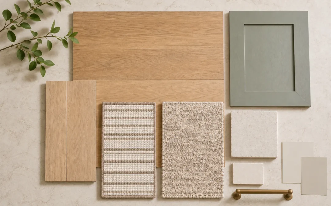
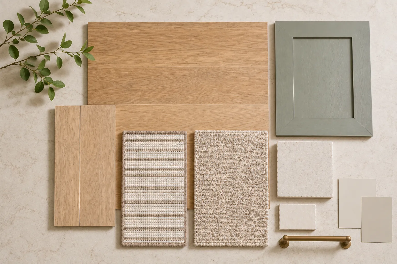
Understanding how flooring shapes interior design begins with recognizing the floor as one of the largest uninterrupted surfaces in a home. Flooring is often treated as a practical decision: hardwood or carpet, light or dark, durable or delicate. In a well-planned interior, however, it does much more. Its color, undertone, texture, sheen, plank width and installation pattern influence how every wall color, cabinet finish, countertop, rug and piece of furniture is perceived.
A beautiful room rarely comes from choosing each finish separately. It comes from building a coordinated material story. If you are still comparing the basic performance of different surfaces, begin with our flooring and interior design overview. This guide goes one step further and explains how to use flooring as the visual foundation of a complete interior.
Paint is flexible. Flooring is not. Wall color can be adjusted quickly and relatively affordably, while flooring is a major investment that is expected to remain in place for years. For a renovation, it usually makes sense to choose the flooring first, then coordinate the fixed finishes, cabinetry, countertops and tile—before selecting paint, textiles and accessories.
This order is especially important in an open-concept home. A flooring sample may appear quiet on a small board, yet cover hundreds of square feet once installed. The color will reflect onto walls and cabinetry and can make a room feel warmer, cooler, brighter, heavier or more relaxed.
A useful selection order is:
Two materials can both be described as beige, brown or gray and still clash. The reason is undertone: the subtle warm, cool, green, pink, yellow or red cast beneath the main color. A floor with golden undertones may look beautiful beside creamy white cabinetry but overly yellow beside a stark blue-white. A taupe floor with a violet cast may fight with a countertop that leans green.
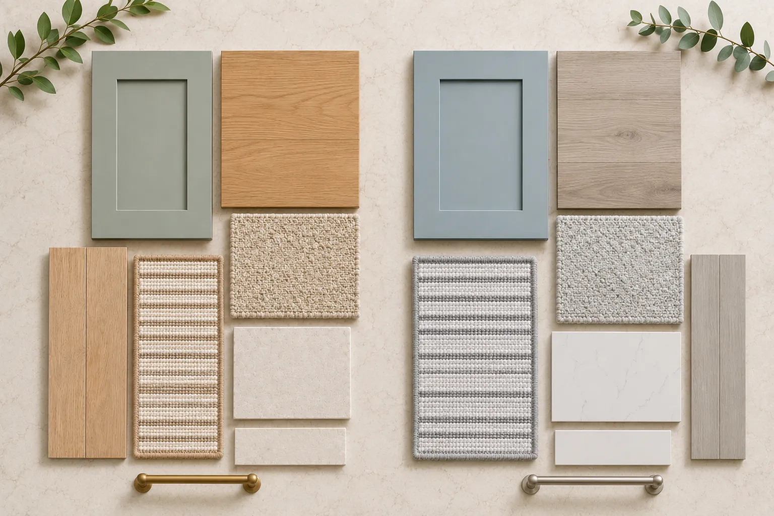
Do not try to make every surface identical. Instead, repeat one or two related undertones and vary the value—the lightness or darkness, and texture. A medium warm-oak floor, an ivory wall, a mushroom cabinet and a warm white quartz can feel layered because they share a family resemblance without matching exactly.
For a warmer palette, our guide to creating a warm modern interior without making it feel dark explains how natural wood tones, soft neutrals and controlled contrast can work together.
One of the clearest examples of how flooring shapes interior design is the way it establishes the design vocabulary. Flooring does not have to dictate one strict style, but it sets the visual direction. A pale matte oak with subtle grain supports Scandinavian, Japandi and organic-modern rooms. A medium brown wood with natural variation feels welcoming in transitional interiors. Deep walnut or a classic narrow plank adds formality. Stone-look tile can create a clean contemporary foundation, while patterned carpet can make stairs, libraries and bedrooms feel tailored and collected.
The finish matters as much as the color. Matte and low-luster surfaces feel natural and relaxed. High sheen reflects more light and reads as formal, but it also makes dust and surface marks more visible. Strong knots, color variation and wire-brushed texture add character; a quieter grain creates a more minimal backdrop.
Explore our hardwood flooring options and compare species, plank proportions, textures and finishes in person before deciding how much visual movement your room needs.
The size and direction of flooring elements affect the way a room is read. Wide planks create fewer seams and can make an open space feel calmer and more expansive. Narrow planks introduce more rhythm and often feel traditional. Large-format tile reduces the number of grout lines, while smaller tile brings pattern and detail.
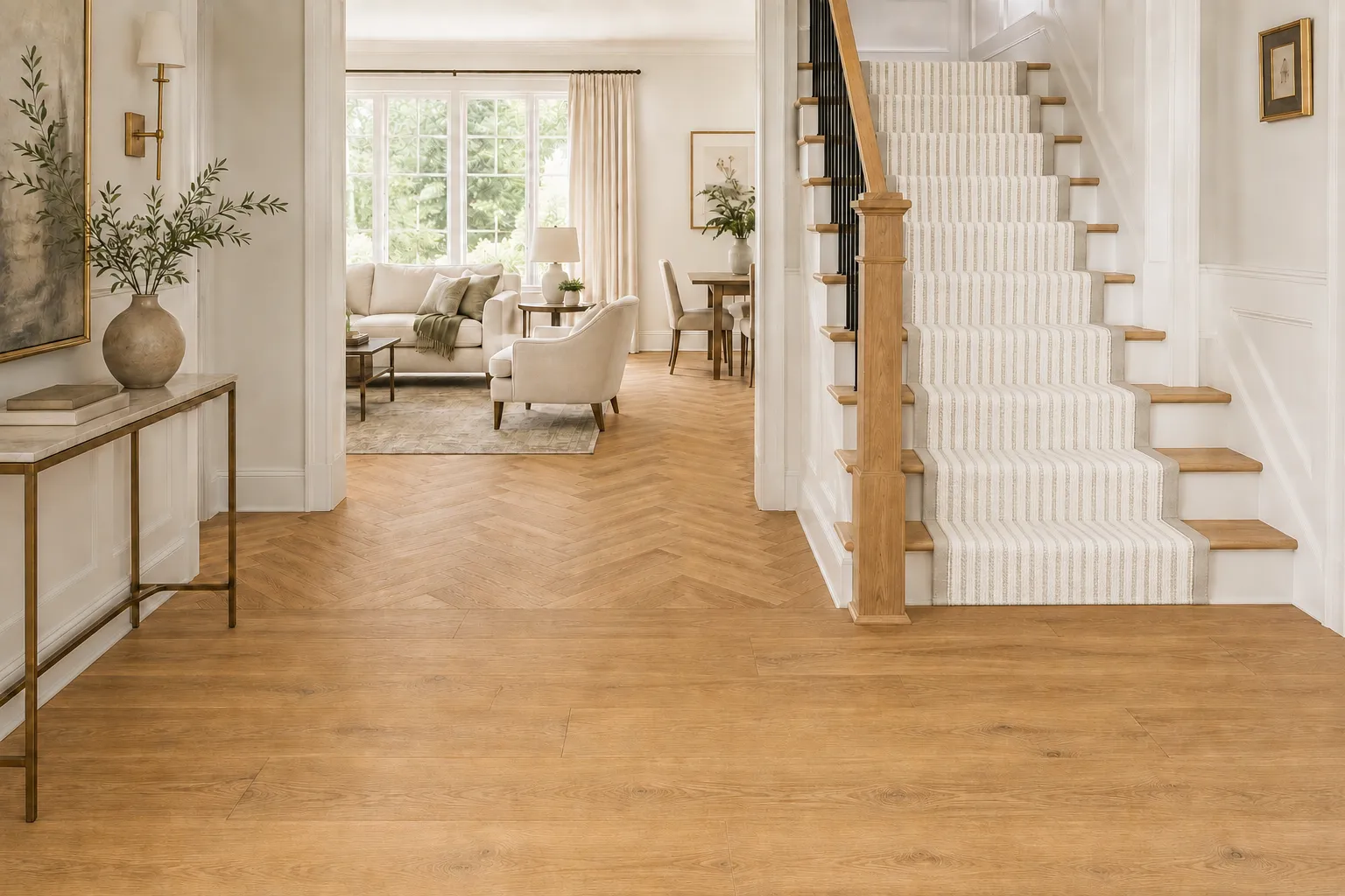
Direction matters too. Straight-laid planks usually create the cleanest flow and can visually lengthen a room. Herringbone or chevron adds movement and formality, so it works best when surrounding finishes are quieter. A patterned carpet or stair runner can become an intentional focal point, but its repeat should be viewed at full scale, not judged from a tiny cutting.
Designer tip: align the dominant flooring direction with the longest sightline or the main flow of movement whenever the architecture allows. In connected rooms, avoid changing direction without a clear architectural reason.
In a kitchen, the floor, cabinetry and countertop are the three largest visual surfaces. If all three have strong grain, contrast or veining, the room can feel busy. A more balanced approach is to choose one lead material and let the others support it.
For example, highly figured stone may pair best with a quieter floor and simple cabinet finish. Character-rich wood flooring can be balanced with painted cabinetry and restrained countertop movement. When both floors and cabinets are wood, aim for contrast rather than a near match: combine light with medium, or warm with slightly deeper neutral tones, while keeping the undertones related.
Compare cabinet finishes beside flooring samples in the same light. Then add the countertop sample and view the group vertically as well as flat on a table; materials can look different in their installed orientation.
Hard flooring gives a room continuity, but textiles make it feel finished. An area rug introduces softness, sound absorption, color and a sense of place. In an open living area, it can define the seating zone without interrupting the flooring beneath it.
The rug should relate to the floor without disappearing into it. On a warm medium wood, try an ivory, rust, olive, muted blue or patterned rug with enough contrast to create a clear boundary. On pale flooring, a deeper or more textured rug adds weight. If the floor already contains strong color variation, choose a rug with a calmer field; if the floor is quiet, the rug can carry more pattern.
Browse area rugs alongside your flooring sample so you can judge contrast, pile, pattern scale and edge detail together.
A cohesive home does not require the same flooring in every room. It requires intentional transitions. Use continuous flooring across the largest connected areas when function allows, then change material where there is a clear reason, such as softness in a bedroom, water resistance in a laundry room or traction on a stair.
When materials change, connect them through at least one shared design element: undertone, color family, texture or pattern scale. A warm-oak hardwood can transition to a taupe carpet, a limestone-look tile or a wood-look LVP with a related neutral base. The materials are different, but the palette still feels planned.
Transitions should also occur at logical architectural boundaries, such as a doorway, threshold or change in level. Avoid small isolated patches of flooring or too many materials visible from one viewpoint; both can make the home feel fragmented.
For moisture-prone or high-use areas, luxury vinyl flooring can provide a wood-inspired visual connection while offering easier everyday care. In bedrooms, family rooms and stairs, carpet can add comfort and acoustic softness without breaking the overall color story.
Showroom lighting is useful for comparison, but the final decision should account for the home’s daylight direction, artificial lighting and surrounding colors. North-facing rooms often make colors appear cooler; warm bulbs can intensify yellow or red undertones. A floor can also look different in the morning, afternoon and evening.
Bring the core samples together: flooring, cabinet door, countertop, tile, paint and one or two textiles. View them on the floor and, when relevant, hold cabinet and wall samples vertically. Move the group between rooms. Look at the materials from several feet away as well as close up. This simple step helps reveal undertone conflicts, insufficient contrast and patterns that become too active at scale.
A material palette is more useful than a collection of individual favorites. Start with the floor, then add the fixed surfaces and one or two supporting finishes. The goal is not for every sample to be exciting on its own; it is for the group to feel balanced.
|
Layer |
What to Evaluate |
Design Question |
|
Flooring |
Undertone, variation, sheen, scale |
Does it create the right foundation? |
|
Cabinetry |
Wood tone or paint color, door style |
Is there enough contrast from the floor? |
|
Countertop |
Base color, veining, movement |
Which material should lead visually? |
|
Tile |
Format, grout, texture, pattern |
Does it connect or introduce a new idea? |
|
Paint |
Light reflectance and undertone |
Does it support the fixed finishes? |
|
Textiles & rug |
Color, softness, pattern scale |
Does the room feel layered and comfortable? |
|
Metal & lighting |
Finish, temperature, contrast |
Do the final accents repeat the palette? |
Before ordering, photograph the palette in natural light and keep a record of exact product names, colors, finishes and lot information. This makes later selections—and communication with installers and trades—more reliable.
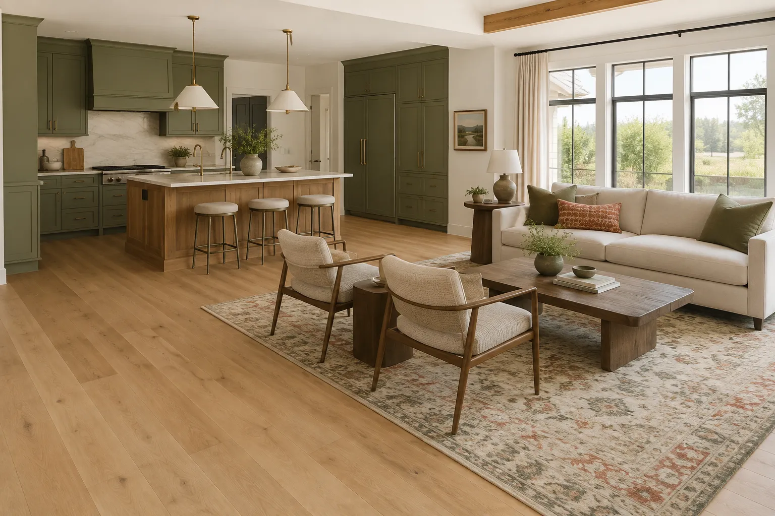
Understanding how flooring shapes interior design makes it easier to build a coordinated home, even when the project is completed in stages. Seeing flooring beside cabinetry, countertops, tile and rugs helps catch color conflicts early and creates a home that feels connected from room to room.
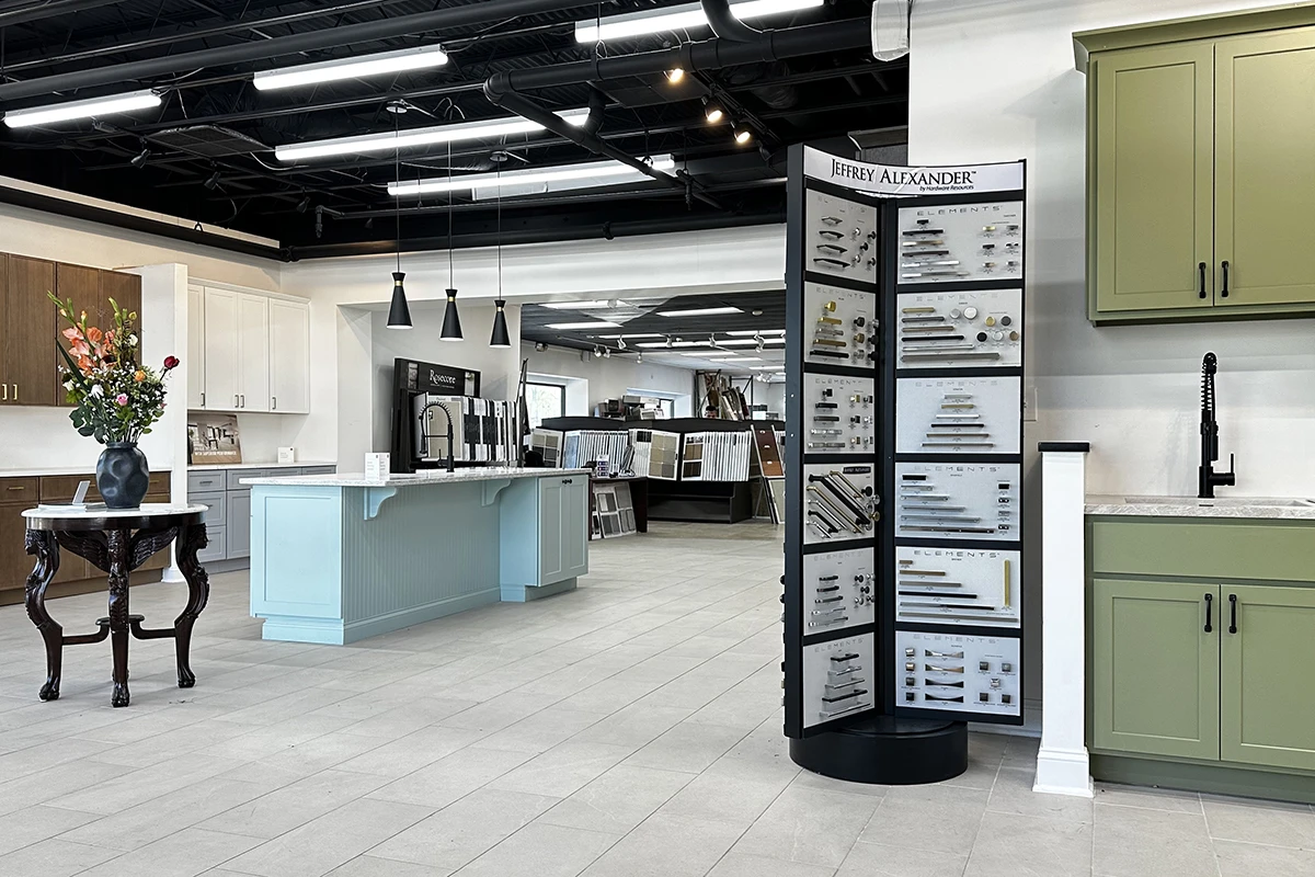
At Karpet King Design Center in Rockville, homeowners, designers and contractors can compare materials side by side and receive interior design guidance for flooring, kitchen and bath selections. Bring photos, measurements and any samples you already love; we can help turn them into a coordinated palette that fits the architecture, lifestyle and budget of your project.
Visit our showroom at 751 East Gude Drive, Rockville, MD 20850, call (301) 770-4110, email [email protected], or contact us online to plan your visit.
The page you requested could not be found. Try refining your search, or use the navigation above to locate the post.
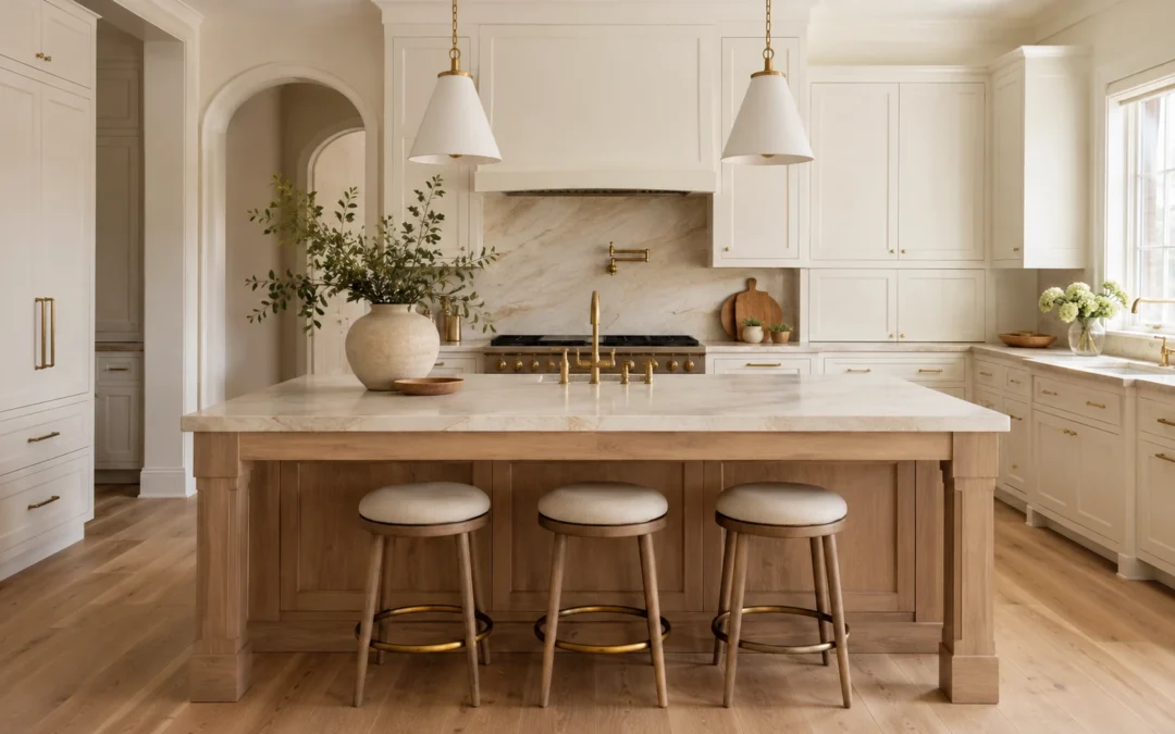
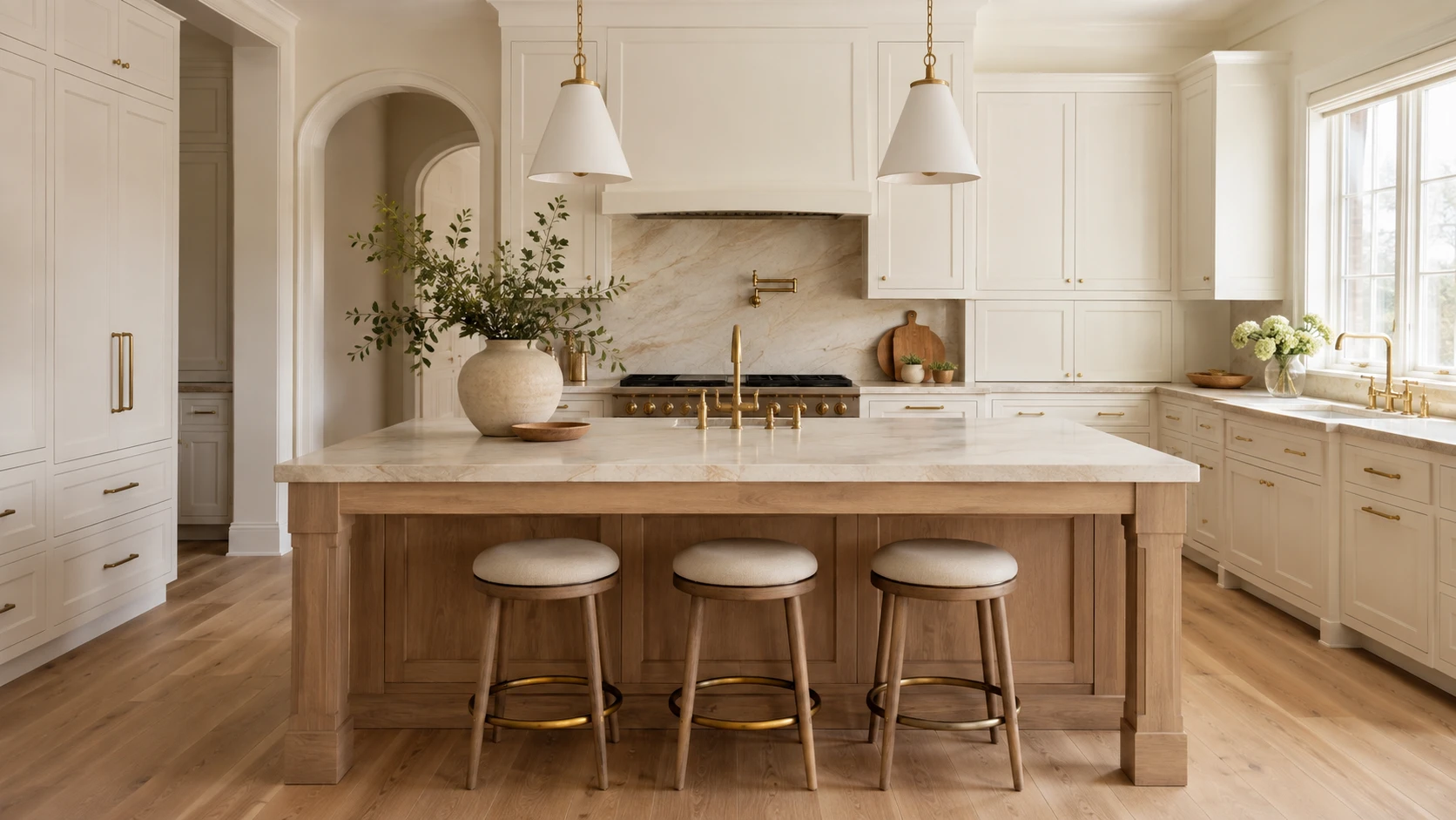
Choosing a kitchen cabinet color can feel more permanent than almost any other design decision. Wall paint, lighting, and accessories can be replaced relatively easily, but cabinetry covers a large portion of the room and represents a significant investment.
The goal is not simply to choose the safest color or copy the latest kitchen trend. The goal is to select a finish that works with your home’s architecture, natural light, flooring, countertops, and overall atmosphere—so the kitchen continues to feel balanced and intentional years from now.
Before choosing your kitchen cabinetry, use the following principles to create a palette that feels current today but remains adaptable for the future.
According to the 2026 Houzz Kitchen Trends Study, wood became the most selected cabinet finish among renovating homeowners, narrowly moving ahead of white. Medium and light wood tones accounted for most wood selections, while off-white remained an important choice. Green also moved slightly ahead of gray.
The 2026 NKBA Kitchen Trends Report similarly points toward neutrals, greens, blues, natural materials, and wood grain. It also shows that homeowners and designers are increasingly using stronger colors on islands, backsplashes, and decorative features instead of applying them to every surface.
These findings do not mean that one color is guaranteed to remain timeless. They show a broader movement toward warmth, natural texture, and colors that feel connected to the rest of the home.
Do not begin with a cabinet paint swatch. Begin with the elements that will be the most expensive or difficult to replace:
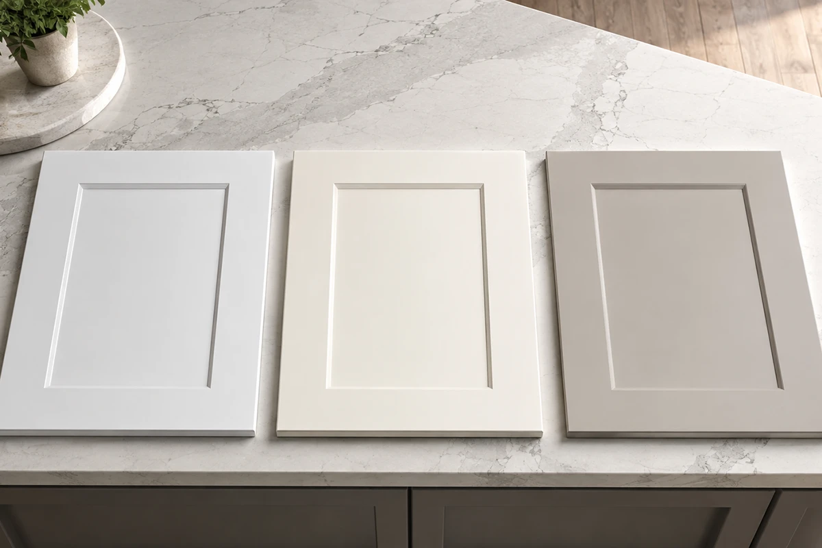
Two colors may both be called white, beige, gray, green, or blue but look completely different once installed. Common undertones include:
Yellow or cream
Color psychology can be useful, but it should be treated as a guide rather than a strict formula.
A 2025 systematic review of 132 peer-reviewed studies found that people form recurring emotional associations with color. Lightness, saturation, and hue all influence those associations, but culture, personal experience, context, and surrounding materials also matter.
In a kitchen, these general impressions may help guide your selection:
These colors can make a kitchen feel bright, gentle, and welcoming, especially when paired with warm flooring and natural materials.
Wood often creates a grounded, tactile, and organic atmosphere. The visible grain adds movement and character without requiring a strong painted color.
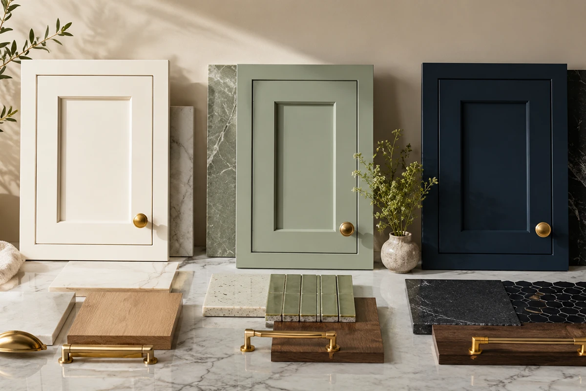
Sage, olive, and gray-green finishes can feel calm and connected to nature. A muted green usually adapts more easily than a highly saturated emerald or lime.
Soft blue can feel relaxed and composed. Navy creates greater contrast, formality, and visual depth.
These shades can create a quiet, layered neutral palette without the sharpness of bright white or the coolness of traditional gray.
These colors feel warmer, richer, and more expressive. They may work best as a carefully coordinated statement rather than an automatic neutral.
Do not assume that every green will feel calming or every white will make a room feel larger. A bright, highly saturated green can feel energetic, while a gray-green sage may feel softer. The complete effect depends on lighting, surface area, saturation, and the materials around it.
Ask yourself:
How do I want this kitchen to feel during everyday life?
White cabinetry can still be a long-lasting choice, but stark white is not always the most adaptable option.
Very bright or blue-white cabinetry may feel harsh in a room with:
Softer alternatives include:
These finishes can keep the kitchen feeling bright while creating a softer relationship with wood, natural stone, and adjoining living spaces. Always compare the cabinet sample with the countertop. A cabinet may look warm white by itself but suddenly appear yellow, gray, or pink beside the chosen stone.
The final result depends on:
White oak, walnut, maple, and other wood finishes can work in modern, organic, transitional, and classic kitchens.
For a design that can adapt over time, consider:
The 2026 NKBA report identified wood grain as a growing cabinet direction and white oak as the leading wood species among surveyed professionals.
Avoid choosing an intense stain only because it is temporarily popular. A finish that respects the wood’s natural character is often easier to coordinate with future paint, hardware, and décor changes.
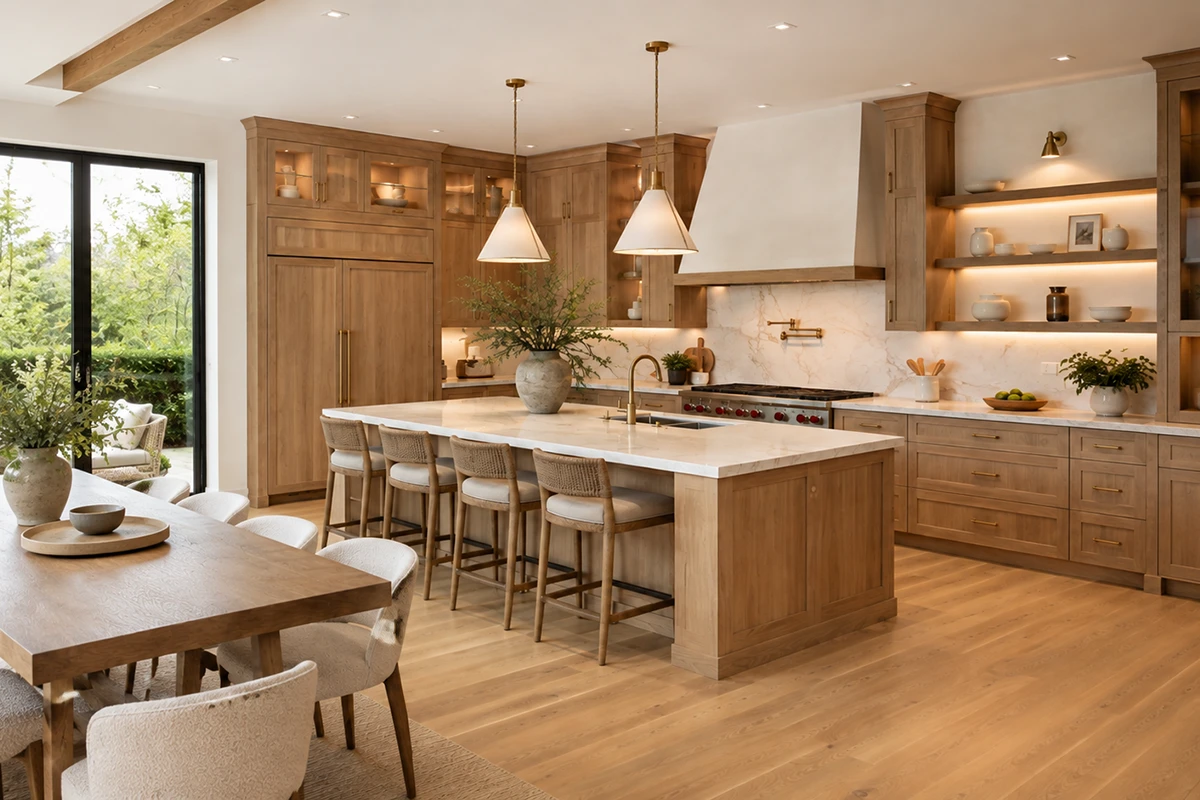
Colorful cabinets can age beautifully when the shade is connected to natural materials and the architecture of the home.
Potentially adaptable colors include:
The difference is often in the saturation.
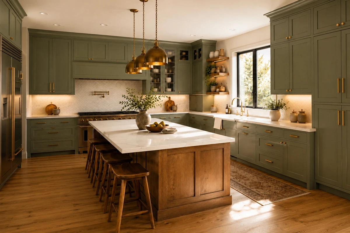
A gray-green sage may behave almost like a neutral. A bright, highly saturated green may dominate the entire room and limit future changes.
Before ordering colorful cabinetry, ask:
A two-tone kitchen can feel custom and layered, but the island should relate to another element in the room.
Successful combinations may include:
The contrasting color might connect with the floor, countertop veining, hardware, nearby furniture, or architectural details.
Current NKBA research suggests that islands are one of the leading locations for statement color, making them a practical way to introduce personality without applying a bold finish throughout the entire kitchen.
When developing a two-tone palette, treat the cabinets, island, flooring, countertops, and backsplash as one coordinated kitchen remodeling design, not as separate purchases.
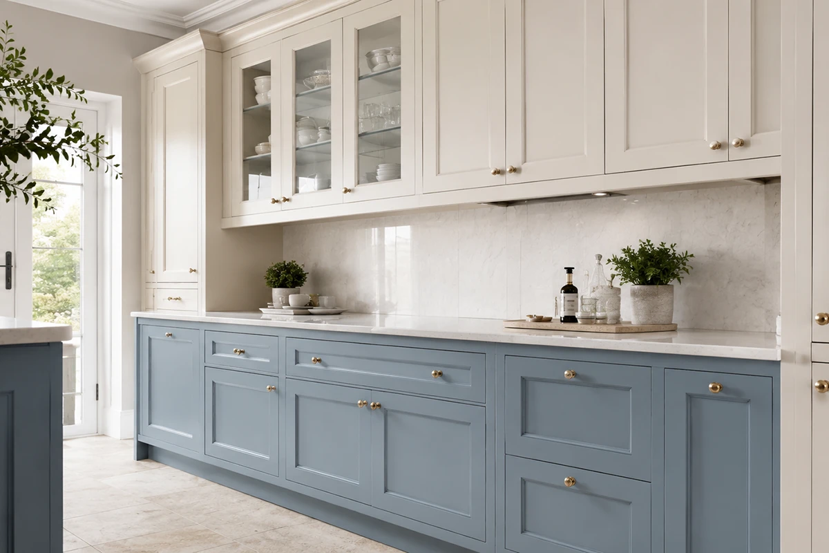
Cabinet colors can change dramatically throughout the day. A finish may appear:
Whenever possible, review a full cabinet-door sample rather than a small paint chip.
Place it vertically, because cabinet doors will not be viewed flat on a table. Observe it in:
Natural and task lighting are major considerations in current kitchen planning, so the cabinet finish should be evaluated under the lighting that will actually be used in the completed room.
During an interior design consultation, cabinet doors can be compared with stone, flooring, tile, paint, and hardware before the order is placed. Karpet King’s consultation service specifically includes color-palette development and coordination among these materials.
Trends can provide inspiration, but they should not be the only reason behind a permanent design decision.
Ask yourself:
A timeless kitchen does not have to be white, beige, or conservative. A navy, green, wood, or burgundy kitchen can remain beautiful when the color has a clear relationship with the rest of the design.
The same color can appear different depending on whether it is applied to:
Painted MDF may create a very smooth, consistent surface. Painted solid wood may retain subtle grain and may show fine movement at the joints over time.
Stained cabinetry behaves differently because the wood species affects how the stain is absorbed. The same stain may look warmer, darker, or more varied on oak, maple, cherry, or walnut.
A small sample cannot show how a color will feel across an entire wall of cabinetry. Request the largest sample available.
Cabinets and floors occupy large visual areas. Conflicting undertones can make the entire kitchen feel disconnected.
Cabinetry and countertops should be developed together. Neither should become an afterthought.
A deep green kitchen shown in a large, sunny home may look very different in a smaller room with limited daylight.
Cabinets, island, flooring, stone, tile, wall paint, hardware, and lighting should not all compete for attention. Decide which element will lead the design.
A fashionable cabinet color does not guarantee a successful kitchen. Coordination is more important than popularity.
For broader project planning, read How to Plan a Kitchen Remodel Without Stress in the DMV Area.
Bring the following items when comparing cabinet colors:
At the showroom:
A cabinet color that remains beautiful for years is not necessarily the palest or safest option. It is the color that works with the home’s architecture, permanent materials, lighting, and the emotional atmosphere you want the kitchen to create.
Current research points toward natural wood, softened whites, grounded neutrals, greens, and blues. However, long-term satisfaction depends more on careful coordination than on choosing the most popular color of the year.
Compare real cabinet doors with your flooring, countertop, backsplash, and hardware before making the final decision. The goal is not to find one universally timeless color. It is to create a kitchen that feels personal, balanced, and adaptable.
Visit our Rockville showroom to compare cabinetry, countertops, flooring, tile, and hardware in person.
Book an interior design consultation at Karpet King Design Center in Rockville, Maryland.
The page you requested could not be found. Try refining your search, or use the navigation above to locate the post.

A new carpet is more than just a decorative touch; it’s a significant investment in your home’s comfort and value. Like any valuable asset, it requires consistent attention to maintain its appearance and extend its life. Proper maintenance is not about occasional, intense cleaning sessions. Instead, it’s about building simple, regular habits that protect the fibers from the inside out. This proactive approach is the core of our carpet maintenance guide.
Beyond aesthetics, clean carpets play a role in your home’s health. Carpet fibers act as a passive air filter, trapping dust, pollen, and other allergens that would otherwise circulate in the air. For families in the Washington, D.C. area, where seasonal allergies can be a concern, this is a notable benefit. However, for that filter to work effectively, it needs to be cleaned out. A consistent routine removes these trapped particles, contributing to better indoor air quality. The most effective carpet care tips focus on preventing dirt from embedding deep into the pile, which is what causes premature wear and dullness.
The single most important task for preserving your carpet is regular vacuuming. But not all vacuuming is created equal. The difference between a quick pass and a thorough cleaning lies in the technique. For the best results, use a quality vacuum with a beater bar or rotating brush, which agitates the carpet pile to loosen embedded dirt. If your vacuum has an adjustable height setting, make sure it’s set correctly for your carpet type to allow for optimal airflow and agitation.
When you learn how to clean carpets the right way, you protect the fibers from the abrasive effects of ground-in soil. Follow these steps for a more effective routine:
This method works wonders on all types of flooring, including the diverse selection of carpets we offer for modern homes. How often should you vacuum? It depends on the foot traffic in each room. Here’s a simple schedule to follow.
| Traffic Level | Area Examples | Recommended Frequency | Rationale |
| High-Traffic | Hallways, entryways, family rooms | Daily or every other day | Prevents abrasive dirt and soil from being ground into carpet fibers, which causes premature wear. |
| Medium-Traffic | Bedrooms, home offices | Twice a week | Manages accumulation of dust, hair, and allergens without the intense foot traffic of main areas. |
| Low-Traffic | Guest rooms, formal dining rooms | Once a week | Maintains cleanliness and prevents dust from settling deep into the pile in rarely used spaces. |
This schedule provides a practical framework for homeowners to protect their investment. Adjust frequency based on household factors like pets, children, or seasonal pollen levels in the D.C. metro area.
Even with the most careful habits, spills happen. That moment when a glass of red wine tips over or a plate of spaghetti lands face down can feel like a disaster, but your immediate response makes all the difference. The key to effective stain removal for carpets is acting quickly before the spill has time to set into the fibers.
Your first instinct might be to scrub furiously, but that’s the worst thing you can do. Rubbing can untwist the carpet fibers, permanently altering their texture and pushing the stain deeper. Instead, blot, don’t rub. Grab a clean, white cloth, press it firmly onto the spill, and lift. Repeat this process with fresh sections of the cloth, working from the outside edge of the spill inward to prevent it from spreading. For many common water-based spills, a simple solution of a few drops of clear dish soap mixed with water is effective. However, for tougher stains like oil or ink, a commercial carpet stain remover designed for your carpet type may be necessary.
To avoid making a bad situation worse, be mindful of these common mistakes:
For more complex situations, it’s always wise to consult a reliable source. According to the Carpet and Rug Institute, different spills require specific treatments to avoid setting the stain, and their website offers detailed guidance for homeowners.
While cleaning addresses dirt that’s already there, proactive protection is just as important for ensuring long-lasting carpets. The goal is to minimize wear and tear before it becomes visible. This starts at your front door. Place durable doormats at every entrance to your home to trap dirt, mud, and moisture from shoes before they ever reach your carpet.
Inside, think in layers. Hallways, family rooms, and other high-traffic paths are the first to show wear. You can shield these areas by strategically placing runners or using some of our beautiful area rugs over the main carpet. This not only protects the fibers but also adds a new design element to the room. Heavy furniture is another source of damage, as its weight can crush the carpet pile and leave permanent indentations. Use furniture coasters under the legs of sofas, tables, and cabinets to distribute the weight more evenly.
A simple but effective habit is to rearrange your furniture layout every six to twelve months. This small change alters foot traffic patterns, giving previously compressed areas a chance to recover. Finally, consider adopting a “no-shoes” policy inside. It’s a simple cultural shift for your household that dramatically reduces the amount of abrasive dirt tracked onto your floors, which is one of the primary causes of fiber breakdown over time.
Your weekly vacuuming routine is essential for surface-level maintenance, but it can’t do everything. Over time, oils, sticky residues, and deep-seated allergens accumulate in your carpet in ways that even the best residential vacuums can’t handle. This is where professional deep cleaning comes in. It’s not a replacement for regular vacuuming but a necessary supplement to it.
Professionals typically use a method called hot water extraction, often referred to as steam cleaning. This process injects a solution of hot water and specialized cleaning agents deep into the carpet pile, dislodging stubborn grime and allergens. A powerful vacuum then extracts the water, solution, and dirt, leaving your carpets thoroughly clean and refreshed. As you consider professional services, remember that our team is here to help with more than just sales, offering expert installation and refinishing support.
For an average household, we recommend scheduling a professional deep cleaning every 12 to 18 months. However, if your home in the D.C. area includes pets, children, or individuals with allergies, you may want to increase the frequency to every 6 to 9 months. As the Environmental Protection Agency (EPA) suggests, this type of cleaning can significantly improve indoor air quality by removing trapped pollutants.
Finally, a complete carpet maintenance guide acknowledges that not all carpets are created equal. The material your carpet is made from influences the best way to care for it. For example, natural fibers like wool are incredibly durable and resilient, but they are sensitive to high-pH or alkaline cleaners, which can damage the fibers.
In contrast, synthetic fibers like nylon and polyester are known for their exceptional stain resistance and durability, making them a great choice for active households. While they are more forgiving, it’s still important to use products designed for synthetic carpets to maintain their appearance and texture. The best approach is always to start with the manufacturer’s care instructions. When in doubt, consulting a flooring expert is the safest path. If you have specific questions about your flooring, please don’t hesitate to contact us for professional advice tailored to your home.
The page you requested could not be found. Try refining your search, or use the navigation above to locate the post.